
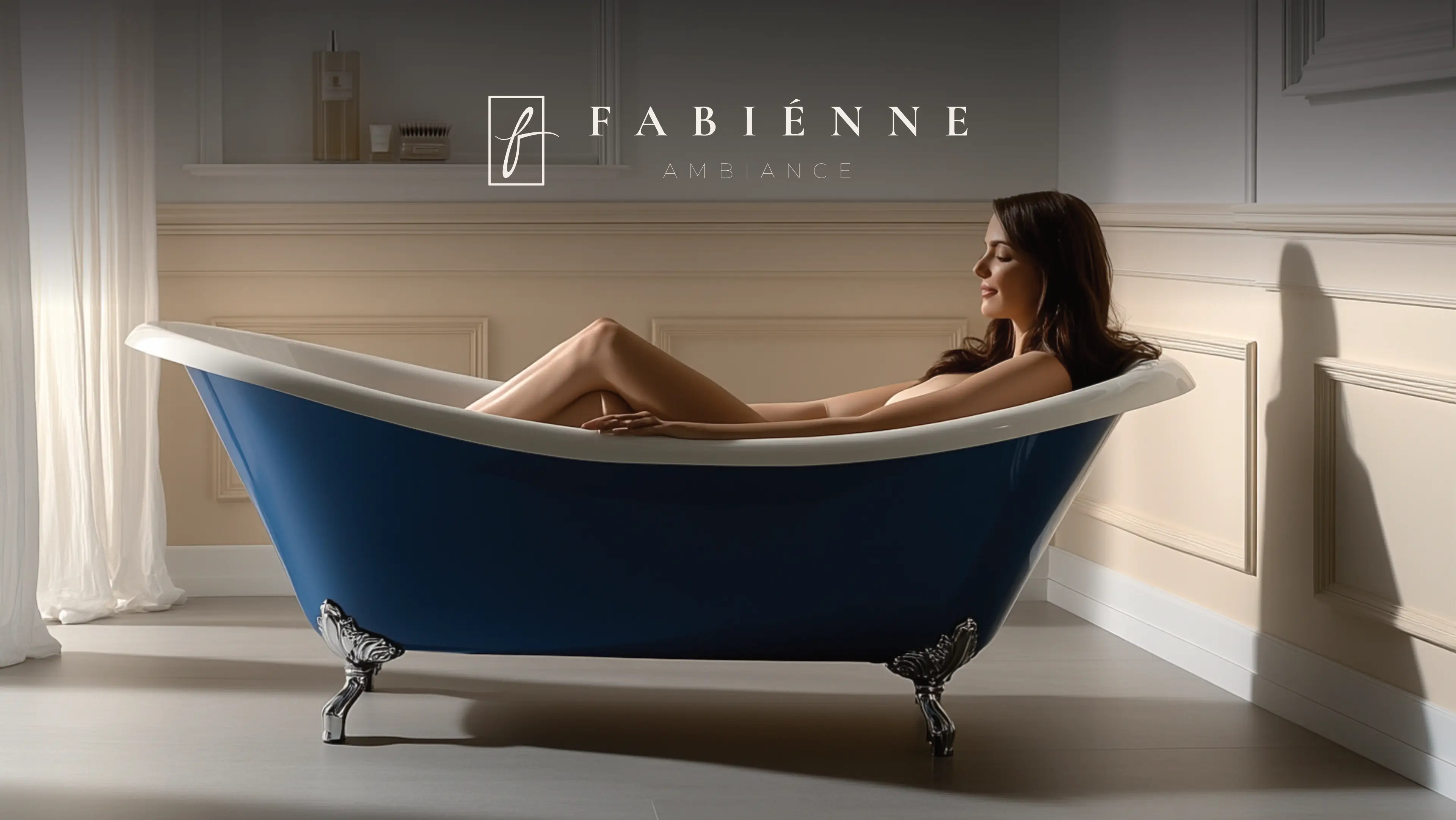
Fabienne Ambiance is a promotional gifts company that believes in self-value and worth. They are building a new brand specialising in producing and selling hand-crafted soy candles with a strong scent. Long-lasting, refillable candles that can be reused as massage oil. But what their customers really buy is a premium gift that ignites the senses and creates an unforgettable ambience. Fabienne Ambiance is a French name specifically chosen to give the impression of high-quality products from a country that understands romance and the finer things in life.
Fabienne Ambiance targets people in Pretoria East, guest houses, real estate agents, Airbnb's, Gift store owners, pharmacies, people with chimneys, and people who enjoy bathroom soak sessions. They are typically men and women in their 35-70's, from the Upper-income class. The brand should create the impression that your place smells amazing, and therefore, you feel better. They want to evoke a sense of self-love in their target audience.
Their primary goal is to build a premium brand that inspires self-value and celebrates life’s finer things. We hand-craft long-lasting, strongly scented soy candles designed to do more than just light a room, they ignite the senses and create unforgettable atmospheres. They aim to deliver exceptional quality and versatility by making candles that double as rich massage oils and feature refillable bases for lasting enjoyment. By blending sustainable luxury with the romance and elegance of French tradition, they aim to provide a premium gifting experience that helps people feel truly valued.
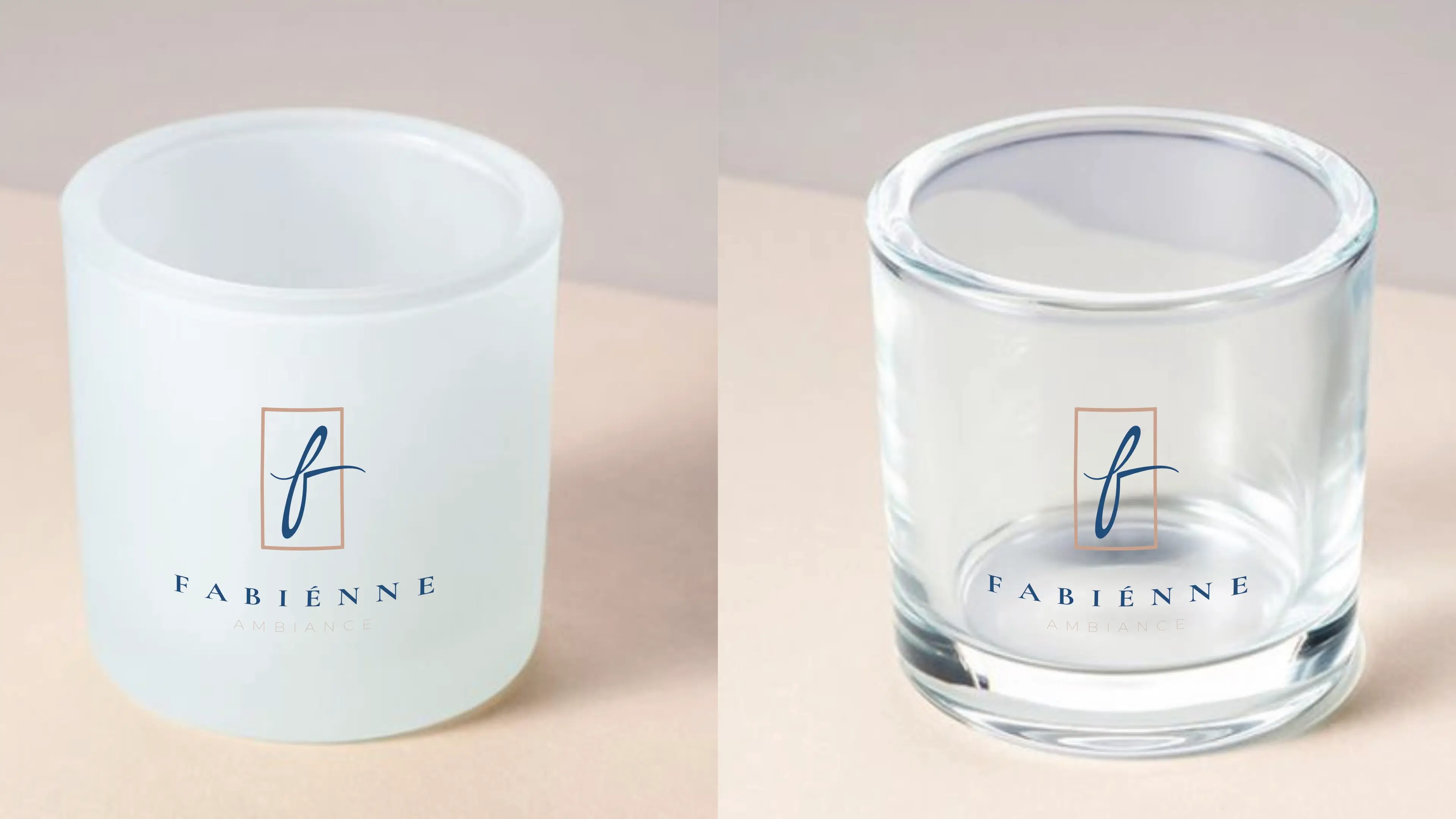
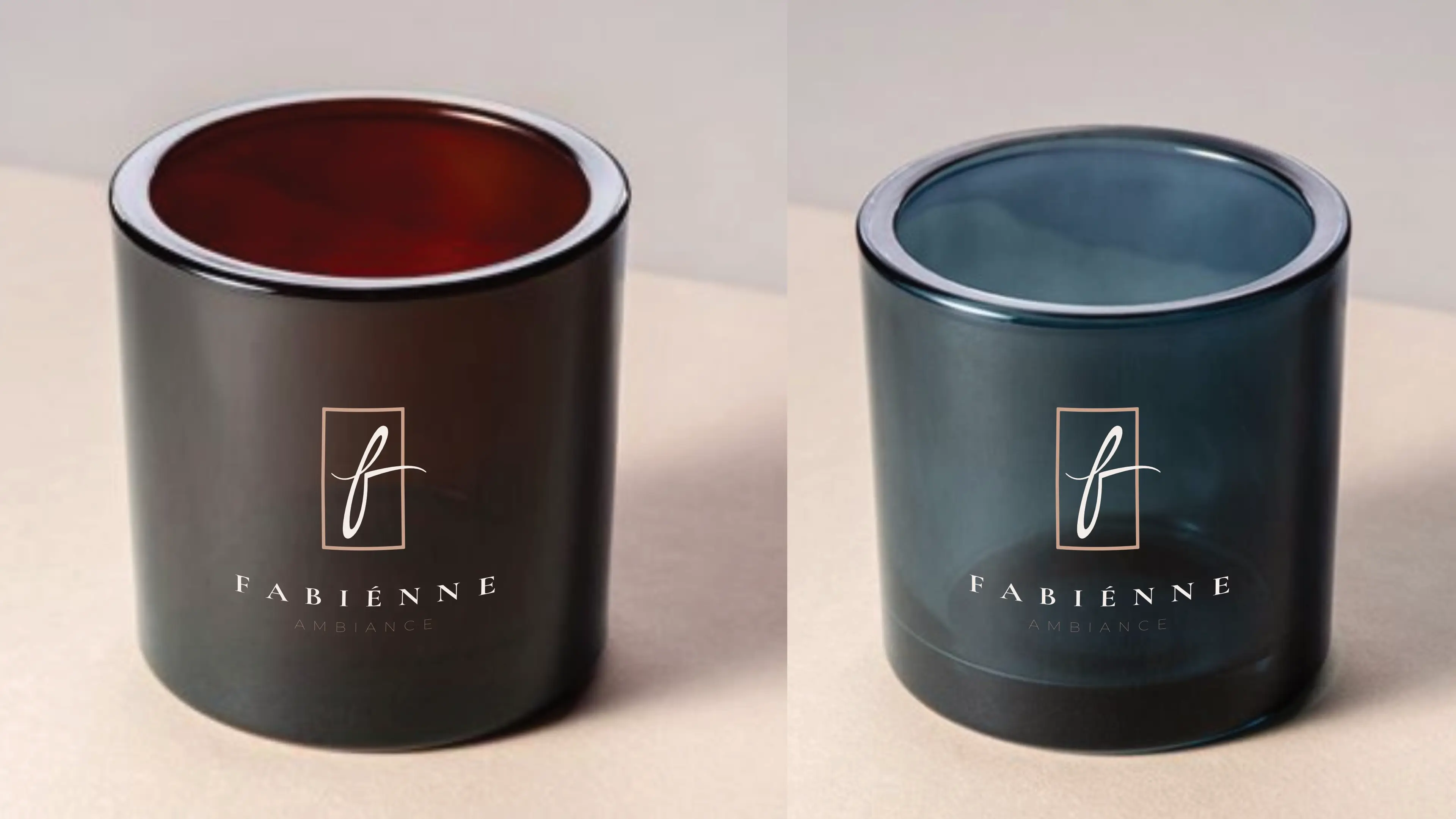
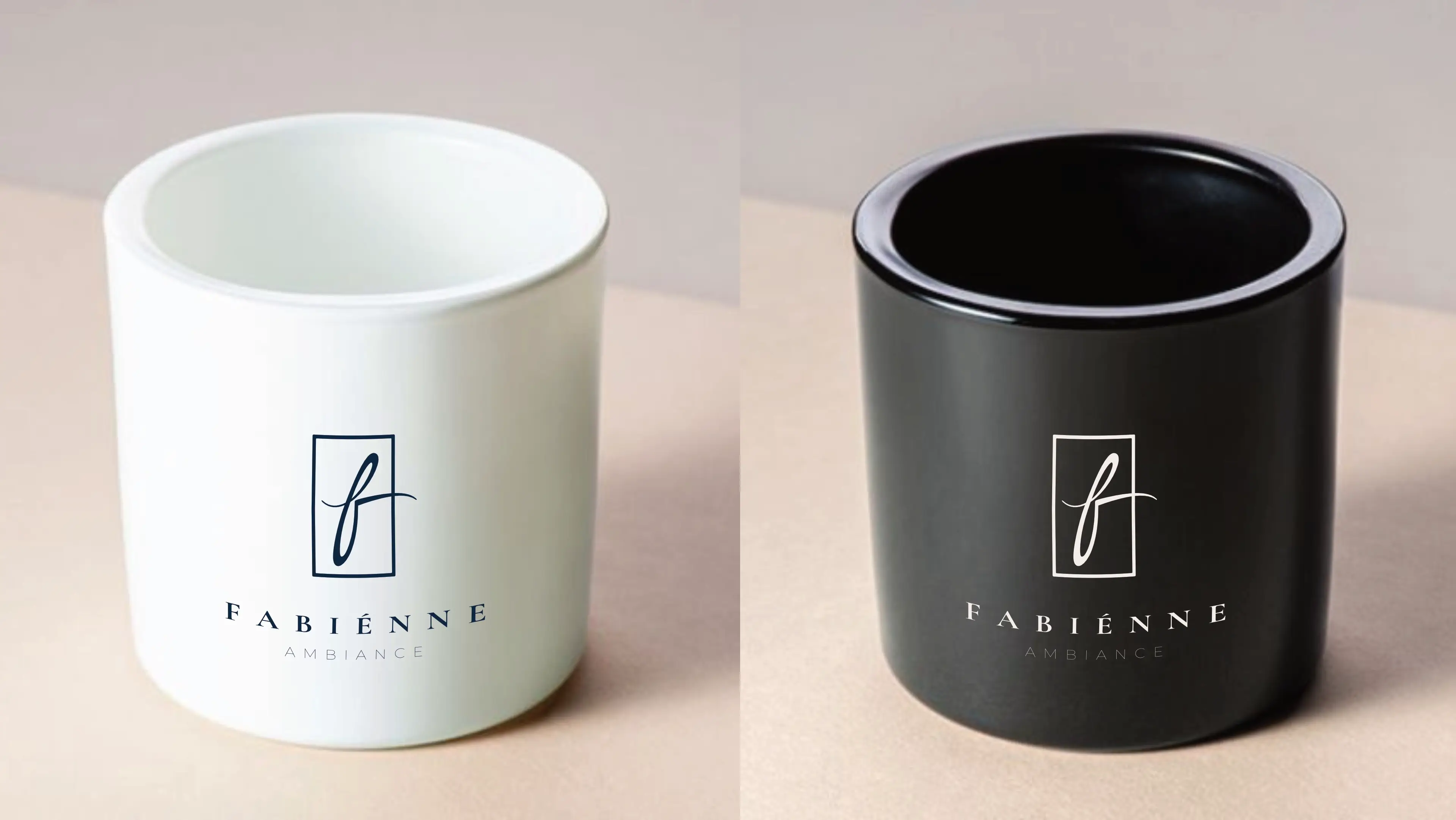
Fabienne Ambiance wants a new logo for a product that will get a foot in the door for its parent brand, Adult Pharma. Their logo will be showcased on their product (5 different bottles) and displayed on store shelves. They have requested that the logo should look expensive, eye-catching, and contain French influence.
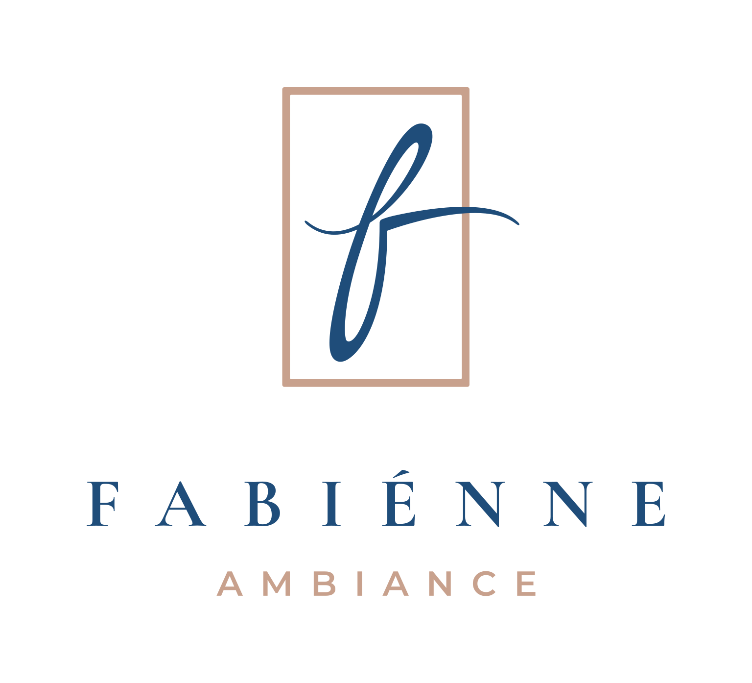
The logo functions perfectly well in a vertical or stacked layout. This means that the logo will work well on vertical applications like smartphones, tablets and roll-up banners.
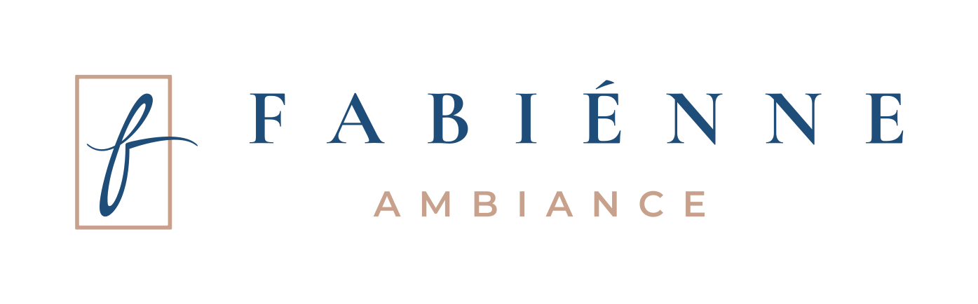
The logo is designed to be functional in a horizontal layout. This allows you to use the logo on horizontal applications like building signage, websites and stationery.
The colour palette perfectly aligns with Fabienne Ambiance's vision of sophistication, luxury, and sensory indulgence. The Soft Mocha and Soft Ivory evoke warmth and refinement, while Deep Marine and Midnight Slate ground the palette with depth and trust. The Rosewood Blush adds a romantic and emotional touch, creating a cohesive, elegant palette that appeals to the brand's upper-income, style-conscious audience.
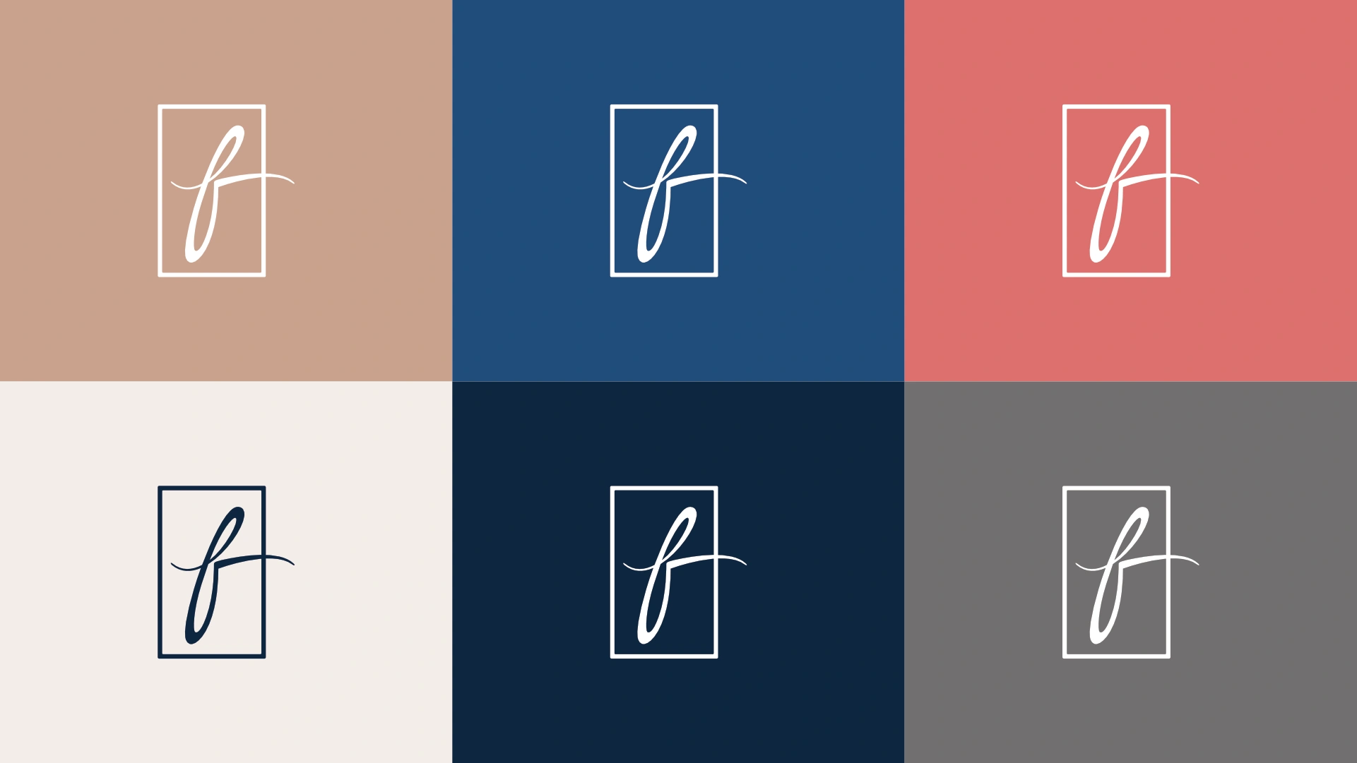
Soft Mocha conveys warmth, comfort, and sophistication. It reflects a sense of understated luxury and timeless elegance, perfectly aligning with the brand's focus on self-care and indulgence.
Deep Marine represents depth, trust, and calmness. It evokes feelings of relaxation and creates a premium, confident look. This deep blue complements the brand's association with indulgence and the senses.
Rosewood Blush adds a pop of romance and emotion. It evokes feelings of love, passion, and warmth, reinforcing the sensory and romantic qualities of the brand.
Soft Ivory symbolises purity, simplicity, and refinement. It serves as a perfect backdrop, enhancing the premium and calm aesthetic of the brand.
Midnight Slate evokes mystery, sophistication, and depth. It adds a sense of luxury and strength while complementing the lighter tones in the palette.
Pebble Grey evokes neutrality, balance, and professionalism. It acts as a calm backdrop that supports the sophistication of the primary colour.
The primary colour version of the logo functions perfectly in a vertical layout, designed for maximum brand impact on light and dark digital surfaces.
For wider applications like navigation bars, signage, and stationery, the horizontal colour variations ensure the brand remains legible and professional.
Our typography pairs a classic, high-end serif font with a clean, modern sans-serif font to reflect luxury, romance, and clarity.

Cormorant Garamond
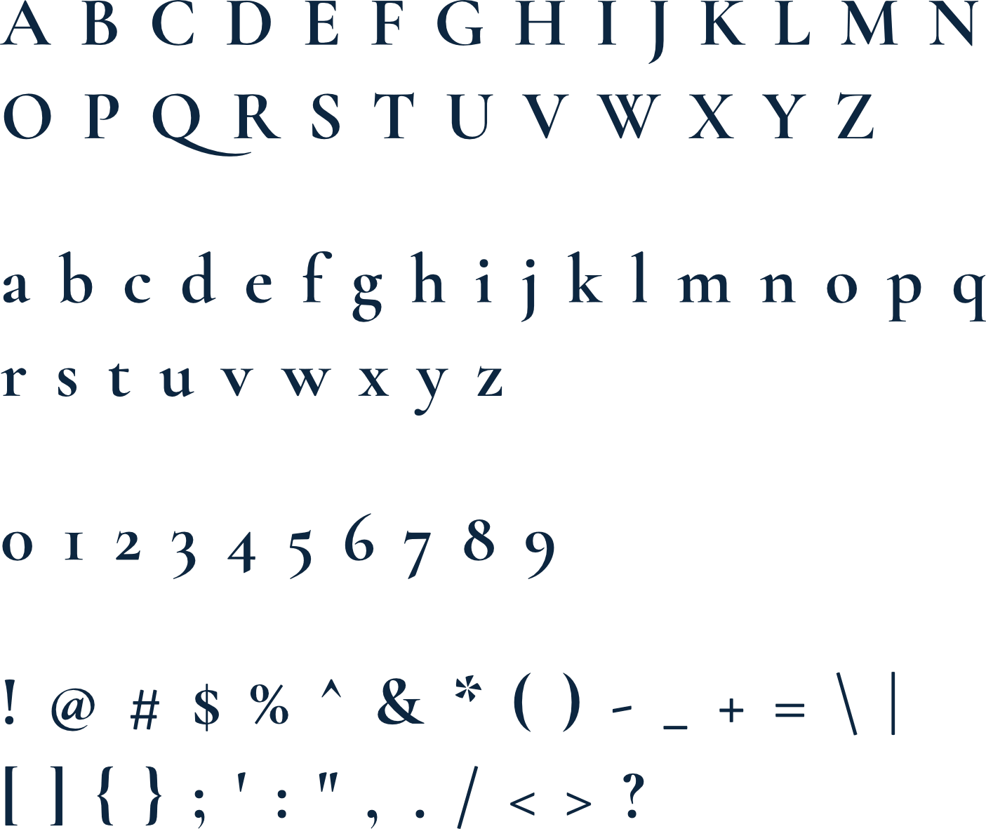
Cormorant Garamond is an elegant, high-contrast serif inspired by traditional Garamond designs. Its delicate curves and fine details give it a luxurious, artisanal quality that makes headings feel romantic and sophisticated. This font is ideal for premium brands that want to communicate elegance, heritage, and artistry.
Montserrat
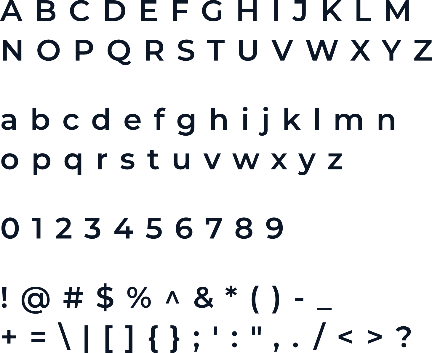
Montserrat provides a clean and modern counterbalance to ornate serifs like Cormorant Garamond. Its geometric structure and contemporary style make paragraphs and subheadings easy to read while maintaining visual harmony with more decorative heading fonts. This font is versatile and brings a fresh, polished look to any design.
The logo is designed to fit inside a profile image that can typically be uploaded to social media platforms like Facebook, LinkedIn, and Instagram.
A favicon is a small icon that represents your website in browser tabs, bookmarks, and address bars, ensuring brand recognition at a glance.

Contact us Today To
The best way to get things done is simply to begin. Reach out to us at Fletch in Pretoria, South Africa today.
