
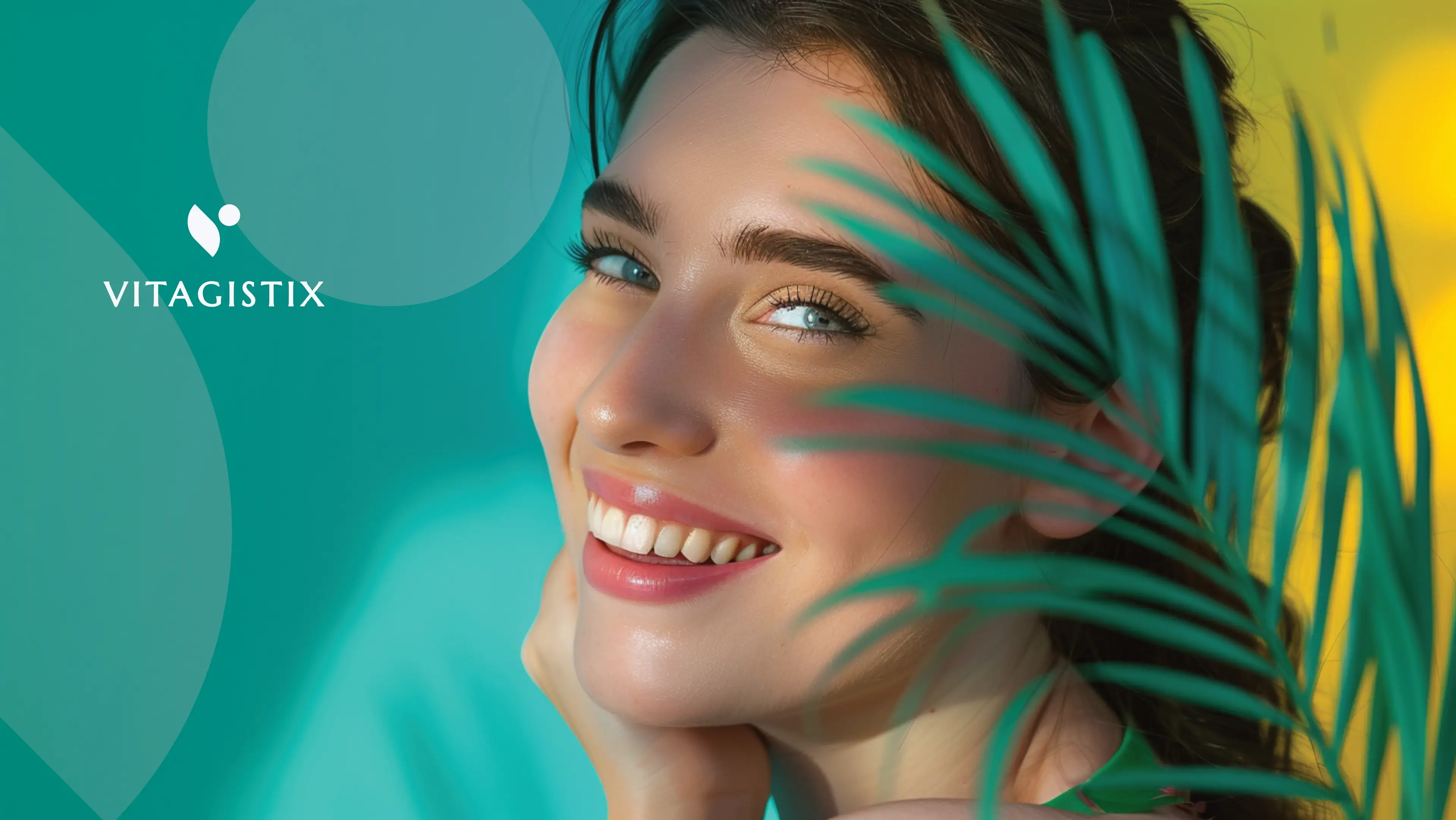
Vitagistix is a Medical Aesthetics company that highly values the creation of a better and more comfortable lifestyle for its target audience. They provide a one-stop shop for medical aesthetic products, skincare products, and supplements. But what their customers really buy is a better, more comfortable lifestyle with longevity, vitality, and confidence.
Vitagistix targets Medical Aesthetic doctors and Clinics (Experienced and new) as well as people from all over SA who want to look better and feel better. They are typically both men and women in their 20's +, generally from the Middle to Upper-income class.
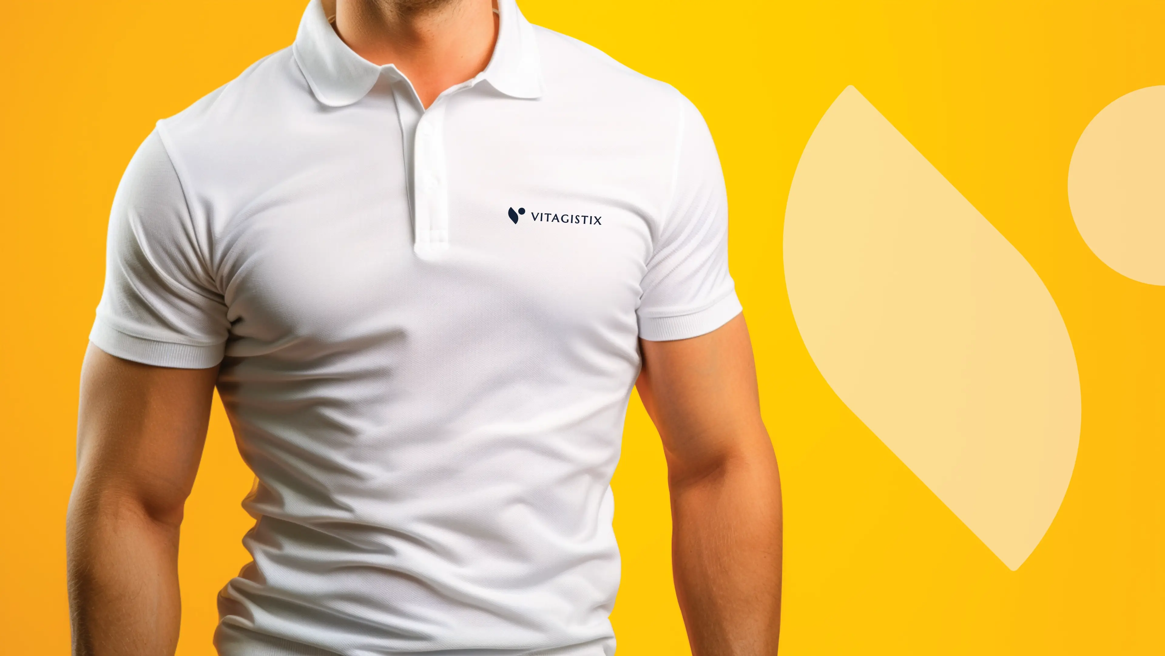
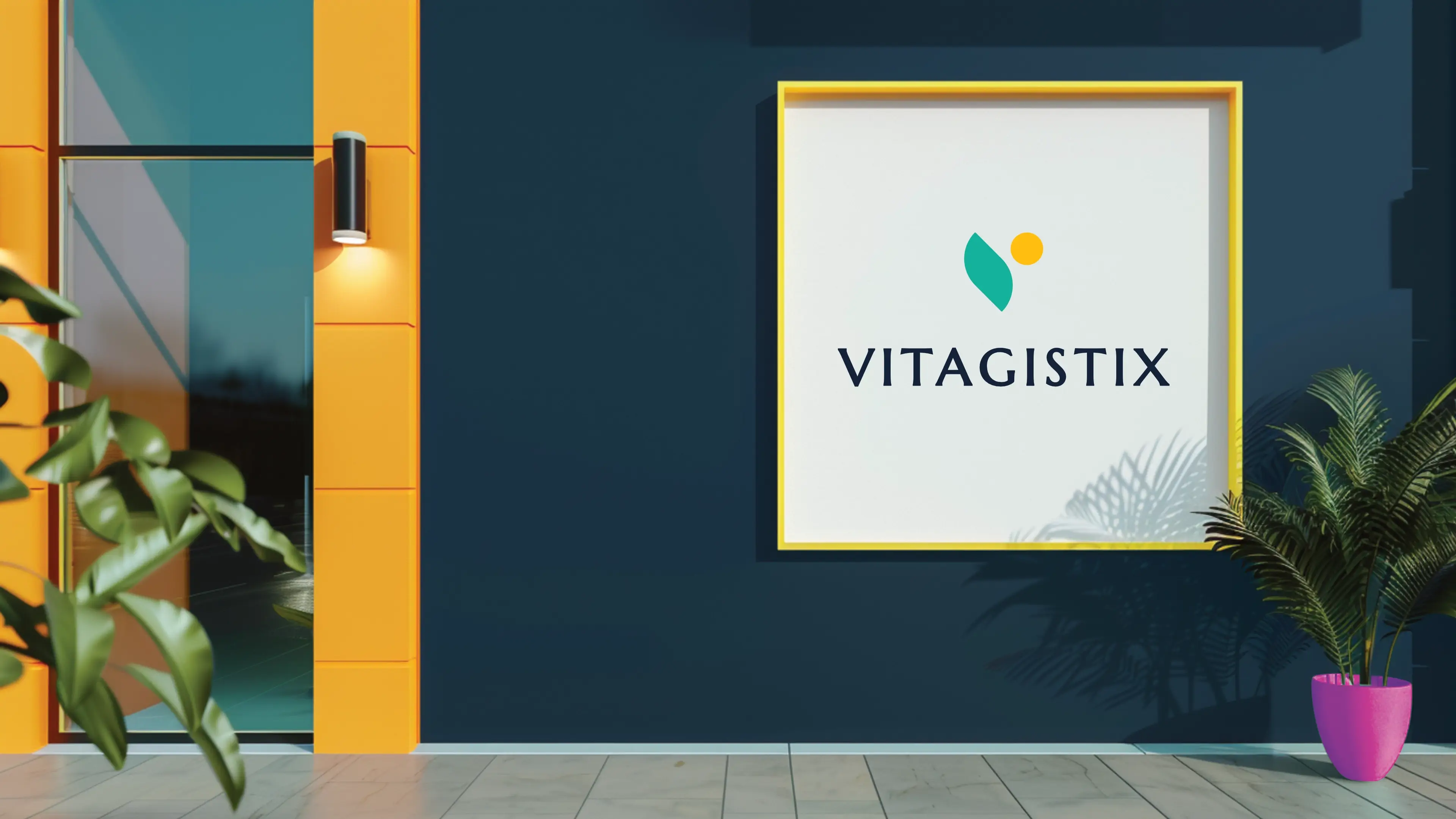
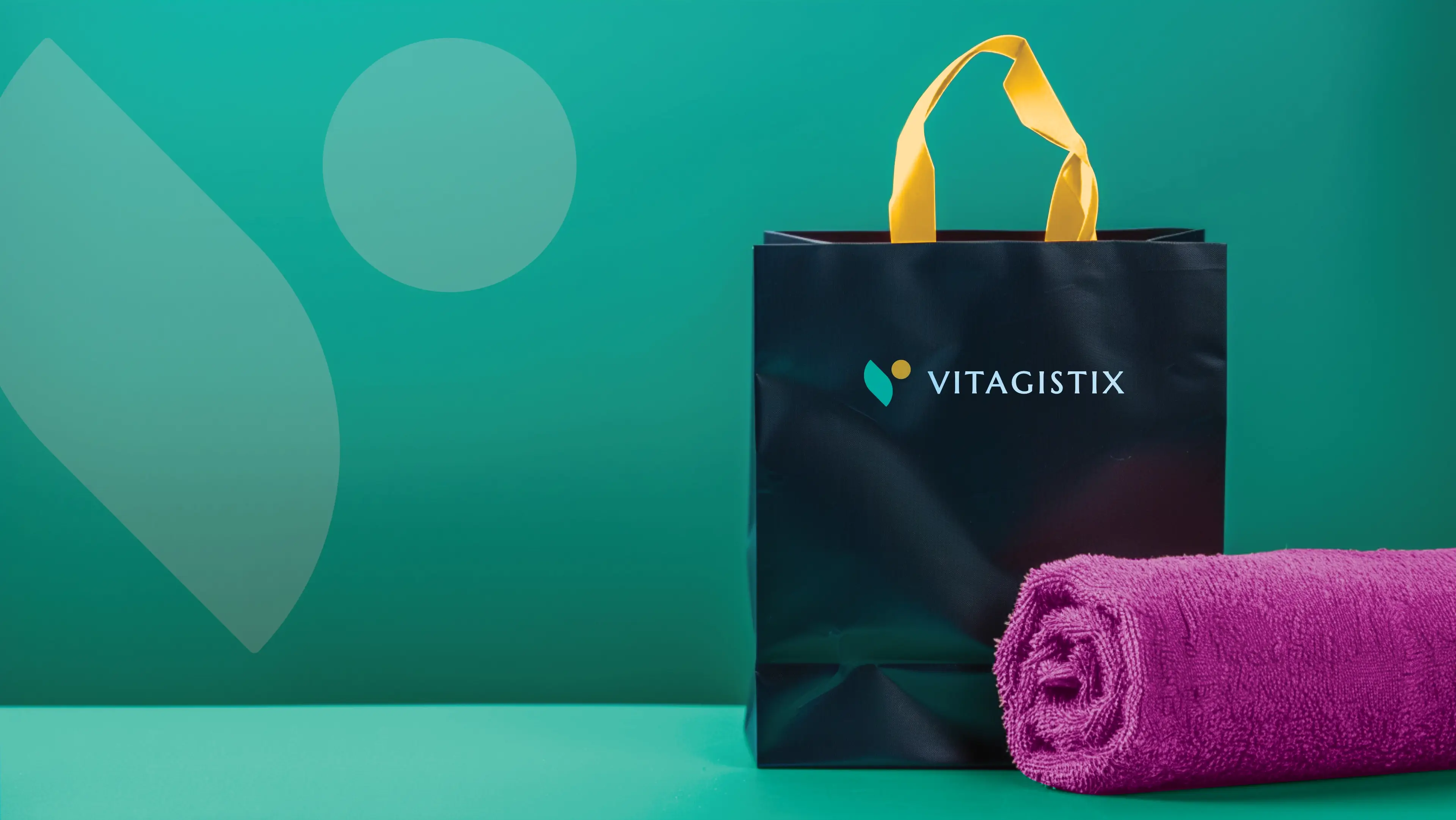
Vitagistix wants a new logo as a New Business. It should create the impression of a brand that's Easy, Comfortable, Fast, and Simple. Their audience should say: It works, they had everything I needed, and I feel so much better, I can feel the difference. They want to evoke a sense of Relief, Confidence, Gratitude, Happiness, encouragement, and support in their target audience. Their logo will be showcased on their Website, box packaging, thank you stickers, training videos and documents, store signage, golf shirts, towels, bags, and specific pens. They have requested that the logo include no medical crosses and should not be interpreted as vegan. The logo may use the colour green and concepts of movement, duality and newness.
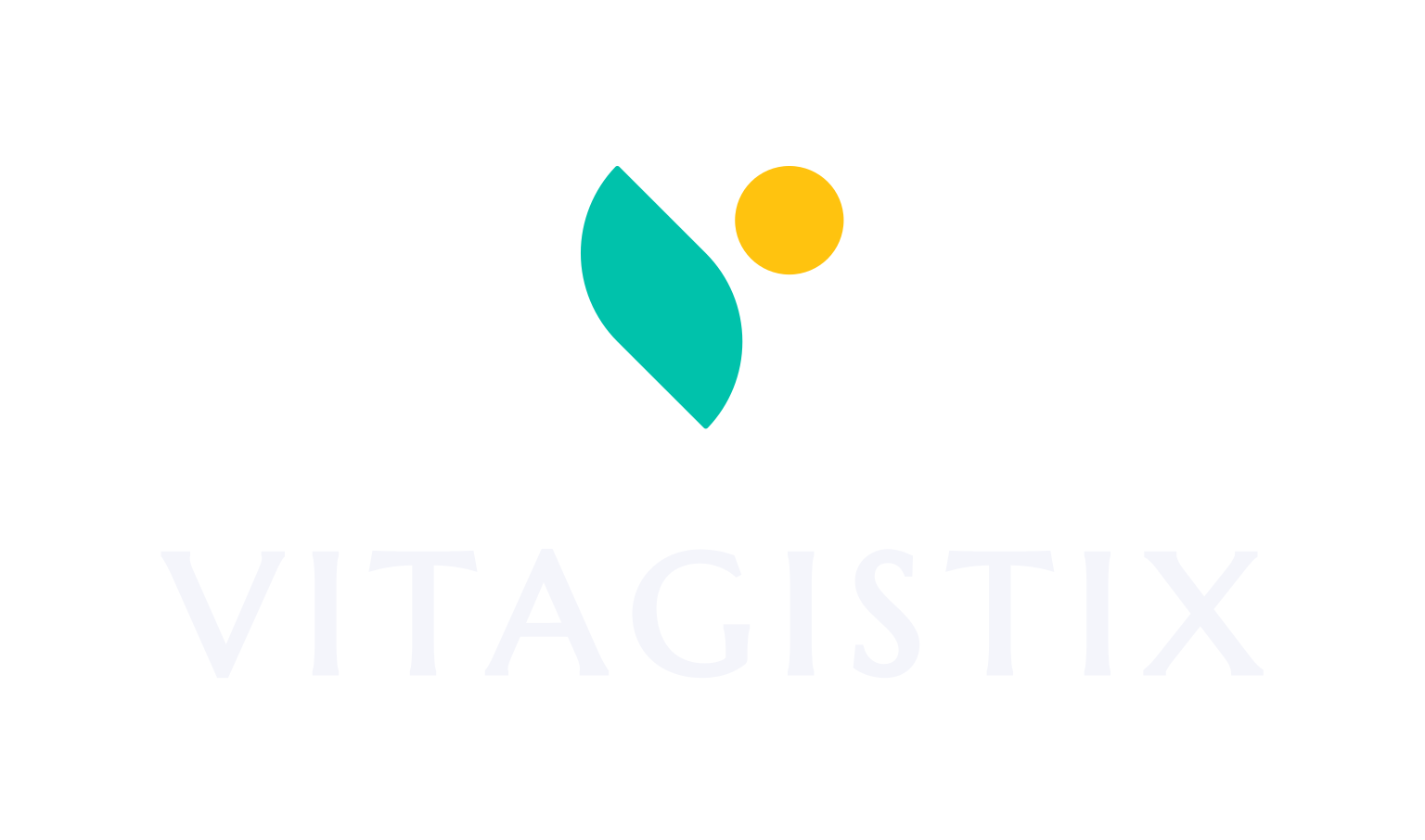

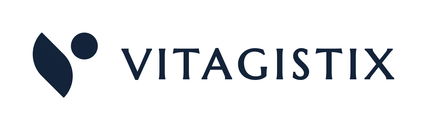
The logo features an abstract letter V that consists of a leaf and a circle. The leaf symbolizes vitality while the circle symbolizes completion. Besides for the letter V, the combination of the 2 elements also looks like a person leaping forward which is a common theme in vitality imagery.
The logo functions perfectly well in a vertical or stacked layout. This means that the logo will work well on vertical applications like smartphones, tablets and roll-up banners.
The logo is designed to be functional in a horizontal layout. This allows you to use the logo on horizontal applications like building signage, websites and stationery.

This palette strikes a sophisticated balance between deep, editorial gravity and high-voltage digital energy. The combination of ultra-dark and ultra-light neutrals provides a premium, structured canvas, while the trio of vivid, jewel-toned accents gives the palette a futuristic, electric edge.
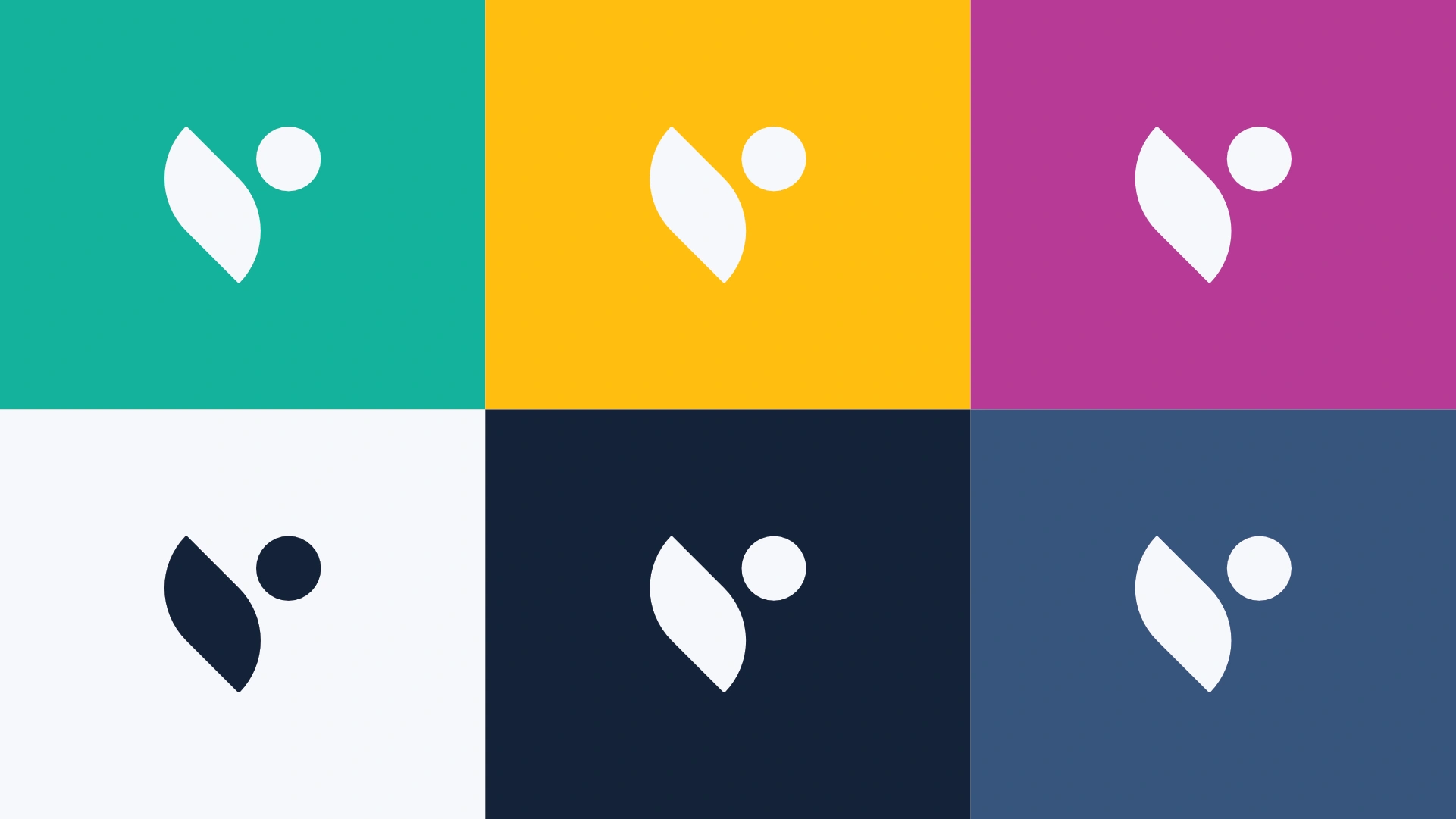
Renewal Teal symbolises balance, calm, and creativity. It communicates trust and innovation while maintaining a refreshing energy.
Energetic Yellow radiates warmth and positivity. It conveys enthusiasm, success, and a sense of approachability.
Vibrant Magenta represents boldness, creativity, and passion. It appeals to those seeking inspiration and confidence.
Calm Sky evokes purity, simplicity, and clarity. It serves as a clean foundation to support other colours.
Sophisticated Navy conveys strength, professionalism, and stability. It creates depth and a sense of security.
Stone Grey communicates professionalism, neutrality, and dependability. It serves as an unobtrusive choice that enhances readability while supporting the vibrant character of the rest of the palette. It evokes calm and balance, making it an ideal backdrop for content-heavy areas.
The primary colour version of the logo functions perfectly in a vertical layout, designed for maximum brand impact on light and dark digital surfaces.
For wider applications like navigation bars, signage, and stationery, the horizontal colour variations ensure the brand remains legible and professional.
This specific pairing represents a striking intersection of classical antiquity and modern, tech-forward geometry. By combining a flared, Roman-inspired serif with a crisp, low-contrast sans-serif, you achieve a sophisticated balance that feels both authoritative and highly functional.

Marcellus
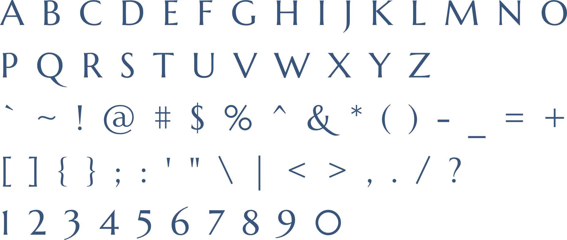
Marcellus-Regular is a serif font that brings sophistication, trust, readability, and timeless appeal to Vitagistix's brand identity. It effectively supports the brand's goals of conveying luxury, professionalism, and a user-friendly experience, making it a relevant choice for the company's visual communications.
Red Hat Display
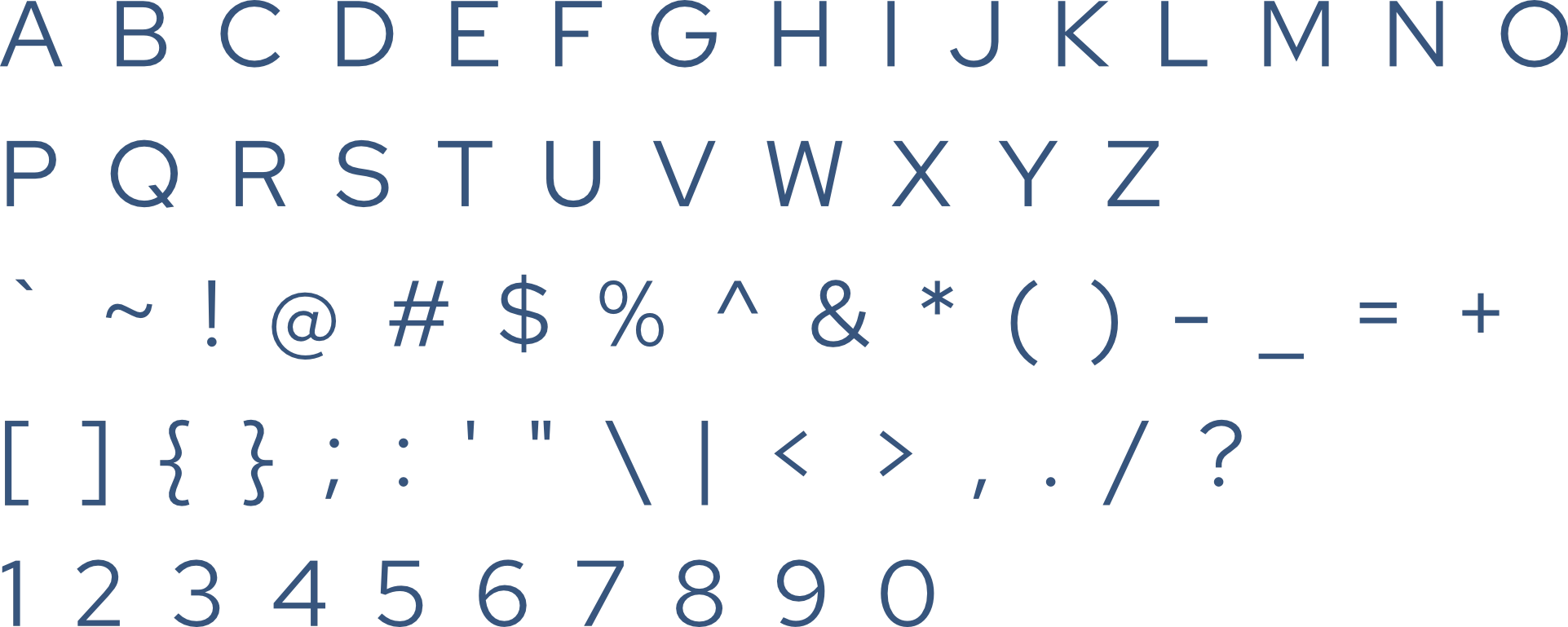
Red Hat Display-Regular, as a secondary typeface for Vitagistix offers a modern and versatile complement to the primary serif font, Marcellus-Regular. This sans-serif typeface is characterized by clean lines and a contemporary aesthetic, making it an excellent choice for various brand applications.
The logo is designed to fit inside a profile image that can typically be uploaded to social media platforms like Facebook, LinkedIn, and Instagram.

A favicon is a small icon that represents your website in browser tabs, bookmarks, and address bars, ensuring brand recognition at a glance.




Contact us Today To
The best way to get things done is simply to begin. Reach out to us at Fletch in Pretoria, South Africa today.
