
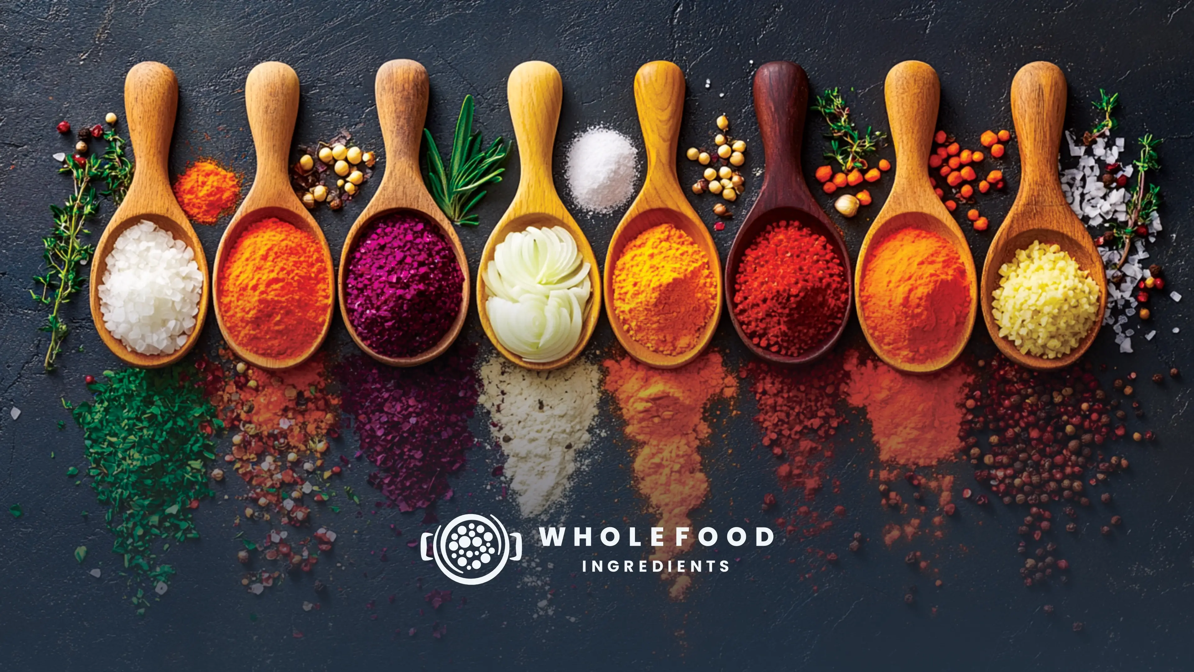
Wholefood Ingredients is a Food Processing company that highly values providing healthy, flavourful food on a large scale. They are currently in the process of rebranding. They specialize in selling dried fruit and vegetable concentrates that keep their nutritional value, flavour, and colour. But what their customers really buy is an improved food experience. The name Wholefood Ingredients comes from the idea that it's the closest thing you'll get to real foods since their process discards as little as possible in order to keep as much of the nutritional value as possible. They currently don't have a slogan, but are open to ideas.
Wholefood Ingredients targets B2b customers, Spice companies, flavour and fragrance specialists, new product developers, typically both men and women in their 40+'s, who are generally from the Upper-income class. The brand should create the impression of being professional, easy and straight forward but functional. They also want to be perceived as clinical but authentic and want to evoke a sense of being effective, sustainable, safe, consistent, and predictable to their target audience.
Their goal is to redefine large-scale food processing by delivering an elevated, uncompromised food experience. As we embark on this rebrand, we are committed to bridging the gap between mass production and pure nature by supplying dried fruit and vegetable concentrates that retain their peak nutritional value, vibrant color, and rich flavor. By engineering a process that discards as little as possible, we aim to provide our partners with the closest thing to raw, real food, ensuring that efficiency never comes at the expense of integrity.
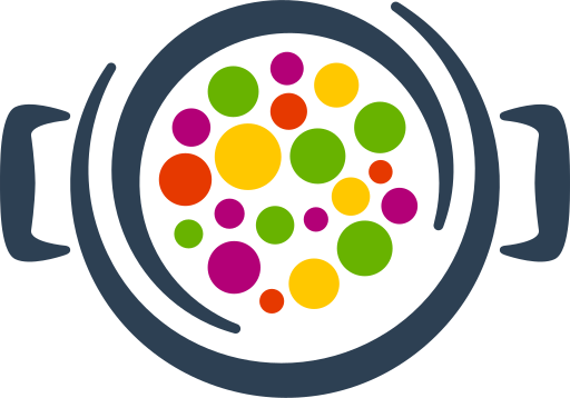
This logo was designed to create the impression that the brand's goal is to help the customer make food more flavourful and colourful. It was also designed to look like a premium product. The design itself is a play on the heaps of flavour concentrate from from a top perspective and sliced veggies (whole food) in a pot, from the perspective of the chef. The two circles reference the process used and are a play on "whole" or completion. Very bright colours were used to draw attention and emphasise flavour and colour.
The logo functions perfectly well in a vertical or stacked layout. This means that the logo will work well on vertical applications like smartphones, tablets and roll-up banners.
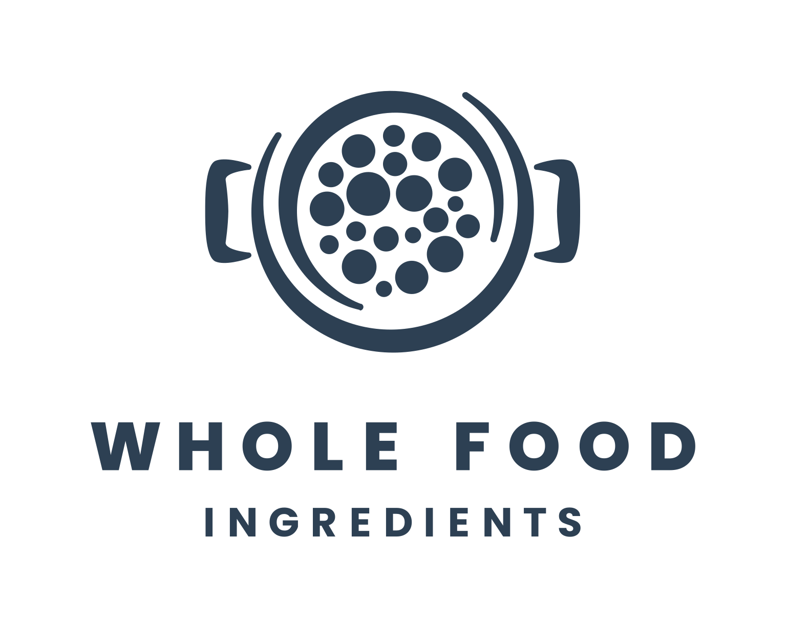
The logo is designed to be functional in a horizontal layout. This allows you to use the logo on horizontal applications like building signage, websites and stationery.

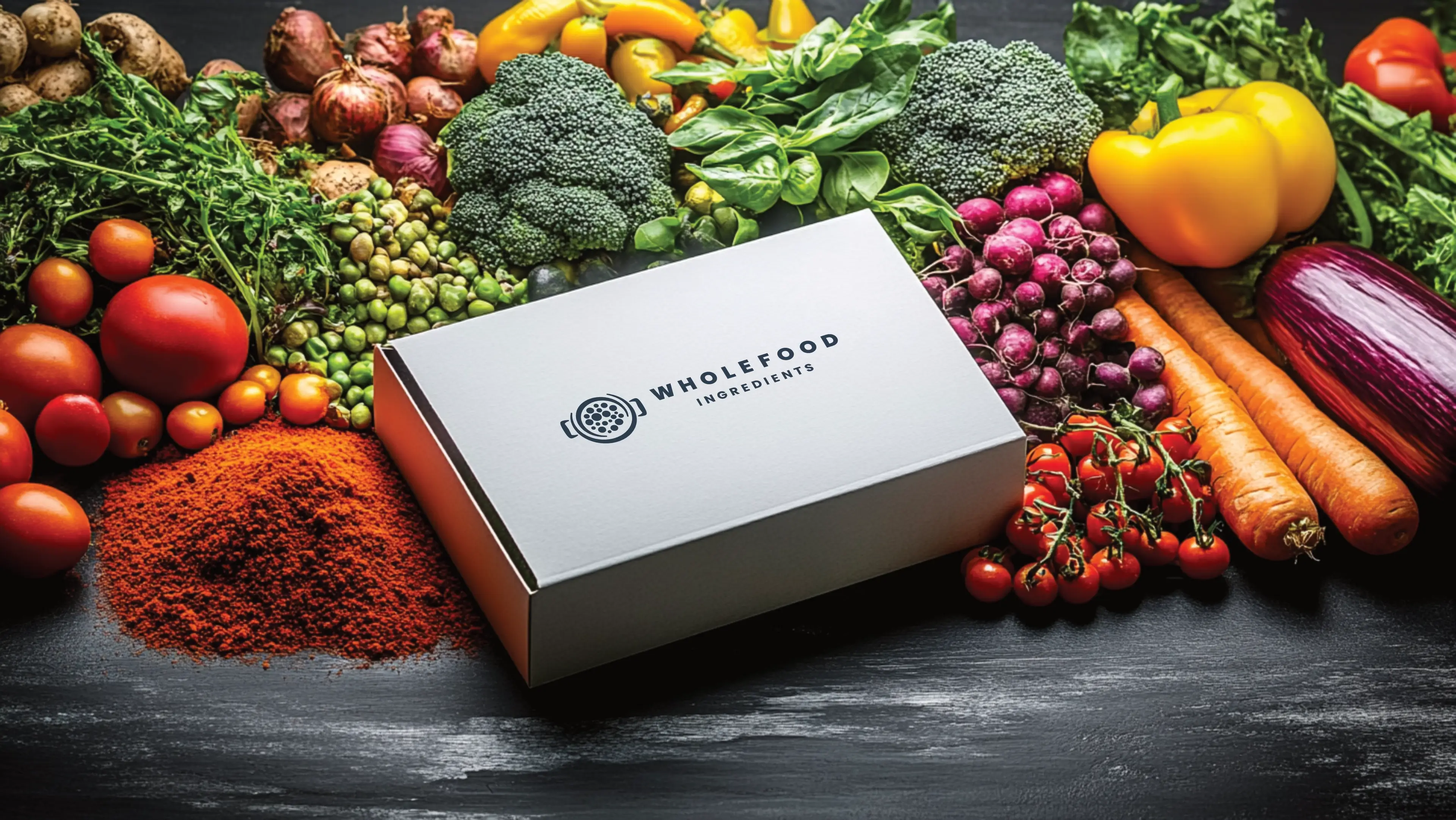
This palette combines bold and vibrant hues with sophisticated neutrals, creating a powerful balance of energy and professionalism. The striking primary and secondary colours offer an engaging and energetic feel, while the light and dark tones ground the palette, ensuring flexibility across various applications. It is well-suited for a brand that wants to appear innovative, confident, and approachable while maintaining depth and stability.

Fresh Green is associated with growth, vitality, and innovation. It conveys freshness and energy, appealing to those who value progress and optimism.
Vibrant Orange embodies enthusiasm, energy, and passion. It's a colour of action and creativity, grabbing attention and inspiring excitement.
Deep Magenta represents boldness, imagination, and luxury. It is often seen as a creative and empowering colour, ideal for innovative and aspirational brands.
Soft Sky symbolises clarity, openness, and purity. It provides a crisp, clean base that supports and highlights other colours in the palette.
Slate Navy exudes professionalism, strength, and depth. It serves as a dependable and elegant anchor for the palette, ideal for text or background use.
Graphite Grey signifies neutrality, professionalism, and dependability. Its subdued tone makes it an unobtrusive yet effective choice for body text, ensuring content is easily readable without detracting from the palette's vibrant primary, secondary, and tertiary colours. This grey also conveys a modern and sleek look, reinforcing the overall aesthetic harmony of the palette.
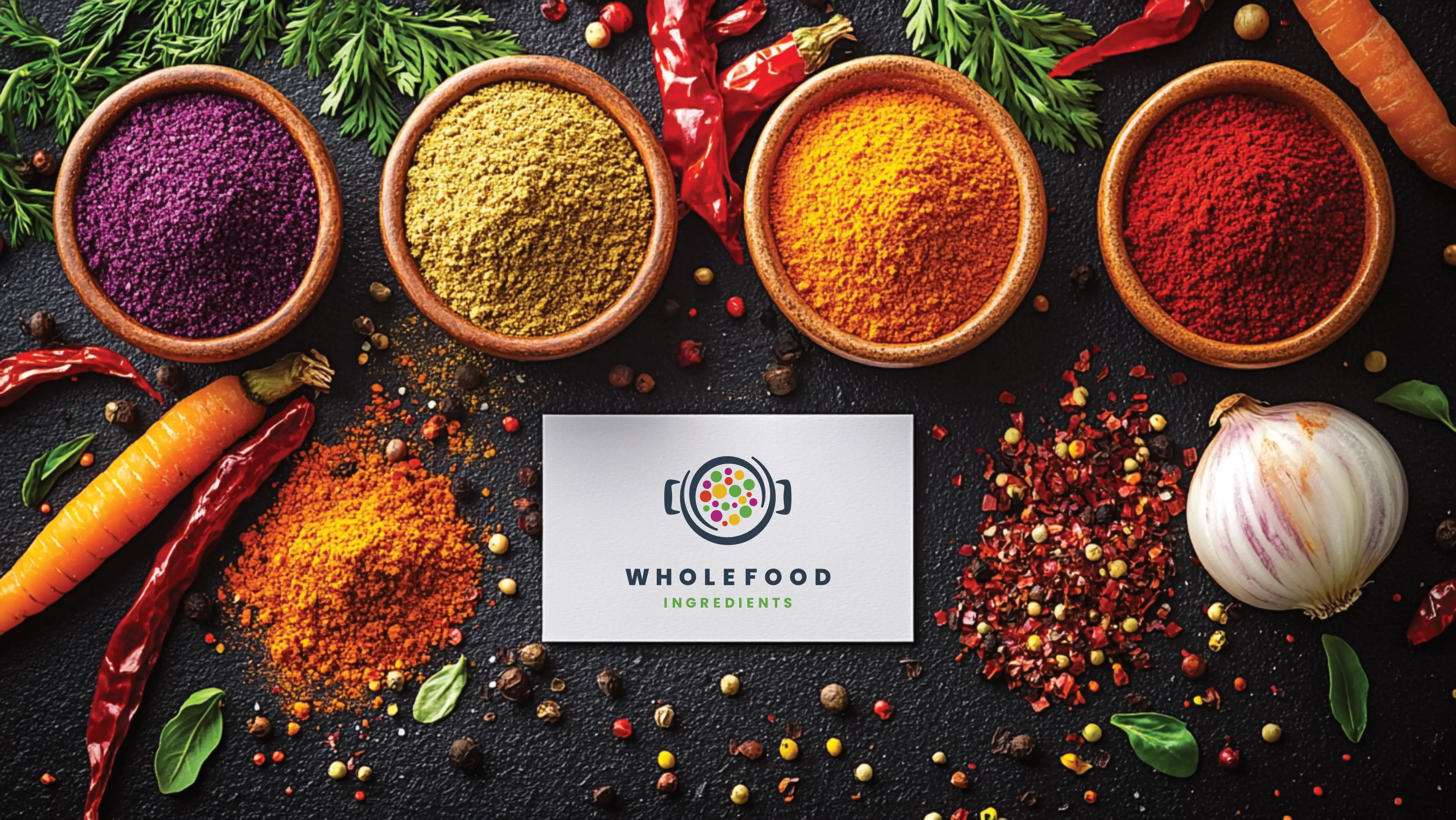
The primary colour version of the logo functions perfectly in a vertical layout, designed for maximum brand impact on light and dark digital surfaces.
For wider applications like navigation bars, signage, and stationery, the horizontal colour variations ensure the brand remains legible and professional.
Poppins is a geometric powerhouse that brings a clean, friendly, and ultra-modern aesthetic to digital layouts.

Poppins
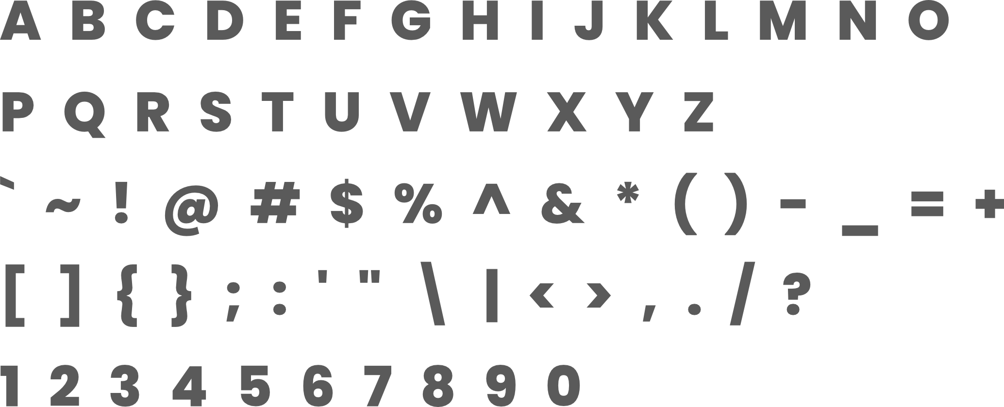
Poppins Extra Bold is a strong, impactful version of the Prompt typeface, designed to stand out and capture attention. Its bold weight makes it ideal for headings or key messages that need emphasis. The rounded forms and geometric style give it a modern and approachable look, while its extra bold weight ensures clarity and legibility even at smaller sizes. This makes it a perfect fit for a professional brand like Wholefood Ingredients that needs to project authority, reliability, and strength.
Poppins
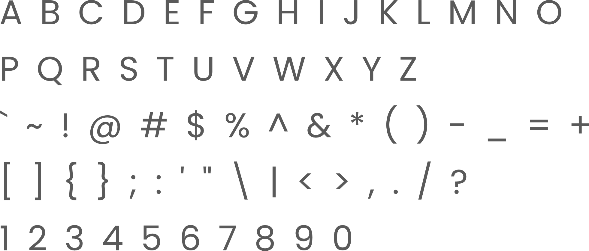
Poppins Regular offers a clean, smooth, and highly readable design, making it well-suited for body text. Its balanced geometry ensures a contemporary feel without compromising on legibility, which is crucial for long blocks of text. The typeface's neutral yet friendly appearance allows it to blend seamlessly with the extra-bold version while maintaining a sense of professionalism and approachability.
The logo is designed to fit inside a profile image that can typically be uploaded to social media platforms like Facebook, LinkedIn, and Instagram.
A favicon is a small icon that represents your website in browser tabs, bookmarks, and address bars, ensuring brand recognition at a glance.




Contact us Today To
The best way to get things done is simply to begin. Reach out to us at Fletch in Pretoria, South Africa today.
