
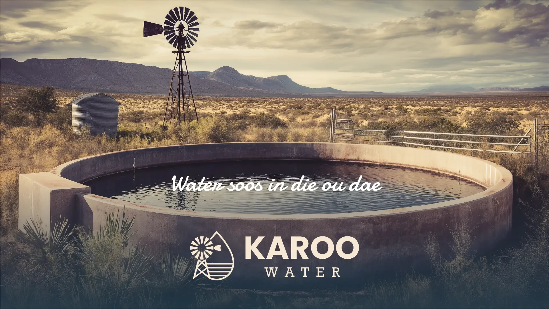
Karoo Water is a newly established brand that entered the market to provide clean, bottled municipal water. The name itself was carefully chosen to resonate with both English and Afrikaans speakers, reflecting the owner’s deep affection for the unique Karoo region and incorporating that distinct character into the brand. This venture emerged from a clear demand in the market for readily available clean water, seizing an opportunity presented by a slow supply chain. Karoo Water’s core offering is pure, clean, and healthy water, which is consistently purified and laboratory tested to ensure clients receive the health benefits they are truly seeking. What makes this brand stand out from its competitors is its distinctive Afrikaans character and commitment to service. Positioned towards the higher end of the market with an aspiration to open a new branch every year, Karoo Water maintains a playful, rather than formal, brand personality.
Their target audience is an older, more conservative Afrikaans generation, typically aged 40 to 70 and including both men and women. These middle to upper-income individuals are often motivated by concerns about unclean water, the inconvenience of heavy bottles, and dirty bottles. The brand aims to evoke emotions of upliftment, pride, and nostalgia, aspiring to be described by its customers using terms like 'goeie diens' (good service), 'skoon' (clean), and 'vriendelik' (friendly).
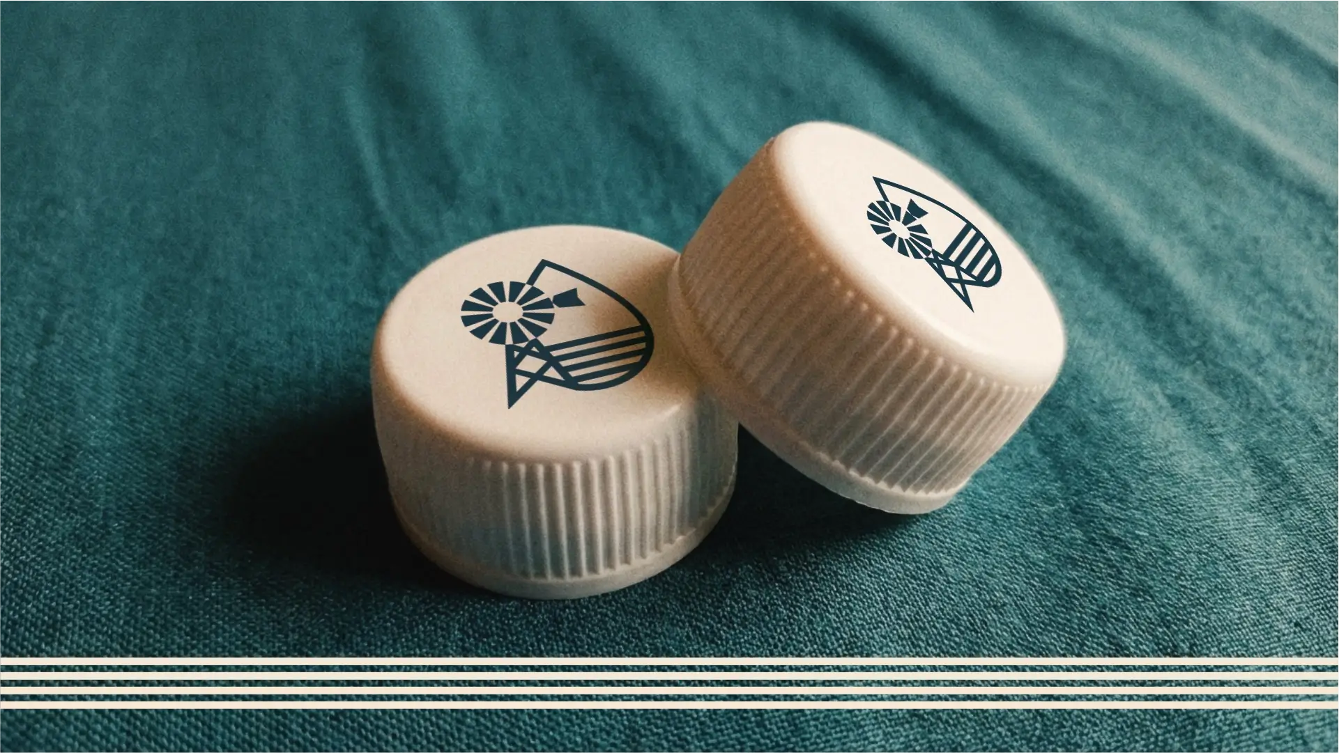
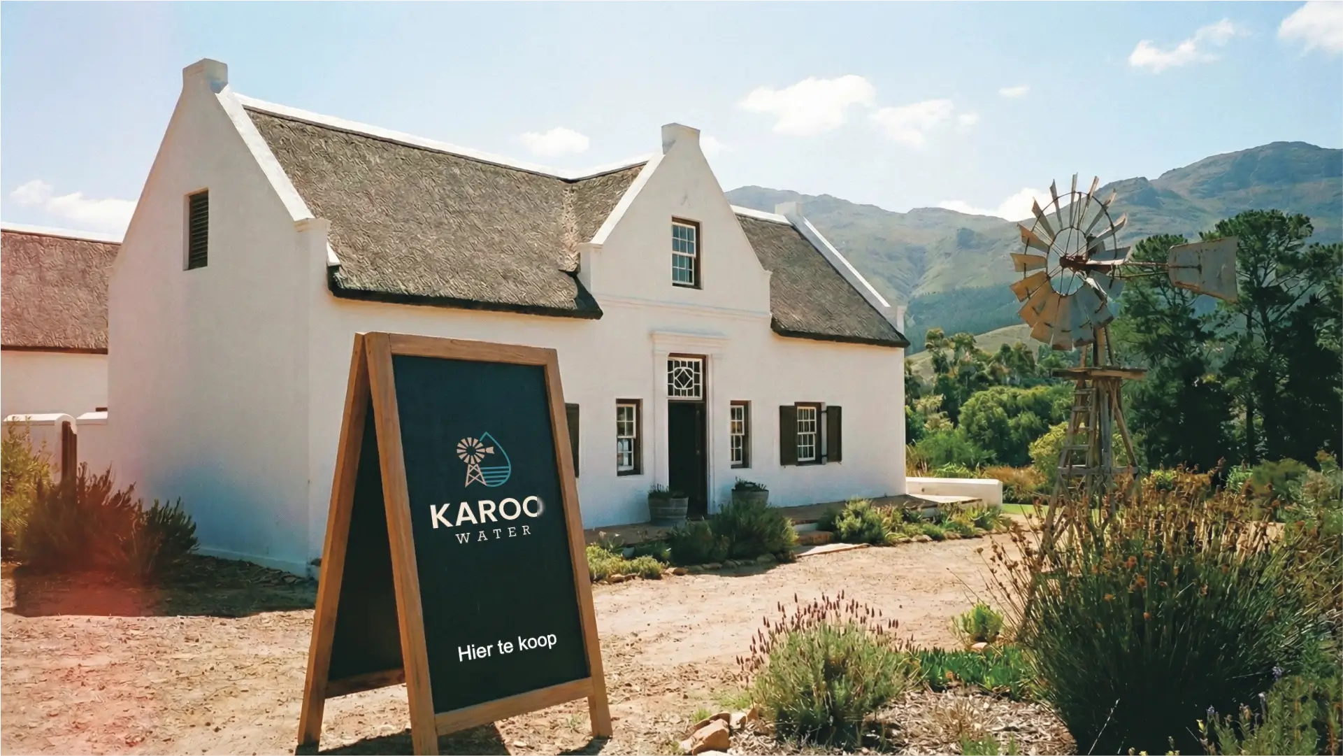
The requirements for the logo design are for a versatile mark that will represent the client across numerous platforms, including their store, product packaging, app, website, apparel, and delivery trucks. The design must visually incorporate either a Windpomp or a mountain, reflecting the brand's identity, with a specific color palette preference for brown, green, and orange. Although a slogan is still being developed, the guiding concept of "water soos in die ou dae" provides insight into the brand's traditional quality. The client emphasizes the logo's importance for establishing clear recognition, differentiating their brand in the market, and serving as a proud emblem of their quality and unique identity.
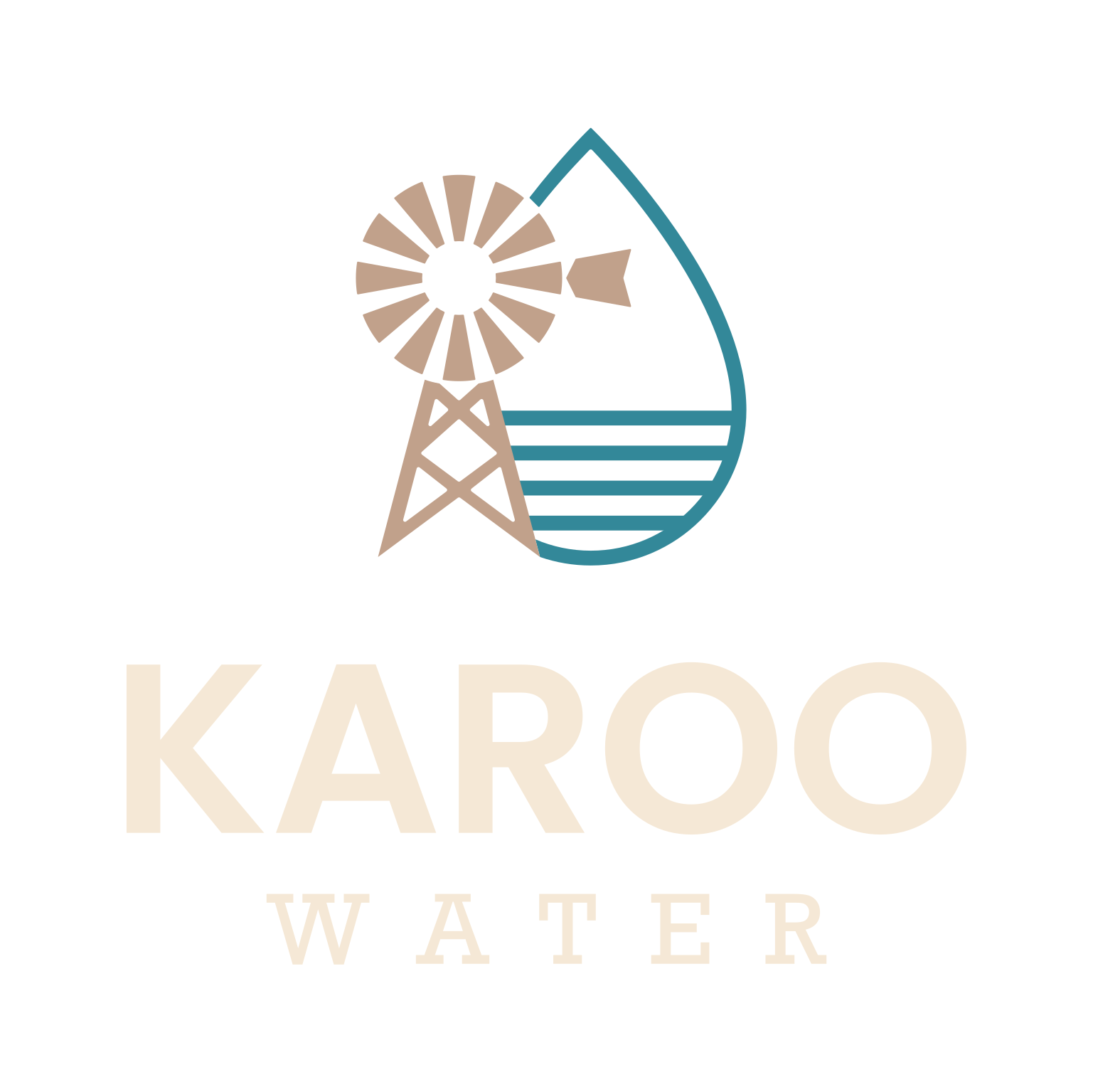
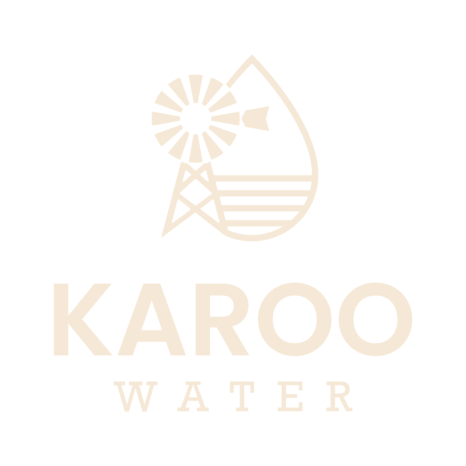
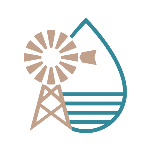
The logo features a wind pump that is displaced next to a water droplet. Inside the droplet are 4 horizontal lines to create a calm but flowing effect. The lines of the droplet are carefully woven into the wind pump to symbolize their connection.
The logo functions perfectly well in a vertical or stacked layout. This means that the logo will work well on vertical applications like smartphones, tablets and roll-up banners.
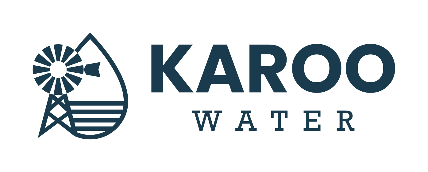
The logo is designed to be functional in a horizontal layout. This allows you to use the logo on horizontal applications like building signage, websites and stationery.
The colour palette features a range of blues and greens, directly referencing clean water and the natural beauty of the Karoo region. The primary Karoo Clear blue evokes freshness and trust, while the deeper Karoo Fynbos teal and vibrant Karoo Oasis green signify purity and natural vitality. The Karoo Night dark blue provides a sophisticated anchor, reinforcing the brand's premium positioning and reliability. A soft Karoo Earth cream adds warmth and authenticity, reminiscent of the Karoo landscape, and the Karoo Horizon blue-grey for text ensures readability with a subtle, timeless elegance. This combination effectively balances the brand's 'pure, clean, and healthy water' message with its 'playful' yet 'higher end' and 'conservative' target audience, evoking emotions of upliftment, pride, and nostalgia through its connection to the unique Karoo character.
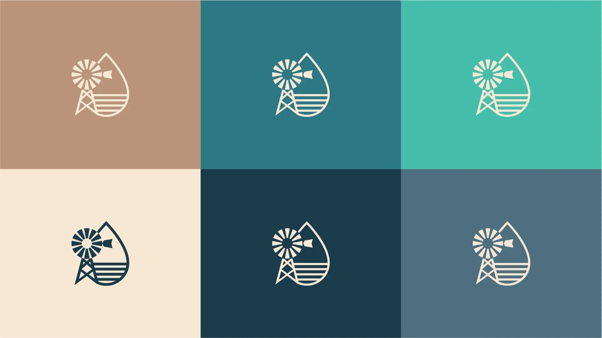
Blue represents cleanliness, freshness, reliability, and trust – all essential attributes for a water brand. It evokes feelings of calm and serenity, directly linking to the purity of Karoo Water. It is also associated with professionalism and stability, appealing to the target audience's desire for a dependable product and contributing to a sense of upliftment and pride.
Teal blends the calming attributes of blue with the renewal and growth associated with green. It suggests sophistication, clarity, and freshness, reflecting the brand's commitment to pure water. It evokes natural elements and depth, aligning with the Karoo's unique environment and the owner's deep affection for the region, fostering feelings of nostalgia and quality.
This refreshing green-blue reinforces the themes of health, nature, and invigoration. It evokes feelings of harmony and balance, suggesting that Karoo Water is a natural and wholesome choice. The 'oasis' feel is particularly fitting for a water brand associated with the often arid Karoo region, symbolizing a source of life, vitality, and upliftment.
This warm, soft off-white or cream colour provides a sense of comfort, authenticity, and naturalness. It serves as an excellent background, allowing the blues and greens to pop. It subtly references the natural earth tones of the Karoo landscape, grounding the brand in its regional identity and evoking feelings of nostalgia, warmth, and friendliness that appeal to the target audience.
This deep, dark blue-grey exudes a sense of strength, reliability, and sophistication. It provides a strong anchor for the palette, signifying the brand's premium positioning and the deep trust clients can place in its quality. It can also evoke the expansive, clear Karoo night sky, adding a subtle layer of regional connection and natural grandeur, contributing to feelings of pride and security.
This moderate blue-grey offers excellent readability without being harsh. It conveys intelligence, composure, and timelessness. Its muted quality allows it to blend seamlessly with the other colours, providing a sophisticated backdrop for information. It also subtly hints at the vast, often muted blue-grey skies of the Karoo, reinforcing the regional connection and fostering a sense of pride and clean aesthetics.
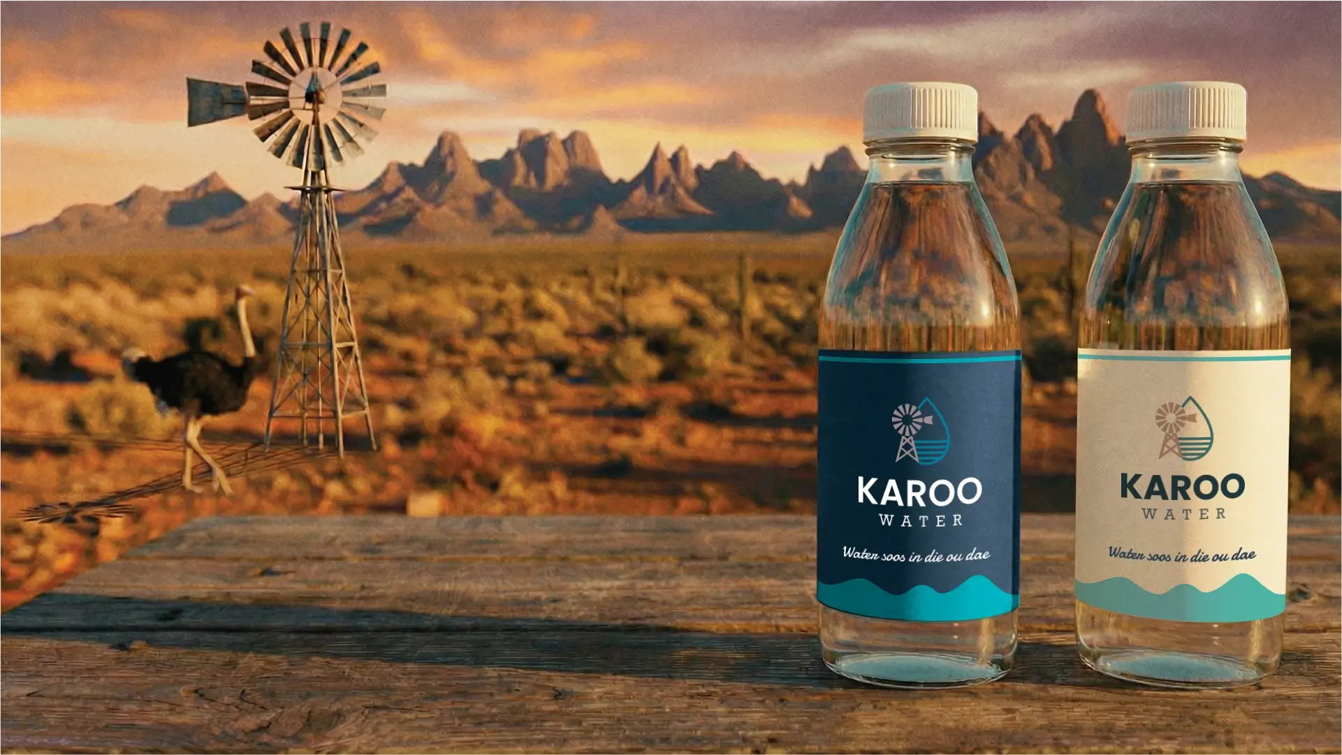
The primary colour version of the logo functions perfectly in a vertical layout, designed for maximum brand impact on light and dark digital surfaces.
For wider applications like navigation bars, signage, and stationery, the horizontal colour variations ensure the brand remains legible and professional.
The strategic pairing of modern Poppins Bold for headings and classic Rockwell for body text establishes a balanced and distinctive typography system for Karoo Water. This combination effectively communicates the brand's playful yet clean and reliable character, resonating with an audience seeking quality service, upliftment, and a touch of nostalgic authenticity. Together, they ensure clarity, warmth, and reinforce the unique Karoo identity.

Poppins

Poppins Bold, a contemporary geometric sans-serif, conveys a clean and approachable aesthetic. Its clear lines and friendly proportions give Karoo Water a modern yet playful confidence, aligning with the brand's 'skoon' and 'vriendelik' aspirations. This typeface is highly effective for headings, ensuring key messages are delivered with strong impact and excellent legibility, while maintaining the brand's desired upliftment and distinctive character.
Rockwell

Rockwell, a robust slab-serif typeface, embodies a sense of strength and classic reliability. It lends Karoo Water a dependable and authentic feel, subtly evoking the enduring character of the Karoo region and resonating with the target audience's desire for pride and nostalgia. This typeface excels for subheadings and paragraphs, offering excellent readability and reinforcing the brand's commitment to quality and 'goeie diens' with its sturdy and trustworthy appearance.
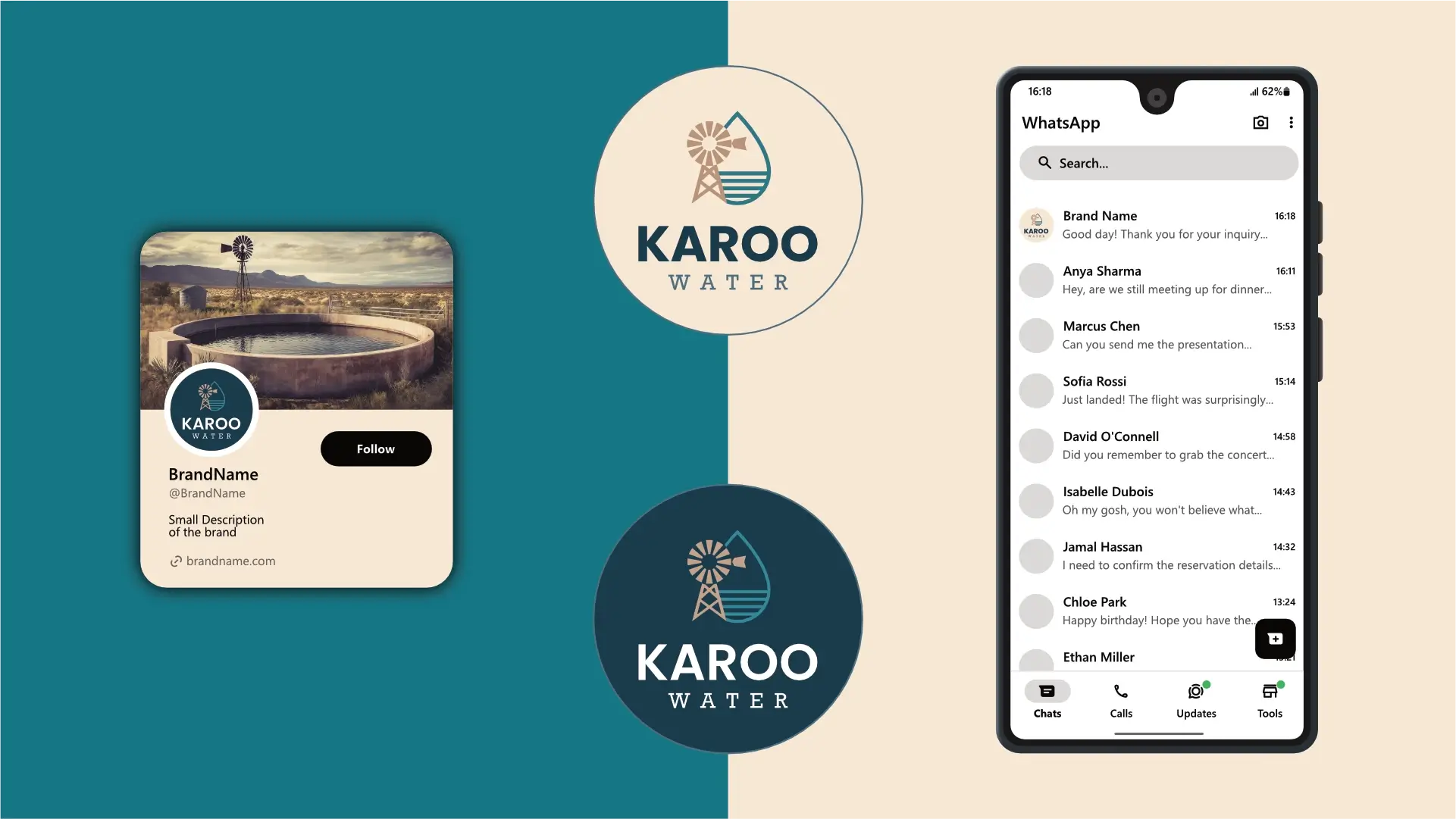
The logo is designed to fit inside a profile image that can typically be uploaded to social media platforms like Facebook, LinkedIn, and Instagram.

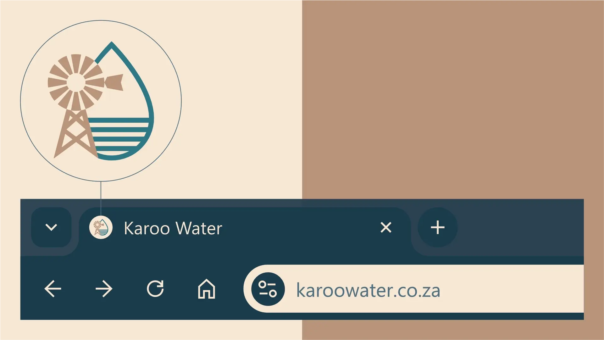
A favicon is a small icon that represents your website in browser tabs, bookmarks, and address bars, ensuring brand recognition at a glance.


Contact us Today To
The best way to get things done is simply to begin. Reach out to us at Fletch in Pretoria, South Africa today.
