

SunUp College is a newly established educational institution dedicated to providing an exceptional, high-quality education. The brand’s name, "SunUp," encapsulates the idea of a new day and fresh opportunities for learning and personal growth. This college passionately invests in the minds of the future, offering individualized attention through an interactive digital platform that adapts to each student's learning style. They aim to provide a higher quality education by ensuring low student numbers in both their digital classrooms and physical classes, prioritizing interactivity and accessibility. What truly differentiates SunUp College from its competitors is this unique blend of both physical and digital learning environments, all while maintaining an emphasis on personalized engagement. Positioned as a high-end and formal brand, SunUp College envisions expanding significantly within the next five years, bringing more teachers and classes to communities throughout South Africa.
Their target audience is upper-income parents, both male and female, who are deeply committed to ensuring a bright future for their children, typically aged 13 to 18. They are driven by the specific pain point of their children underperforming due to a perceived lack of individual attention, leading them to seek out solutions. These discerning parents seek a brand that they can describe as working, results-oriented, and of high quality, ultimately aiming to feel pride, trust, and comfort in the choices they make for their children's development and success.
The requirements for the logo design are to create a singular, impactful logo that will establish a memorable brand identity for our client. This central visual element will be extensively utilized across various platforms, including their website, social media channels, and all branding stationery. A specific creative constraint for this project is the exclusion of the color yellow from the design palette. We have also received permission from the client to proudly showcase the resulting logo on our company website and social media platforms once completed.


The logo features a sunrise with 3 horizontal lines below it and one line above it. The ends of these shapes are cut off on the left and right. This traditional approach makes the logo easily recognisable amongst school logos.
The logo functions perfectly well in a vertical or stacked layout. This means that the logo will work well on vertical applications like smartphones, tablets and roll-up banners.


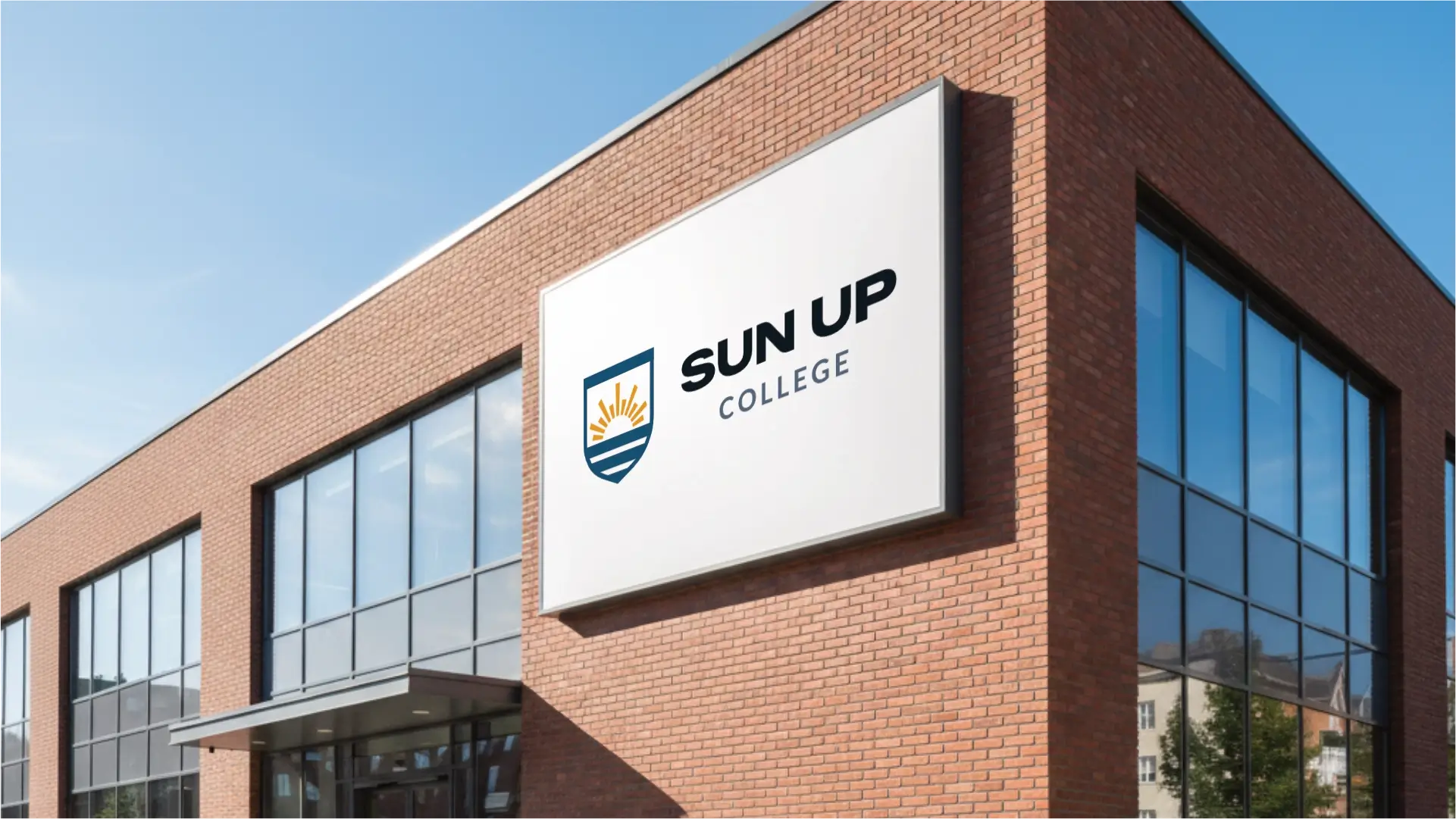
The logo is designed to be functional in a horizontal layout. This allows you to use the logo on horizontal applications like building signage, websites and stationery.



This palette is ideal for SunUp College. The golden orange reflects energy and premium quality, aligning directly with the brand name. Deep teals and blues establish the trust and stability discerning parents seek, while bright teal accents signal digital innovation and adaptability. Together, they project a prestigious, forward-thinking institution that balances a nurturing environment with high-end results.

This vibrant golden-orange conveys enthusiasm, creativity, and determination. It symbolizes new beginnings, optimism, and the 'sunrise' aspect of the brand, while the golden hue hints at quality, prestige, and achievement. It's energizing without being overly aggressive, encouraging aspiration and success.
A deep, rich teal-blue, this colour signifies trust, intelligence, stability, and professionalism. It inspires confidence and security, essential for parents entrusting their children's education to the college. It also suggests depth of knowledge and a serious commitment to learning, aligning with a 'high-quality' and 'formal' brand.
This bright, clear teal represents innovation, clarity, communication, and modernity. It suggests forward-thinking and technological integration, reflecting the interactive digital platform. It's also calming and refreshing, promoting focus and clear thought, suitable for a dynamic learning environment.
A very light, almost white, cool blue-grey, this colour embodies purity, cleanliness, spaciousness, and tranquility. It provides a crisp, professional backdrop, suggesting transparency and order. Psychologically, it creates a sense of openness and calm, ideal for focused learning environments and a high-end aesthetic.
This extremely dark, almost black, blue-grey conveys authority, sophistication, strength, and formality. It establishes a sense of seriousness and importance, reinforcing the brand's high-end positioning. It provides a strong contrast and grounding, representing the profound depth of knowledge and stability offered.
This mid-tone, muted blue-grey for text suggests reliability, intelligence, and impartiality. It's professional and serious but also approachable and readable, offering a softer alternative to pure black. It promotes a sense of calm and collected thought, ensuring information is conveyed with clarity and trustworthiness.
The primary colour version of the logo functions perfectly in a vertical layout, designed for maximum brand impact on light and dark digital surfaces.

For wider applications like navigation bars, signage, and stationery, the horizontal colour variations ensure the brand remains legible and professional.



Zalando Sans Expanded and Lato Regular establish a contemporary, professional, and trustworthy typographic system. This combination effectively communicates SunUp College's commitment to high-quality, personalized education, creating a visual language that is both authoritative and inviting for discerning parents and students.

Zalando Sans Expanded
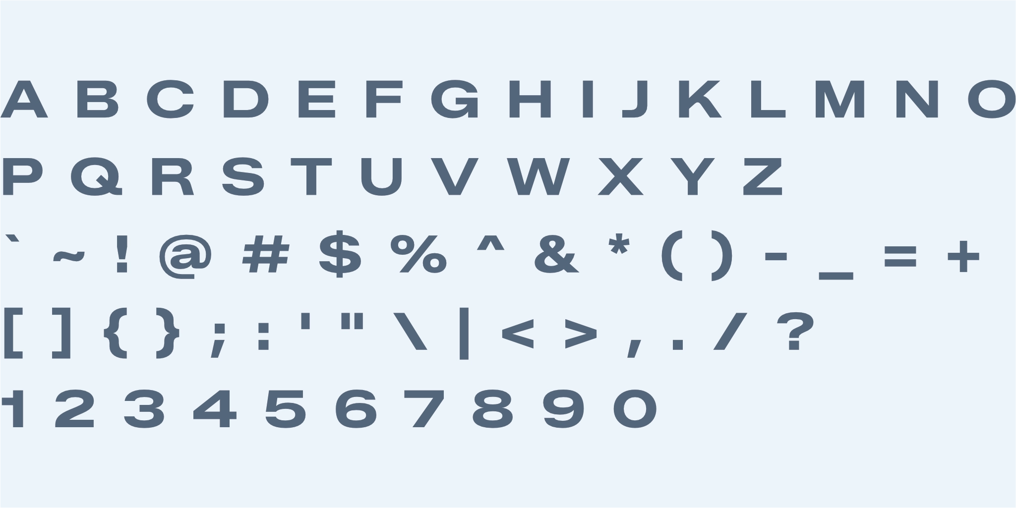
Zalando Sans Expanded presents a modern, clean, and confident sans-serif style with a distinctive expanded width. It projects an impression of authority, innovation, and high quality, perfectly aligning with SunUp College's premium and forward-thinking brand identity. This typeface effectively commands attention as a heading font, ensuring key messages are delivered with impact and a sense of established gravitas.
Lato
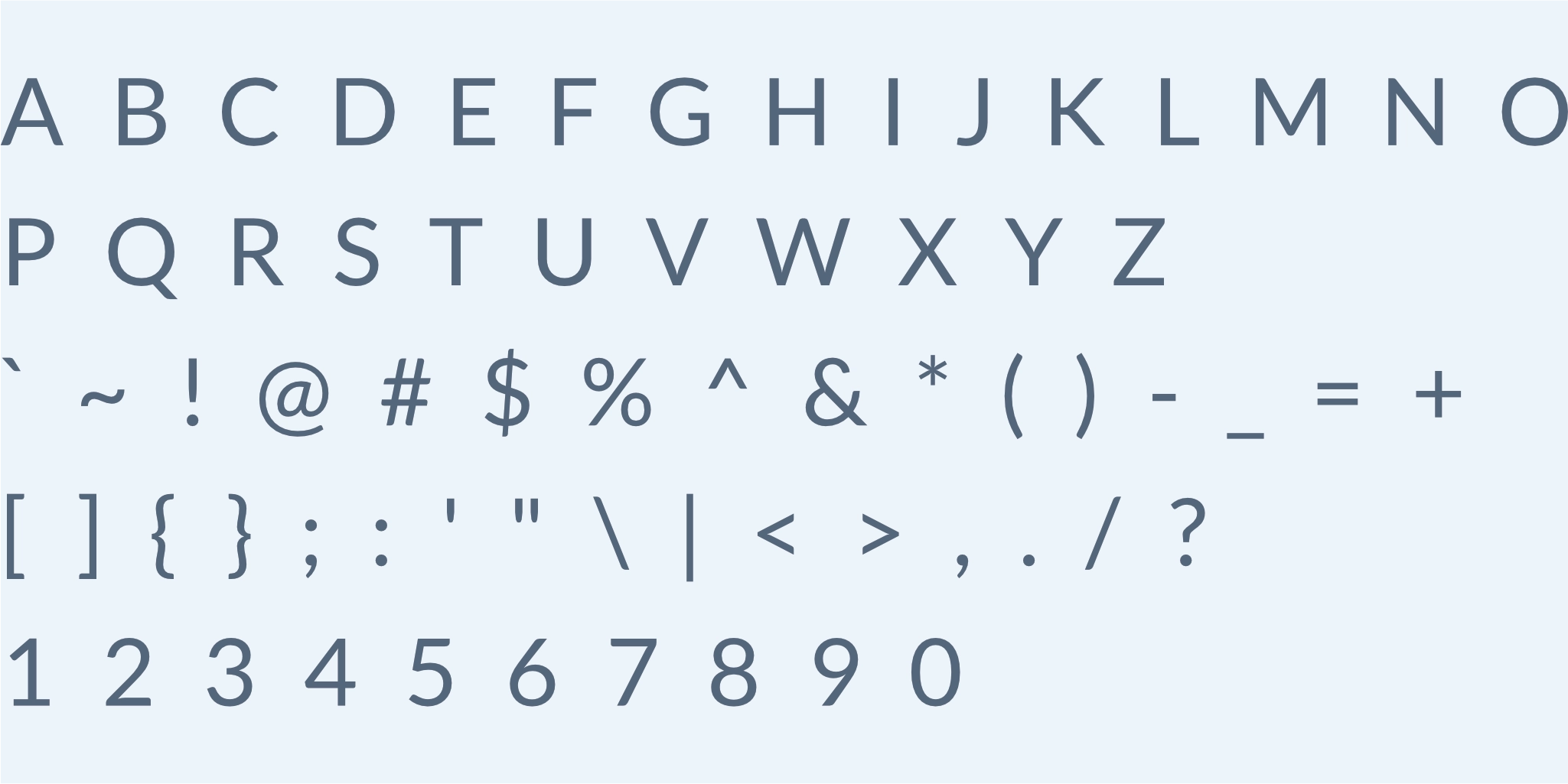
Lato Regular is a warm and highly legible sans-serif typeface, characterized by its clean lines and open, friendly demeanor. It creates an impression of approachability, trustworthiness, and clarity, fostering comfort and understanding for the reader. As a secondary typeface, Lato is exceptionally effective for subheadings and paragraph text, ensuring ease of reading and accessibility for SunUp College’s detailed information and interactive digital content.
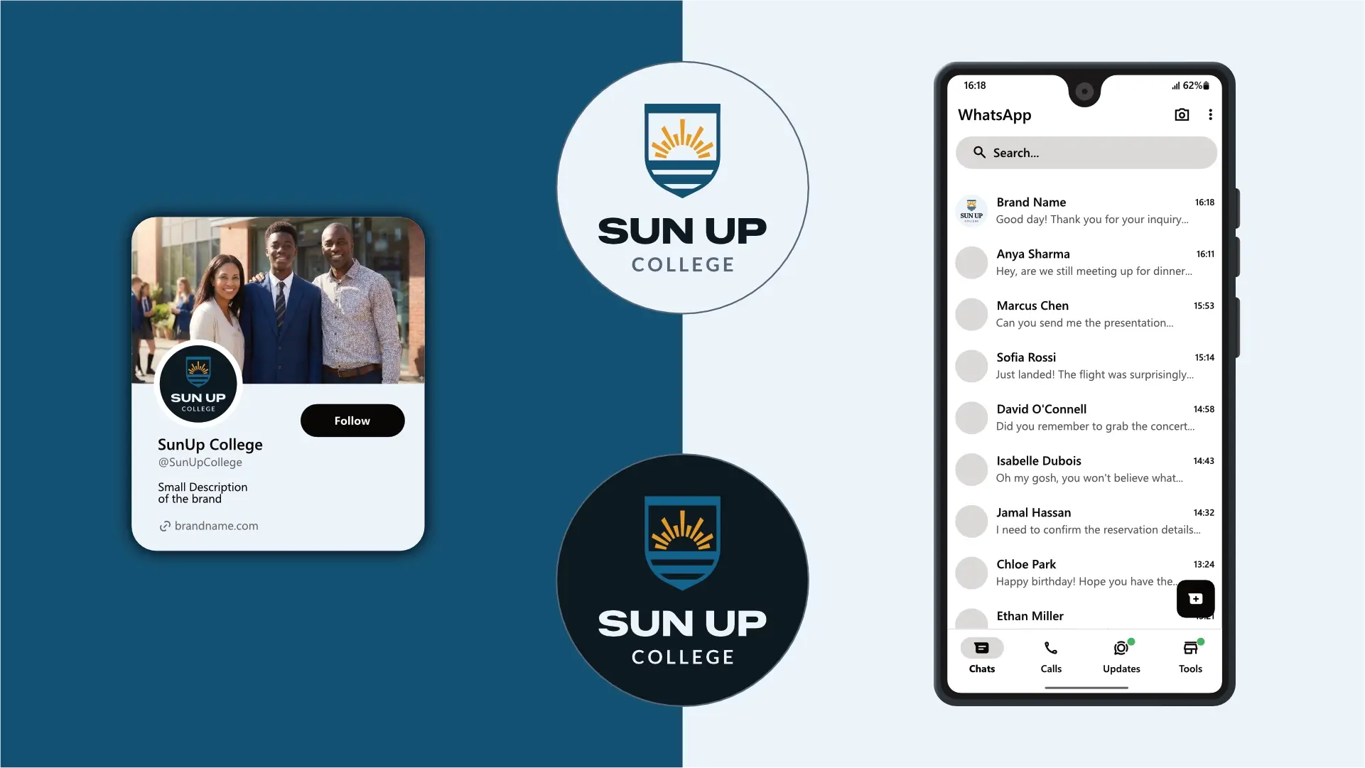
The logo is designed to fit inside a profile image that can typically be uploaded to social media platforms like Facebook, LinkedIn, and Instagram.


A favicon is a small icon that represents your website in browser tabs, bookmarks, and address bars, ensuring brand recognition at a glance.





Contact us Today To
The best way to get things done is simply to begin. Reach out to us at Fletch in Pretoria, South Africa today.
