
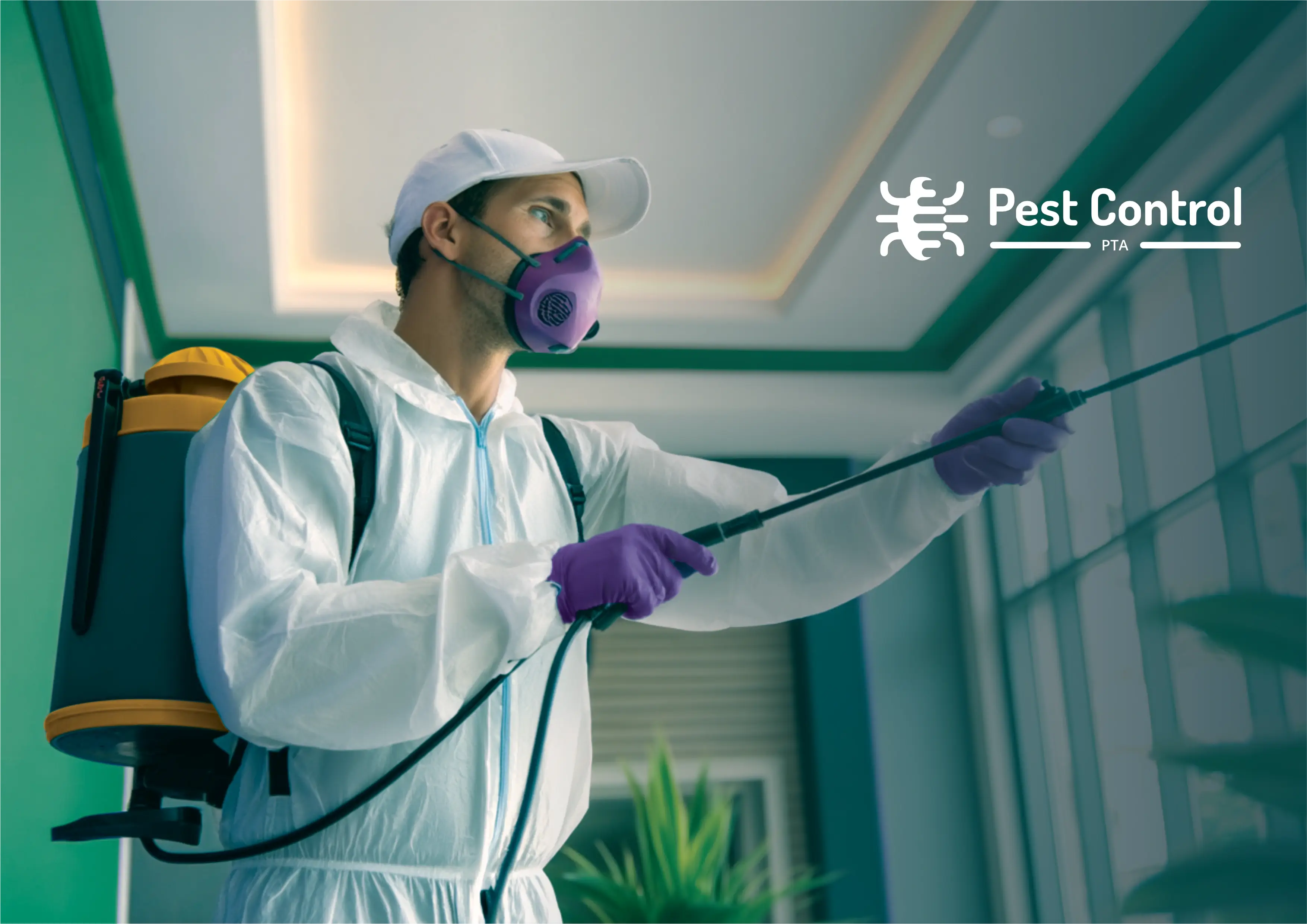
We believe that working with people on a personal level, while preserving the environment, is the most rewarding way to solve pest problems. This is why we provide Department of Agriculture-approved treatments through a trusted owner-operated process that ensures clients gain peace of mind, protection, and a clean reputation. So that we can deliver safe, eco-friendly structural pest control with an efficient, affordable, and friendly touch.
The brand primarily serves Estate Managers, Body Corporates, and Property Managers who manage high-value properties, with a secondary focus on upper-income residential clients. While both genders are represented, decision-making is often female-led. These clients buy pest control services not out of desire but necessity to maintain a social image, stay compliant, and achieve peace of mind. Infestation signals neglect and embarrassment. They need a solution that’s efficient, environmentally safe, and human-led. They describe the brand in three words: Efficient. Affordable. Friendly. The emotions they seek: Humour, Relief, and Trust.
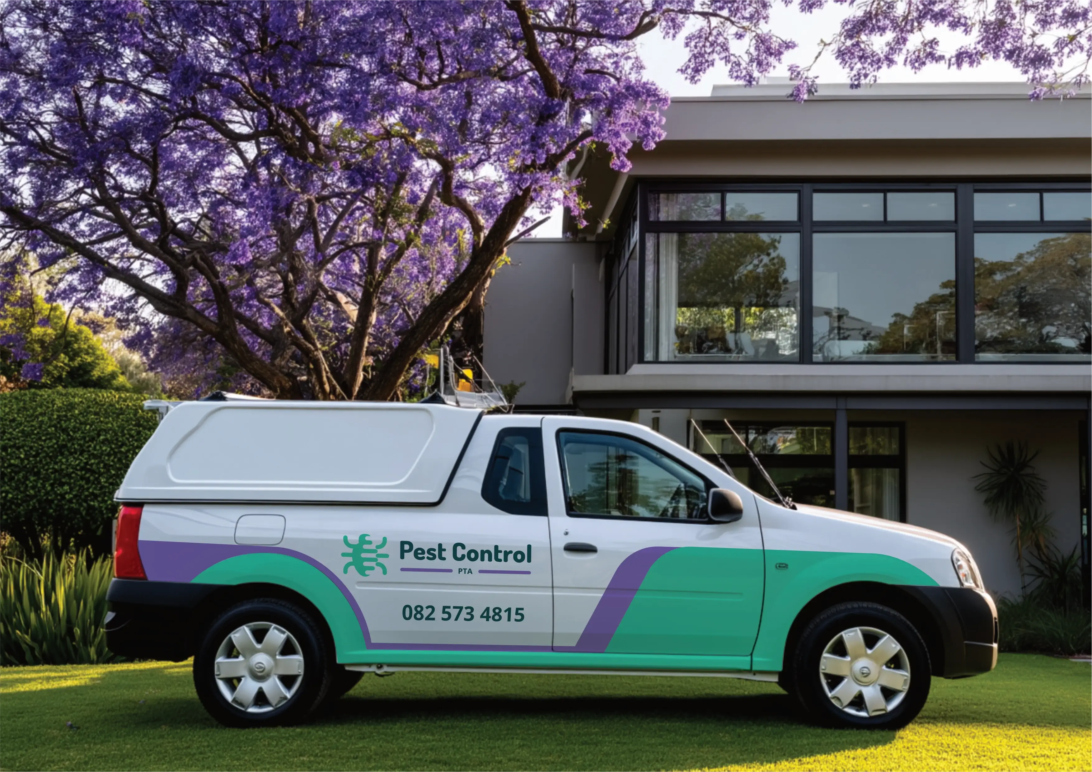
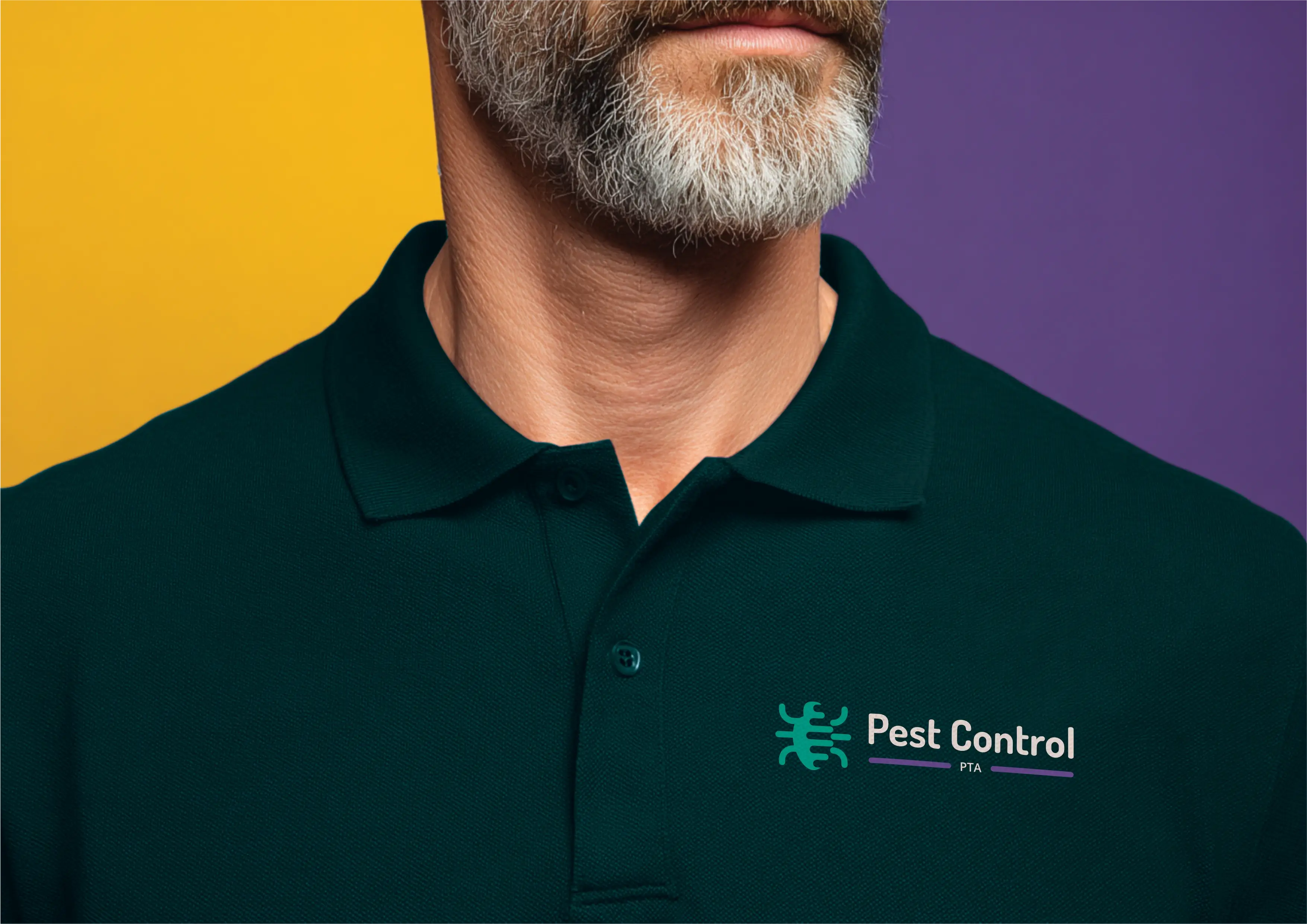
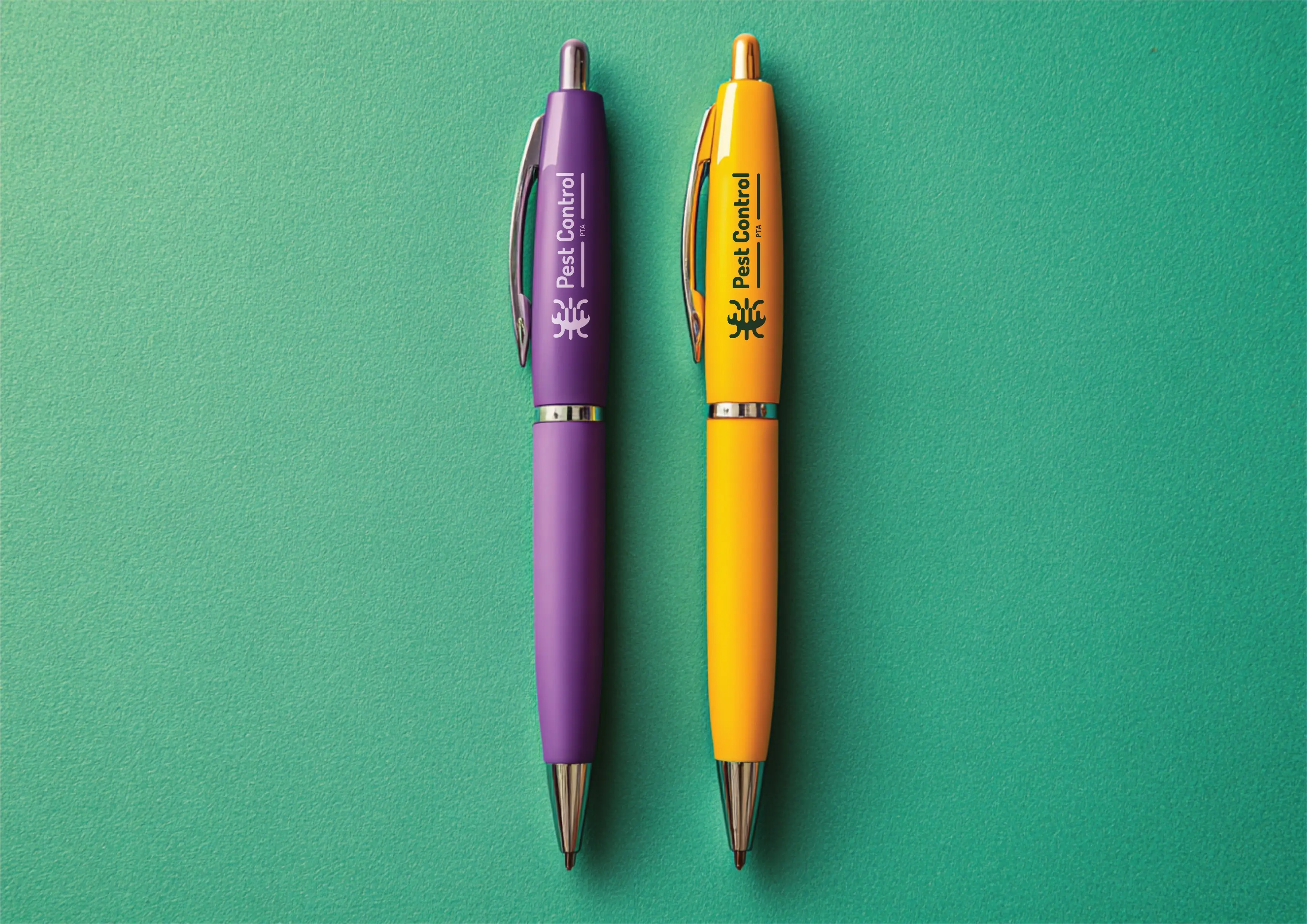
Challenge: The existing logo is too long and doesn’t scale well across media. Design Goal: A modernised, compact logo that sets the brand apart from typical pest control visual language (like that used by SAPCA affiliates). Application: The logo will appear on a wide range of brand assets, website, vehicle branding, business cards, certificates, promotional stationery (pens, almanacs), and presentations. Visual Tone: Friendly, trustworthy, competent, and ideally something that evokes personal service with a smile, not a chemical hazard warning. Additional Notes: No specific visual elements or exclusions were defined in the brief, leaving creative freedom for differentiation.

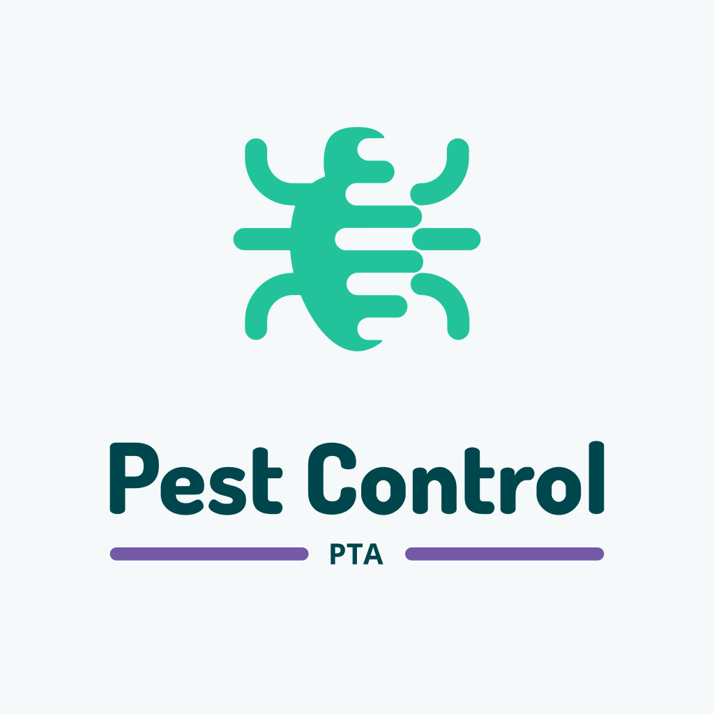
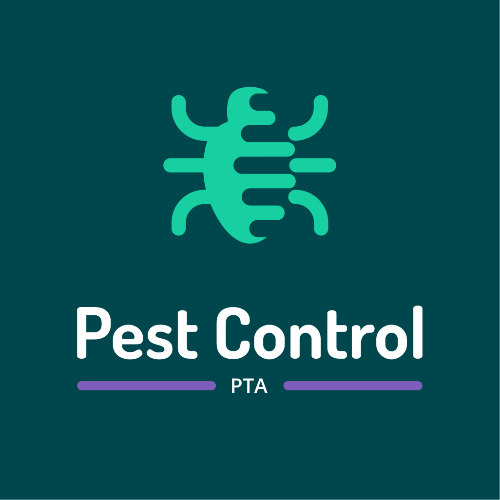
The logo takes a more modern abstract approach, featuring a generic bug symbol that's being wiped out to the right, subtly communicating the idea of pest removal. The rounded shapes adds a friendly feel to the logo. The bug's shape was born out of the original logo's bug shape.
The logo functions perfectly well in a vertical or stacked layout. This means that the logo will work well on vertical applications like smartphones, tablets and roll-up banners.
The logo is designed to be functional in a horizontal layout. This allows you to use the logo on horizontal applications like building signage, websites and stationery.

This palette is bold, energetic, and confident — a strong match for MJ Accountant, which promises to simplify complex finances. The vivid primary and secondary colours balance the trust and clarity of the dark and light tones, creating a modern, approachable brand identity.

Emerald Surf reinforces the brand’s eco-conscious and health-focused approach, reflecting safety and care in pest control solutions. It evokes a sense of renewal and cleanliness, which aligns with the client's desire to improve social image and maintain hygienic environments. This colour supports the brand’s promise of personal, trustworthy service with a fresh, modern edge.
Royal Amethyst adds a touch of sophistication and uniqueness, helping the brand stand out in a saturated market. It conveys creativity and reliability, which supports the brand’s goal of being perceived as different and efficient. This colour also appeals to the upper-income target audience by suggesting quality and professionalism
Golden Ember symbolizes optimism and energy, reinforcing the brand’s friendly and approachable personality. It draws attention and communicates confidence, making it ideal for a brand that wants to be remembered and trusted. This colour also subtly hints at the value clients receive peace of mind and compliance making it easier to justify a “grudging expense.”
Frosted Mist brings a sense of calm, clarity, and cleanliness, which is essential for a pest control brand aiming to evoke relief. It supports the brand’s modern and minimal aesthetic, ensuring that the identity feels fresh and professional. This colour also enhances the perception of transparency and trustworthiness in service delivery.
Deep Current grounds the brand in professionalism and dependability, reinforcing the idea that Pest Control PTA is a serious, capable service provider. It evokes trust and stability, which are crucial for clients seeking long-term pest control solutions. This colour also balances the brighter tones, adding depth and authority to the brand’s visual identity.
Slate Ink is a strong, neutral tone that enhances readability and reinforces the brand’s message with clarity. It communicates intelligence and calm, supporting the brand’s goal of being seen as efficient and trustworthy. This colour ensures that all communication feels grounded and professional, even when the brand uses humour or light-hearted messaging.
The primary colour version of the logo functions perfectly in a vertical layout, designed for maximum brand impact on light and dark digital surfaces.
For wider applications like navigation bars, signage, and stationery, the horizontal colour variations ensure the brand remains legible and professional.

Dosis and Open Sans work together to create a brand voice that is both welcoming and dependable. This pairing is perfect for Pest Control PTA’s goal of being seen as approachable yet professional, especially in a market where trust and clarity are essential.
Dosis
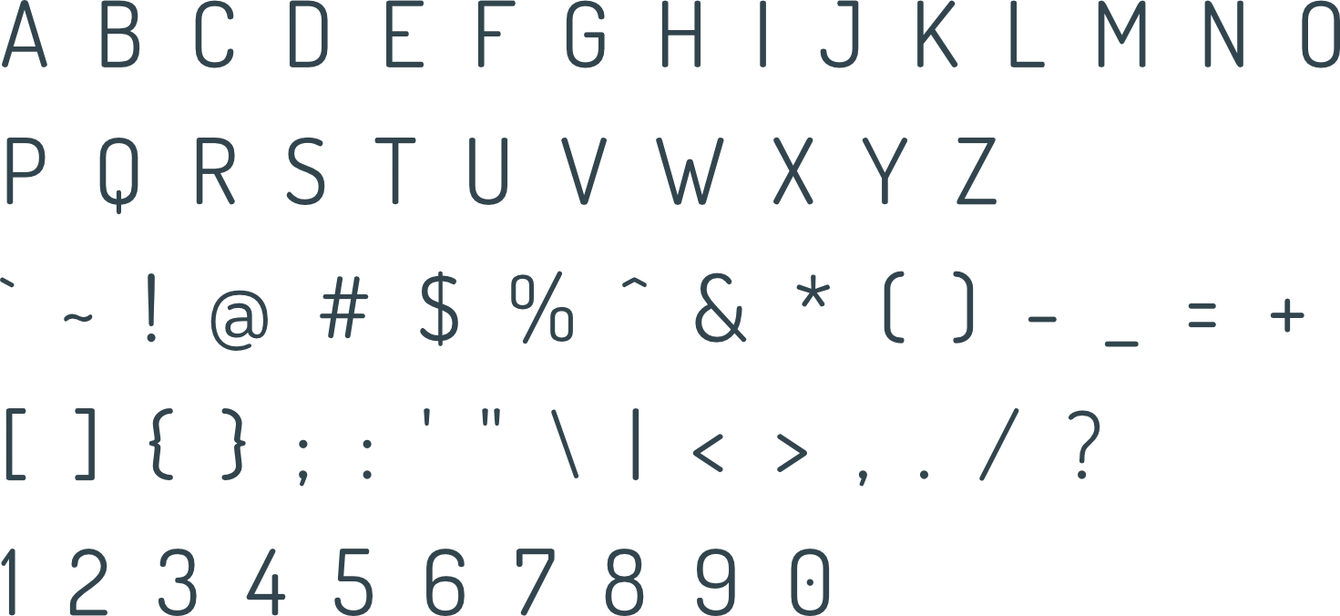
Dosis brings a clean, rounded, and approachable style that reflects the brand’s friendly and modern personality. Its soft geometry makes it feel non-threatening and accessible making it ideal for a service that deals with an uncomfortable topic like pests. As a heading font, it communicates clarity and warmth, helping to build trust and ease for clients at first glance.
Open Sans
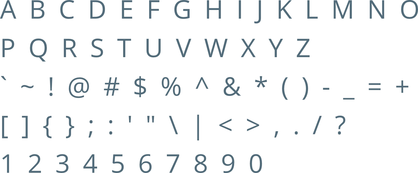
Open Sans is a highly legible and neutral typeface that supports the brand’s promise of efficiency and professionalism. Its open letterforms and balanced spacing make it ideal for communicating detailed information clearly, whether in print or digital formats. This font reinforces the brand’s reliability and ensures that messaging feels straightforward and honest.
The logo is designed to fit inside a profile image that can typically be uploaded to social media platforms like Facebook, LinkedIn, and Instagram.
A favicon is a small icon that represents your website in browser tabs, bookmarks, and address bars, ensuring brand recognition at a glance.




Contact us Today To
The best way to get things done is simply to begin. Reach out to us at Fletch in Pretoria, South Africa today.
