

Medicore Technologies aims to improve the healthcare sector and bring more life to it throughout South Africa at the highest standard. Their process ensures that their clients get what they are after by maintaining good communication and actively listening. They provide health care from a personal provider by specializing in the supply and manufacture of medical consumables to the state and private sector. This includes sustainability, quick returns, and quality service. Unlike their top competitors in the healthcare sector—Adcock Ingrams, B. Braun, and Fresenius—what makes them different is that they are new in the market, young, fresh, and innovative, and they challenge the status quo. Their goal is to become one of the leading medical companies in Africa.
Medicore Technologies wants to work with procurement professionals in the primary public and private healthcare sectors. They are usually female, aged between 35 and 60, from the middle-income class. What makes them approach a healthcare provider is the need to get new suppliers for better quality products.
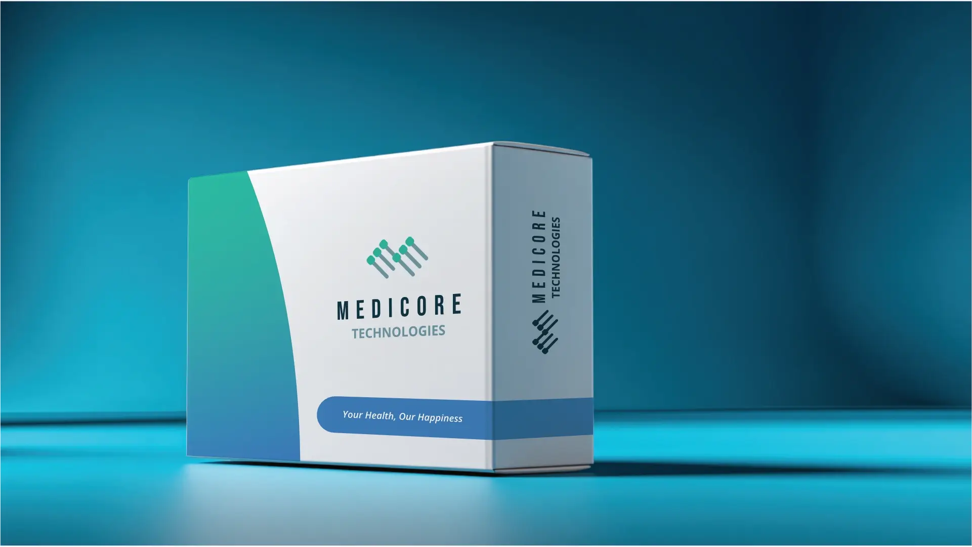
Medicore Technologies is in the process of rebranding their brand. They need social media assets that will solve their challenge of having more structure and more organisation. Their customers should describe them as reliable, efficient, and respectable, and feel a sense of being pleased, excited, and confident. The logo will be visible on invoices, office signage, vehicle signage (trucks), website, branding stationery, packaging, and labels. Keep in mind that there is nothing specific the logo should incorporate or stay away from. The name comes from a focus on the medical industry. As for their slogan, they have one: "You're healthy, we're happy."
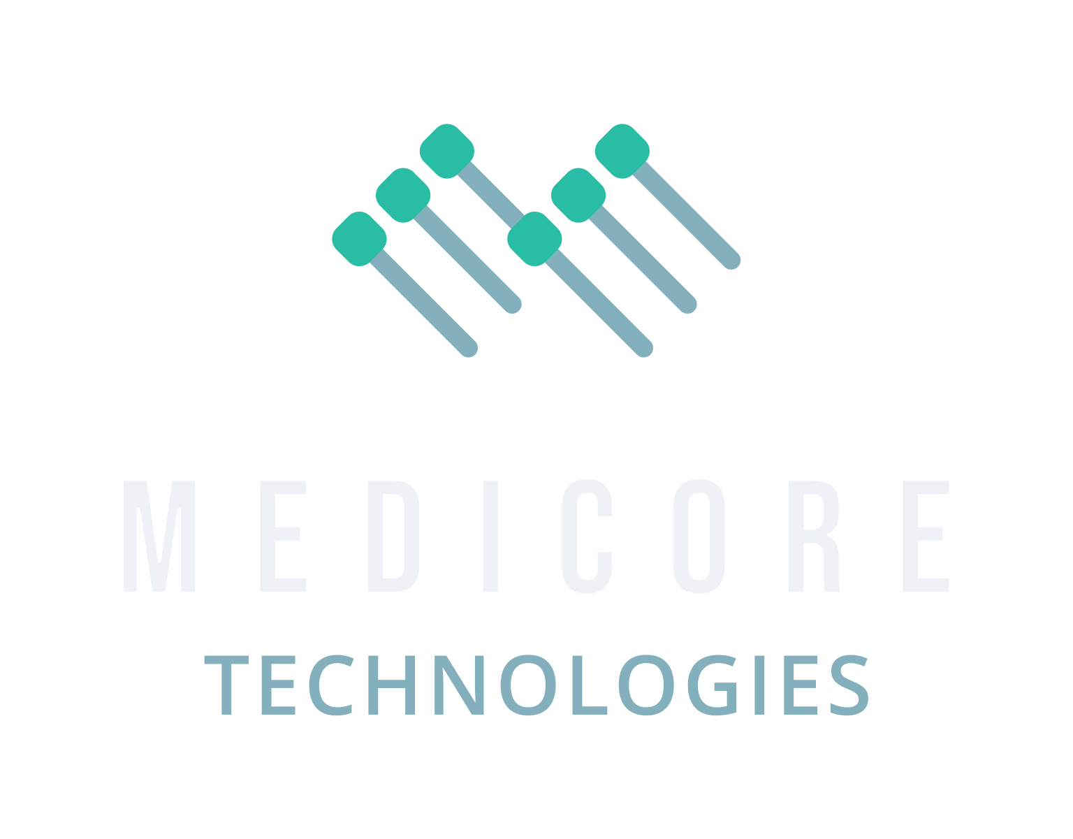

The logo features 3 diagonal lines that form an abstract M shape. Each diagonal line has a node on top that adds a technological aspect to it. Combined they almost look like laboratory viles.
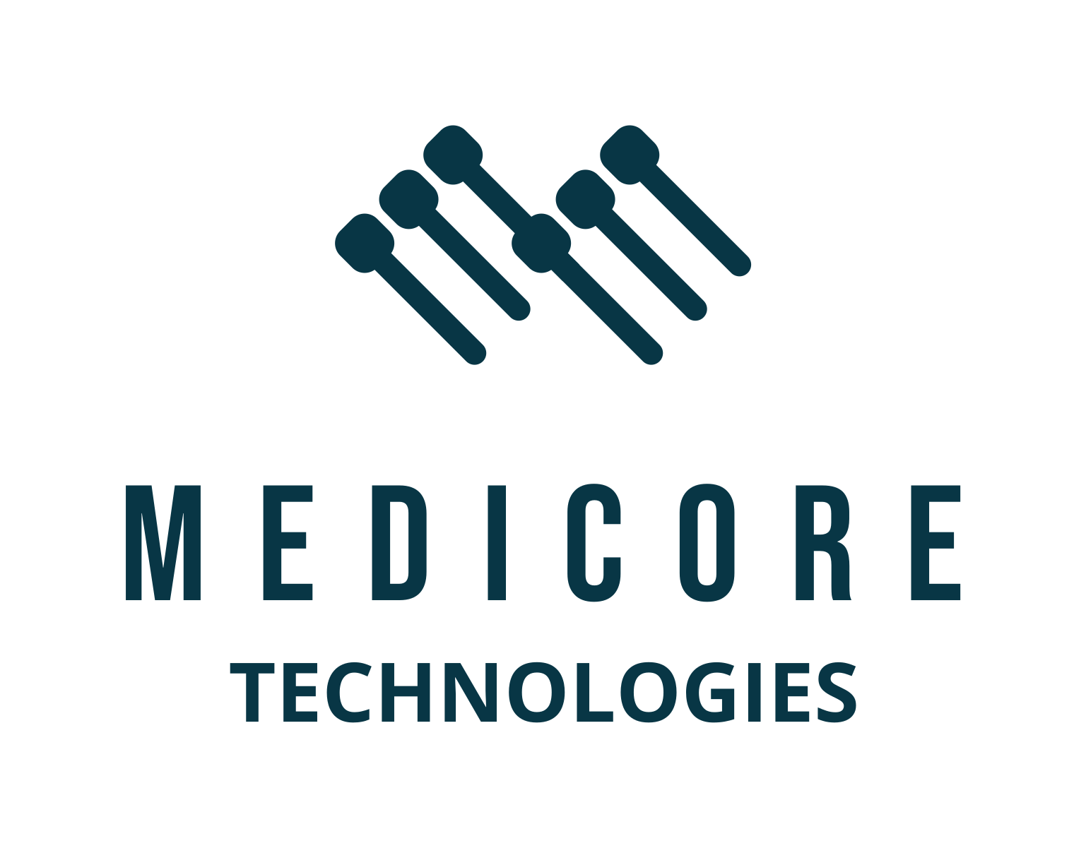
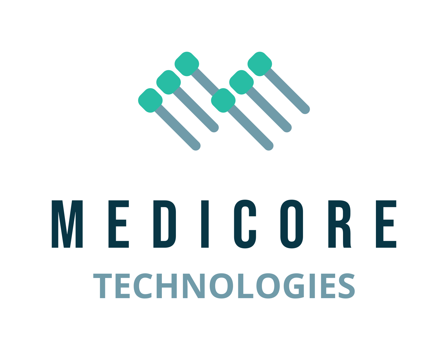
The logo functions perfectly well in a vertical or stacked layout. This means that the logo will work well on vertical applications like smartphones, tablets and roll-up banners.
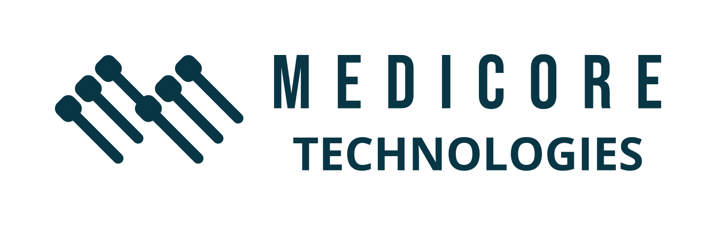
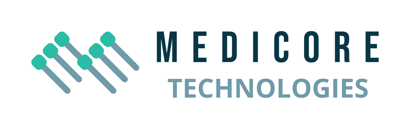
The logo is designed to be functional in a horizontal layout. This allows you to use the logo on horizontal applications like building signage, websites and stationery.


This palette is highly suitable for Medicore Technologies. It balances freshness and professionalism, aligning with the brand’s identity as a young, innovative healthcare provider. The combination of teal, blue, and soft neutrals evokes trust, vitality, and clarity—perfect for a company aiming to challenge the status quo in the medical sector.

Teal Surge represents health, rejuvenation, and emotional balance. It’s often used in healthcare to promote calmness and trust, making it ideal for a brand focused on wellness and innovation.
Slate Horizon conveys stability, intelligence, and professionalism. It’s a calming colour that supports the brand’s image of reliability and structured service delivery.
Clarity Blue symbolizes innovation, clarity, and confidence. It energizes the brand and appeals to a forward-thinking audience, reinforcing Medicore’s fresh and dynamic approach.
Mist Grey evokes cleanliness, simplicity, and openness. It’s ideal for backgrounds and whitespace, helping the brand feel modern and uncluttered.
Deep Trust conveys authority, depth, and security. It’s a grounding colour that reinforces the brand’s commitment to quality and reliability.
Steel Blue is neutral and modern, promoting clarity and readability. It supports the brand’s tone of professionalism and approachability.

The primary colour version of the logo functions perfectly in a vertical layout, designed for maximum brand impact on light and dark digital surfaces.
For wider applications like navigation bars, signage, and stationery, the horizontal colour variations ensure the brand remains legible and professional.
Bebas Neue and Open Sans form a balanced pair—bold and assertive for headings, clean and readable for body text. This combination is compatible and effective for a healthcare brand that values structure, clarity, and professionalism.

Bebas Neue
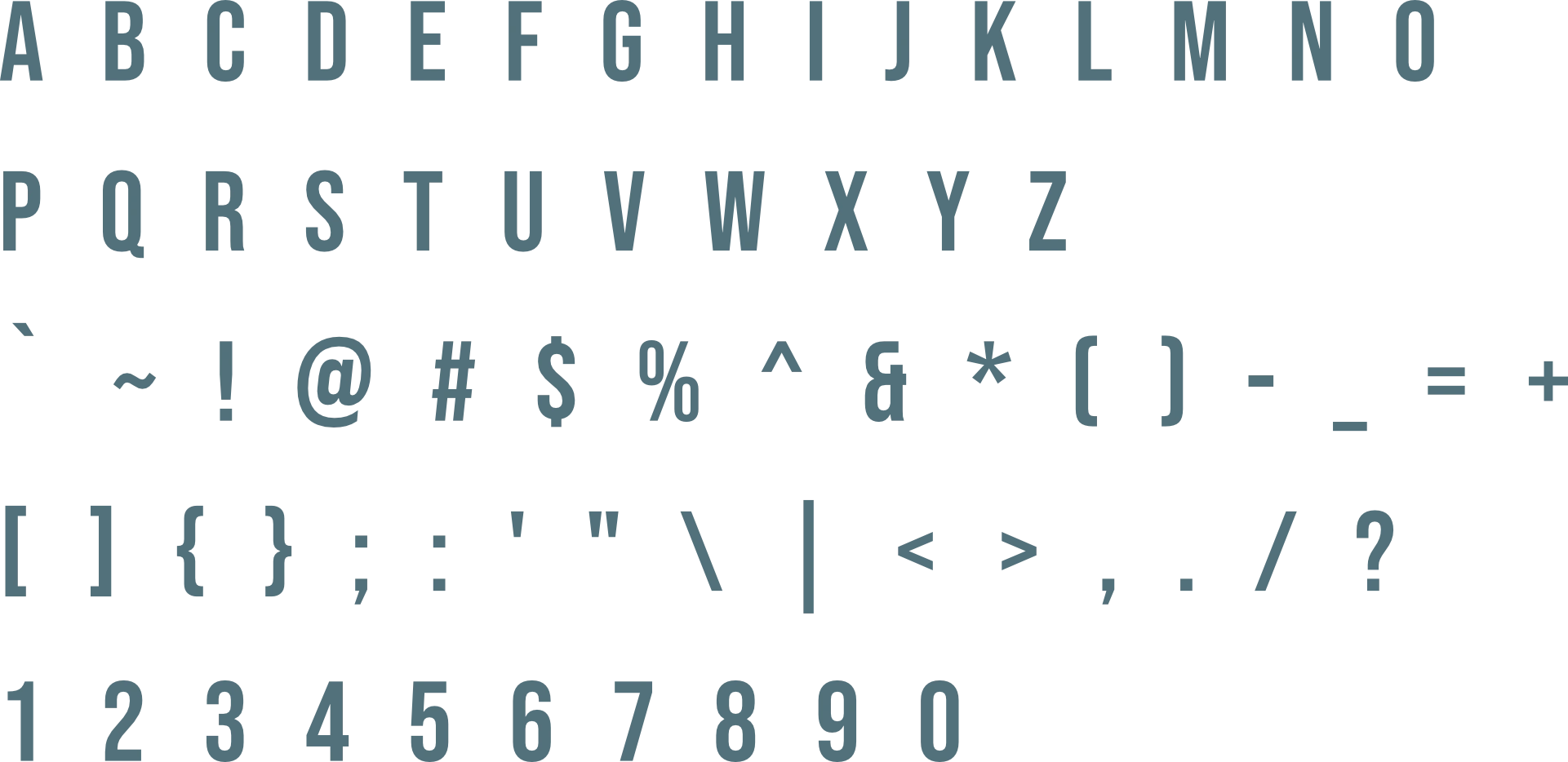
Bebas Neue is a bold, all-caps display font with a clean and modern aesthetic. Its condensed letterforms create a strong visual impact, making it ideal for headlines and signage. The font conveys confidence and clarity, aligning well with a brand that wants to be seen as reliable and innovative.
Open Sans
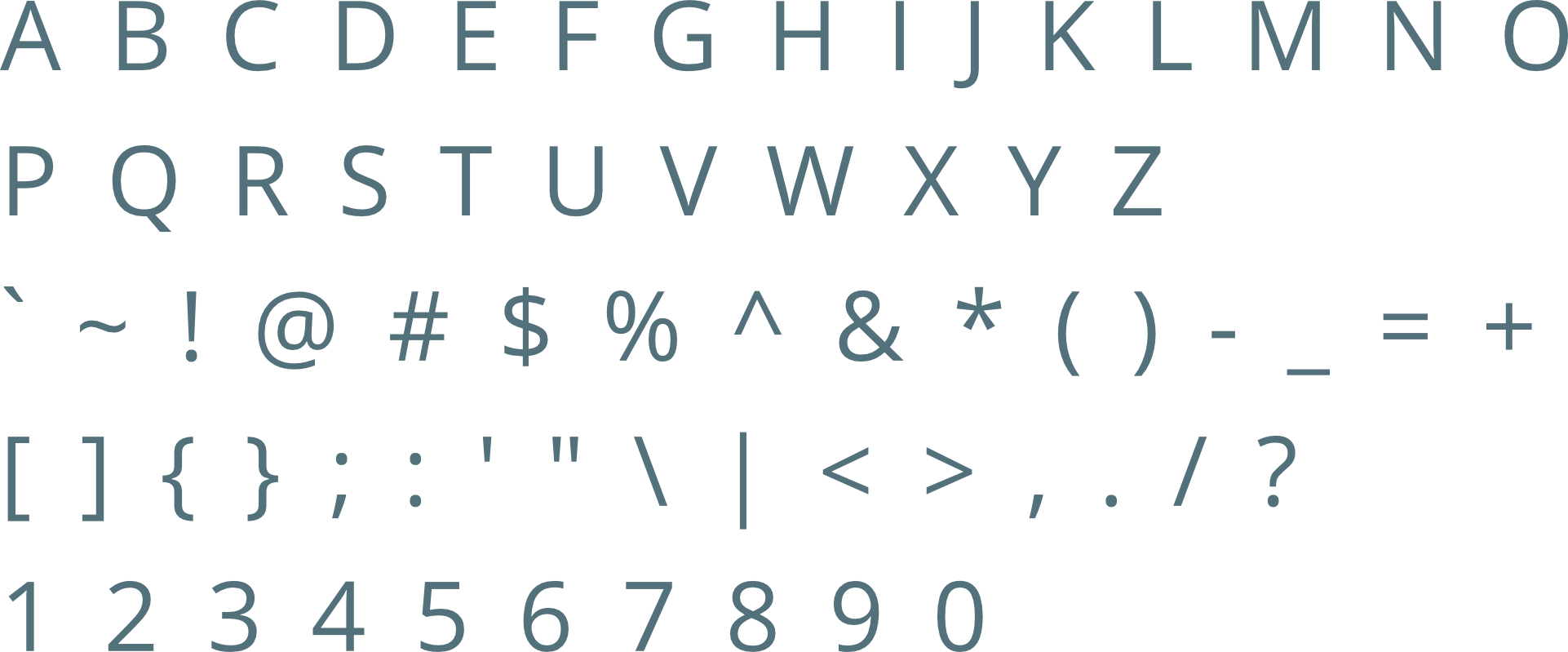
Open Sans is a humanist sans-serif typeface known for its readability and neutrality. It offers a friendly and approachable tone, making it perfect for body text and subheadings. Its versatility ensures consistency across digital and print platforms, supporting Medicore’s goal of clear communication.
The logo is designed to fit inside a profile image that can typically be uploaded to social media platforms like Facebook, LinkedIn, and Instagram.
A favicon is a small icon that represents your website in browser tabs, bookmarks, and address bars, ensuring brand recognition at a glance.




Contact us Today To
The best way to get things done is simply to begin. Reach out to us at Fletch in Pretoria, South Africa today.
