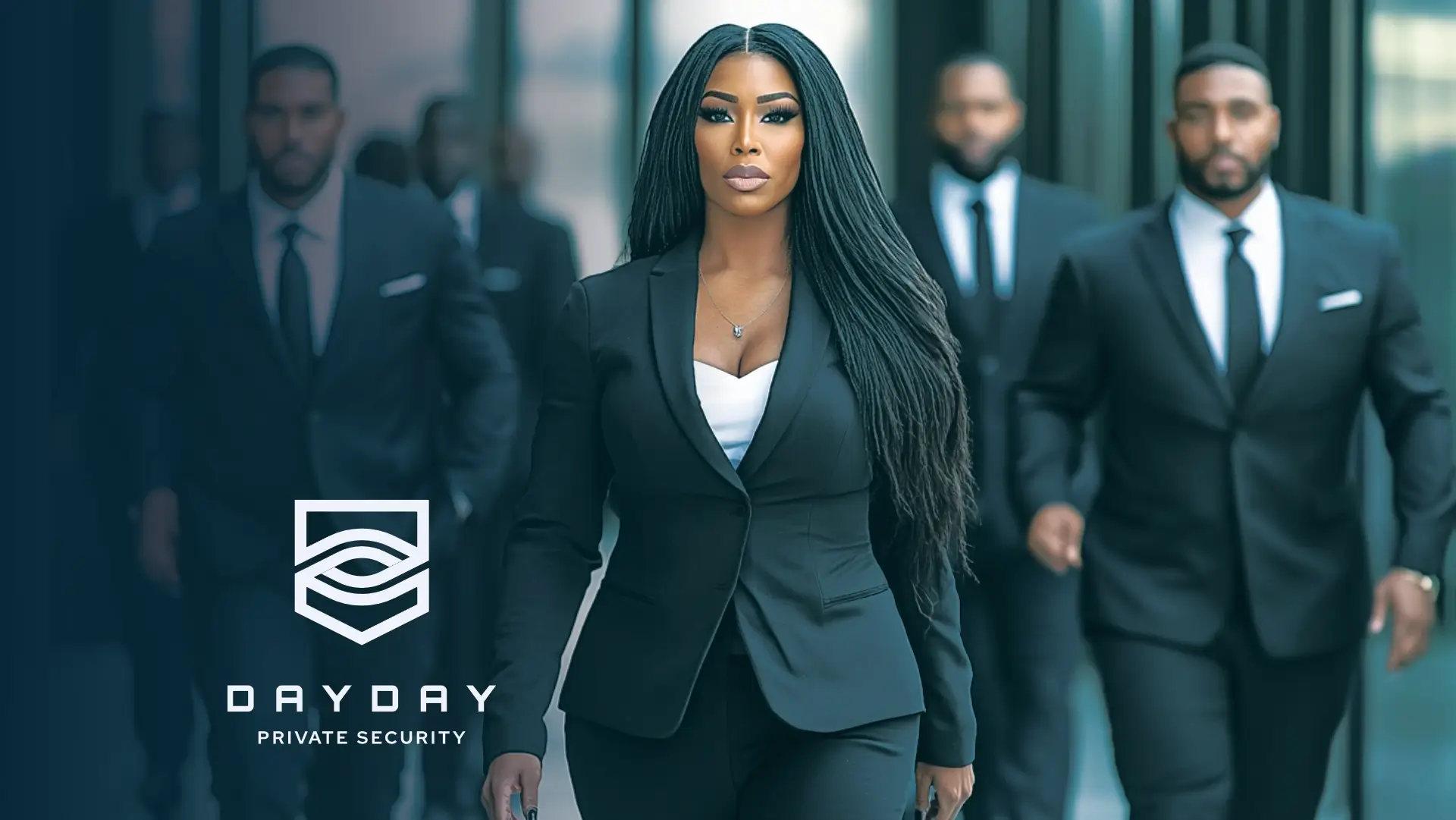
DayDay Private Security is a Private Security company that highly values helping others with personal security after experiencing a personal kidnapping. They are currently in the process of building a new brand. They specialize in private security services, VIP escort, day-to-day security patrol, and in-house protection services. includes high tech. But what their customers really buy is safety. The name DayDay Private Security comes from a teacher who called the owner DayDay because he was the main character and influence of the day.
DayDay Private Security primarily targets celebrities going in and out of the country, government, and the commercial sector, typically both men and women in their 25-35s, who are generally from the Upper-income class. The brand should create the impression of being Safe, authentic, and easy to use. They want to evoke a sense of confidence, being emotionally engaged, comfort, and trust in their target audience.
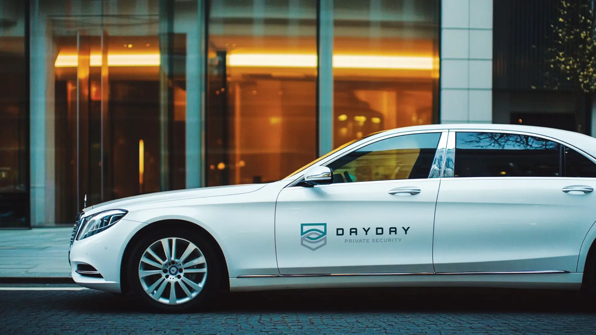
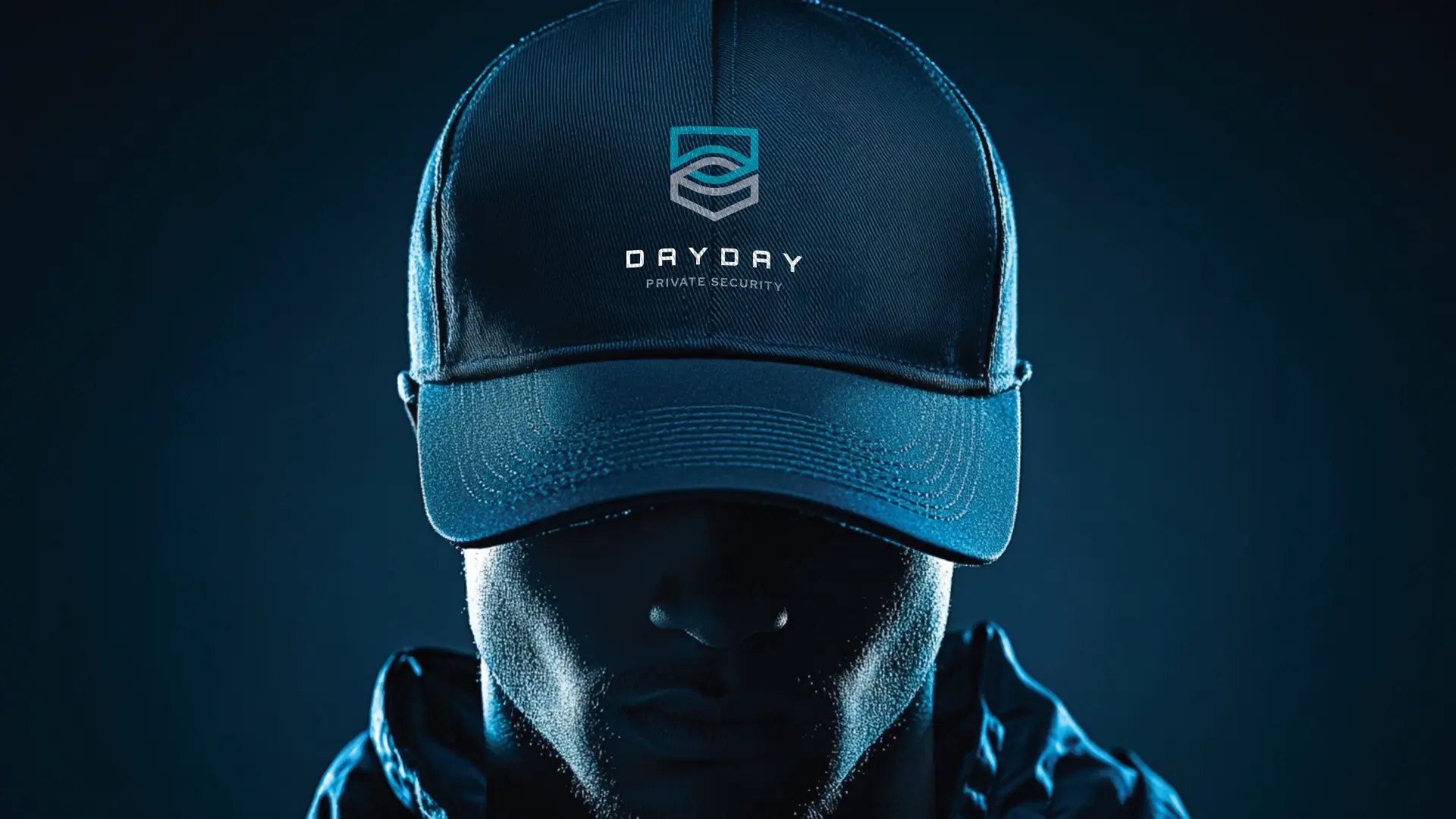
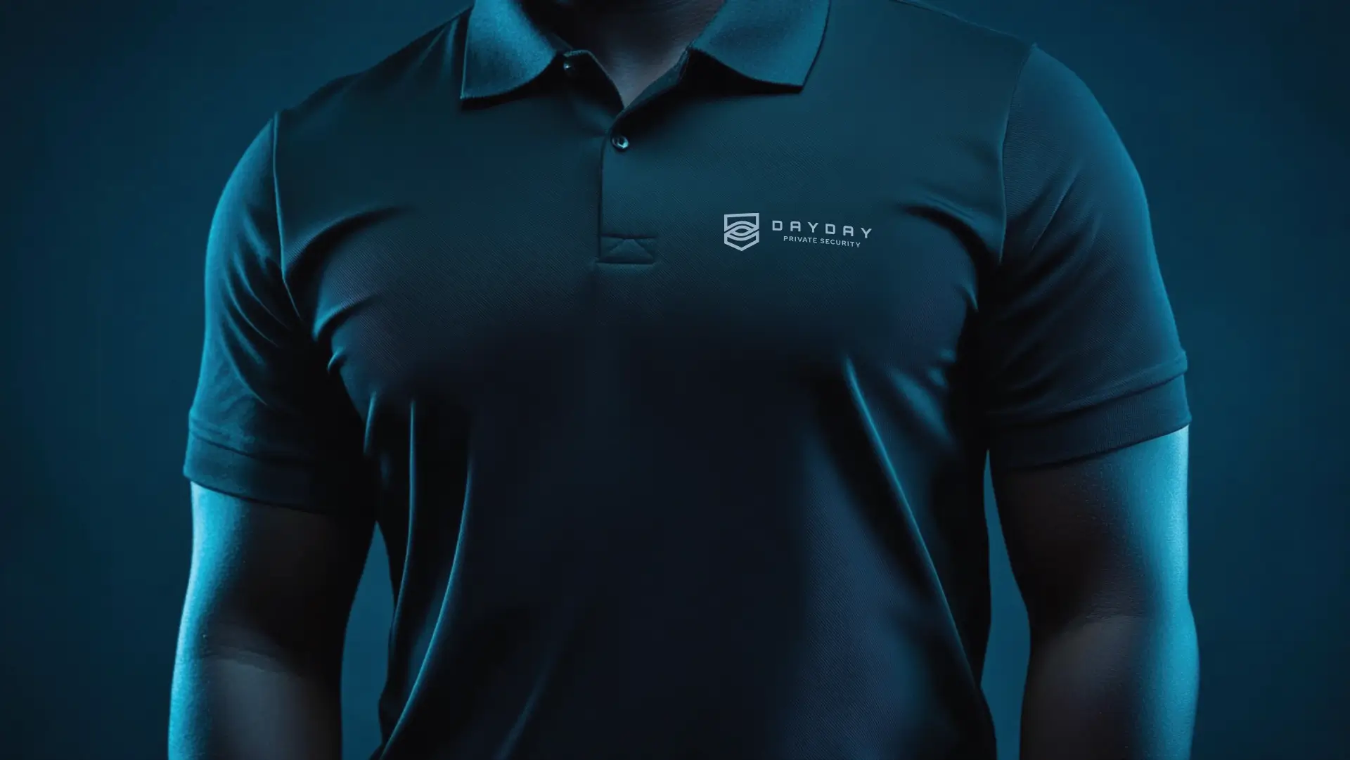
DayDay Private Security wants a new logo that will establish a solid brand identity. Their logo will be showcased on their branding stationery, website, app, apparel, vehicles, and signage. They have suggested that the logo should include an eye, but no shield.
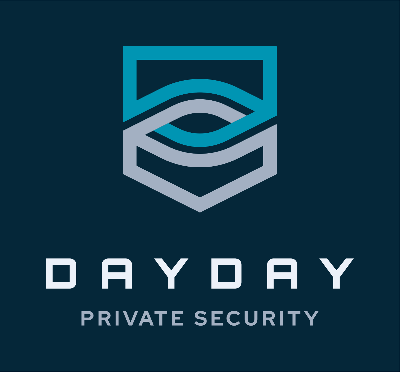
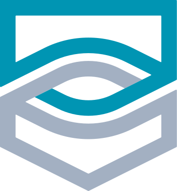
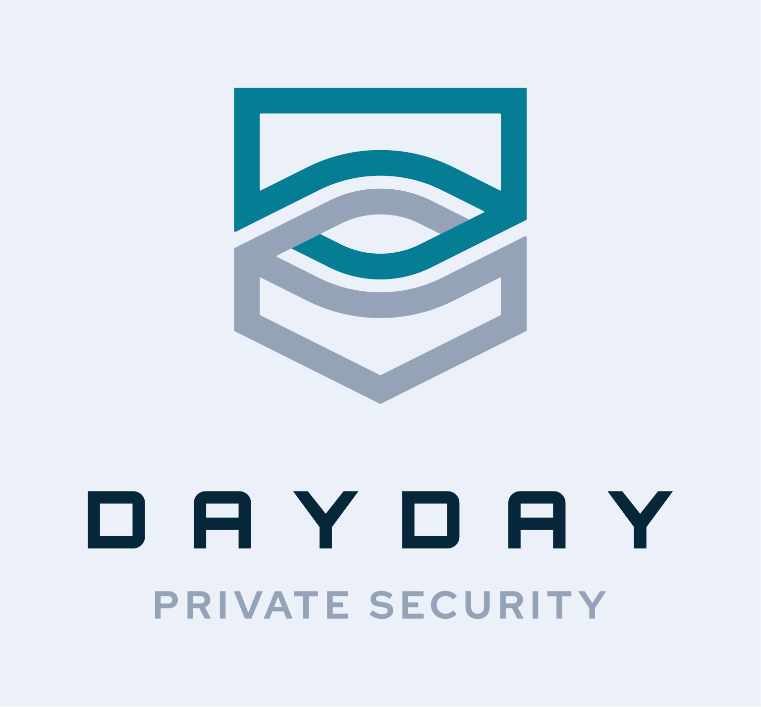
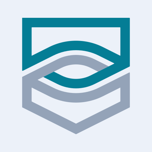
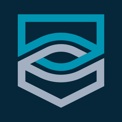
The logo features an abstract shield shape, with an eye that's interconnected with the top and bottom half, symbolizing protection, strength, and resilience. The layered, wave-like elements within the shield suggest fluid adaptability, reinforcing that DayDay Private Security is dynamic and responsive to threats.
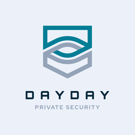
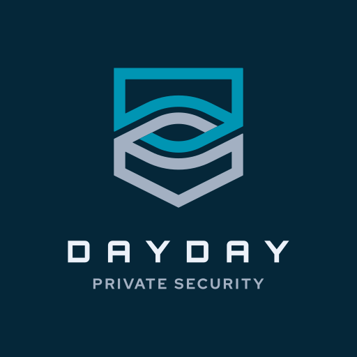
The logo functions perfectly well in a vertical or stacked layout. This means that the logo will work well on vertical applications like smartphones, tablets and roll-up banners.
The logo is designed to be functional in a horizontal layout. This allows you to use the logo on horizontal applications like building signage, websites and stationery.
This colour palette strongly aligns with DayDay Private Security’s brand values of safety, trust, and technological sophistication. The deep blues and teals evoke confidence, reliability, and professionalism, while the lighter shades add clarity and approachability. The dark and text colours provide a strong contrast, ensuring readability and a polished, high-end look. The combination is effective for a security brand targeting VIPs and government clients, reinforcing a sense of control, authority, and peace of mind.
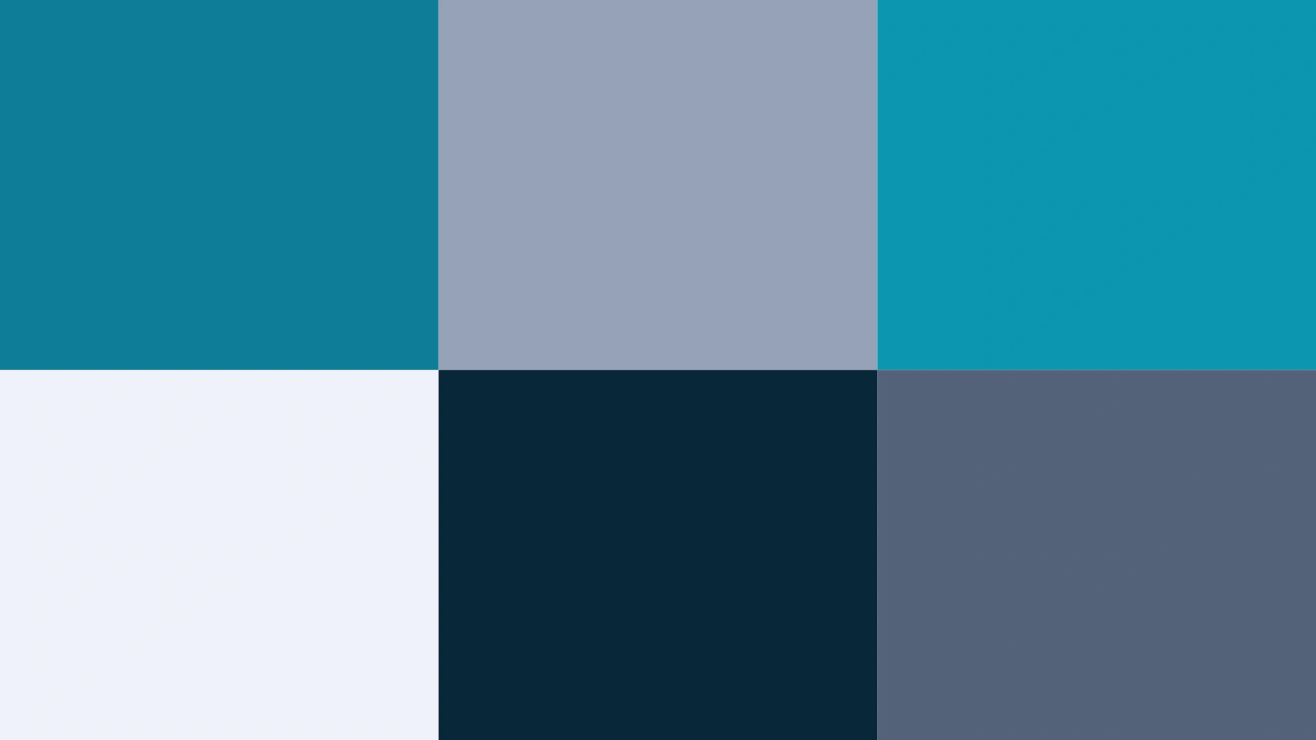
Deep teal signifies protection, intelligence, and technology. It is a colour often used in law enforcement, security, and corporate brands to symbolize stability and expertise. It reassures clients that they are in safe hands.
Steel grey represents professionalism, neutrality, and security. It complements the deeper blues and teals by adding a sense of balance and sophistication, making the brand feel established and trustworthy.
Bright teal is modern, energetic, and innovative, reinforcing the brand’s technological and high-end security focus. It creates a dynamic and forward-thinking impression.
Frosted white conveys clarity, cleanliness, and transparency. It ensures that the brand feels approachable while maintaining an aura of professionalism.
Midnight blue symbolizes authority, control, and depth. It enhances brand credibility and a sense of dependability, reinforcing the security-focused nature of the business.
Slate blue is calm, intelligent, and reliable. It enhances text readability while reinforcing a sense of stability and expertise.
The primary colour version of the logo functions perfectly in a vertical layout, designed for maximum brand impact on light and dark digital surfaces.
For wider applications like navigation bars, signage, and stationery, the horizontal colour variations ensure the brand remains legible and professional.
This typographic pairing strikes a balance between cutting-edge digital aesthetics and clean, modern readability. By combining a highly stylized geometric sans-serif with a friendly, structured display font, the brand achieves a commanding, high-tech presence without sacrificing clarity.

Orbitron
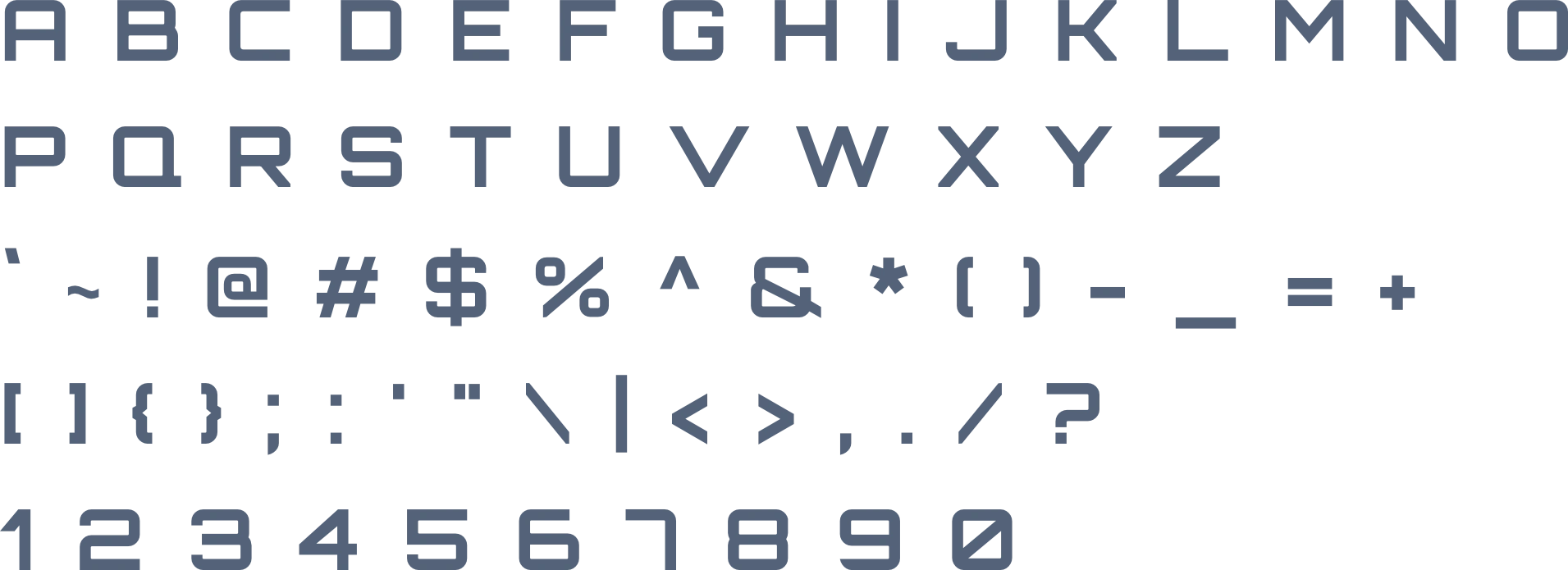
Orbitron is a futuristic, tech-inspired typeface with sharp, angular forms that immediately convey strength and security. Its bold structure and space-age aesthetic make it a powerful choice for a high-tech private security brand. As a heading font, it ensures a commanding and protective presence.
Red Hat Display
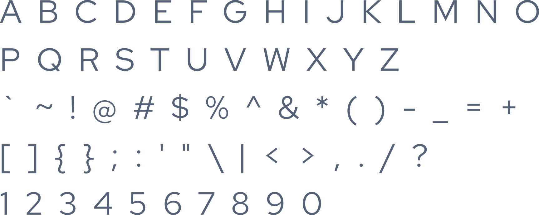
Red Hat Display, with its geometric clarity and modern appeal, complements Orbitron’s futuristic look while adding a touch of warmth. It provides excellent legibility in body text while still maintaining a sleek, high-tech feel.
The logo is designed to fit inside a profile image that can typically be uploaded to social media platforms like Facebook, LinkedIn, and Instagram.
A favicon is a small icon that represents your website in browser tabs, bookmarks, and address bars, ensuring brand recognition at a glance.


Contact us Today To
The best way to get things done is simply to begin. Reach out to us at Fletch in Pretoria, South Africa today.
