
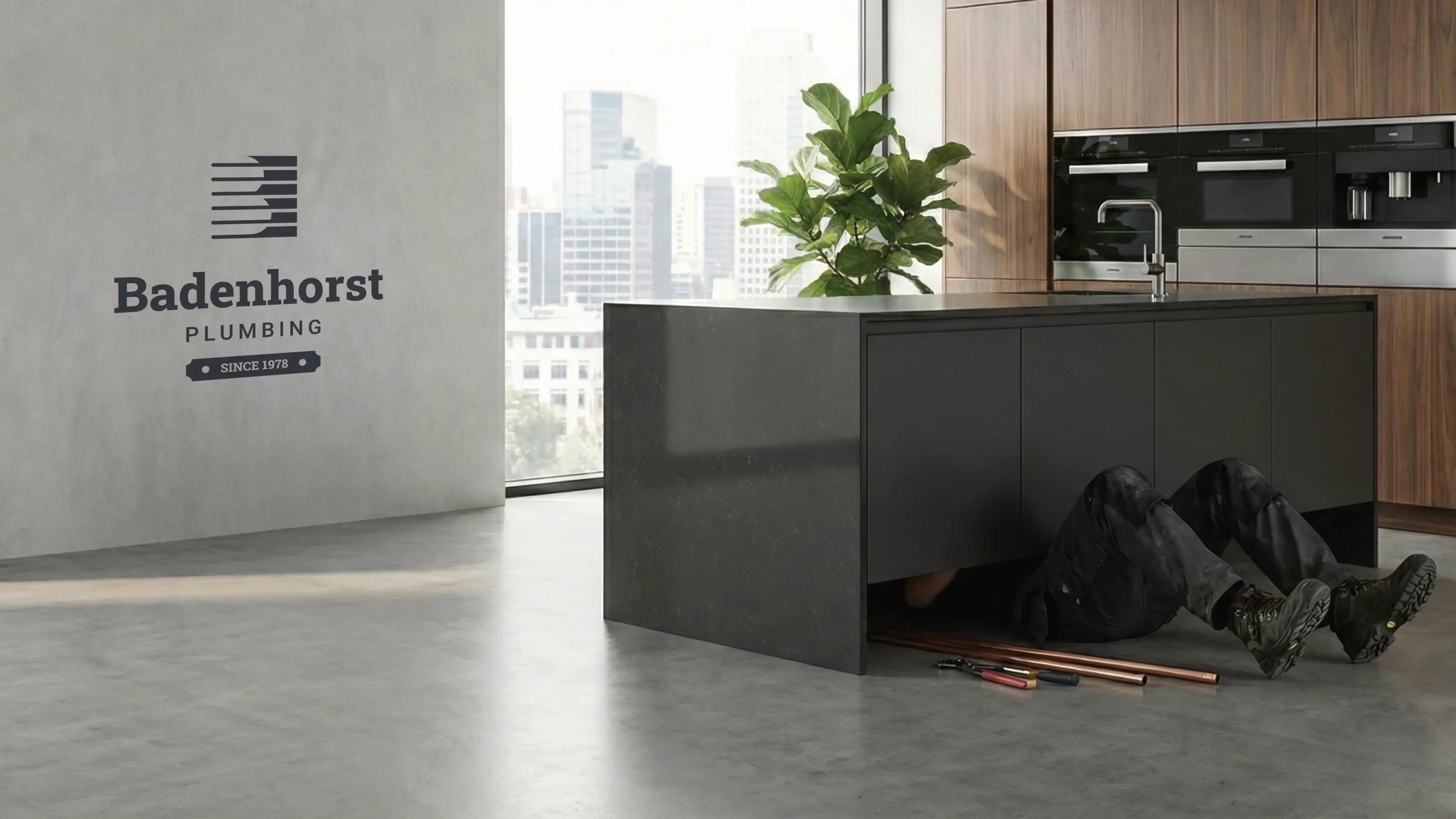
Badenhorst Plumbing is a 148-year-old institution currently evolving into a modern industry titan. Operating at the intersection of The Sage (historical authority) and The Hero (disciplined precision), the brand delivers "premium relief" to the elite tier. We don't just fix infrastructure; we provide the absolute peace of mind that only a century and a half of institutional knowledge can offer.
Our clients are high-net-worth Property Developers and Luxury Homeowners who view their assets as legacies. They are "battle-weary" from industry mediocrity—frustrated by disappearing contractors and "dirty handoffs." They aren’t looking for a vendor; they are looking for a peer-level partner who values timeliness, clinical cleanliness, and transparent, high-end pricing.
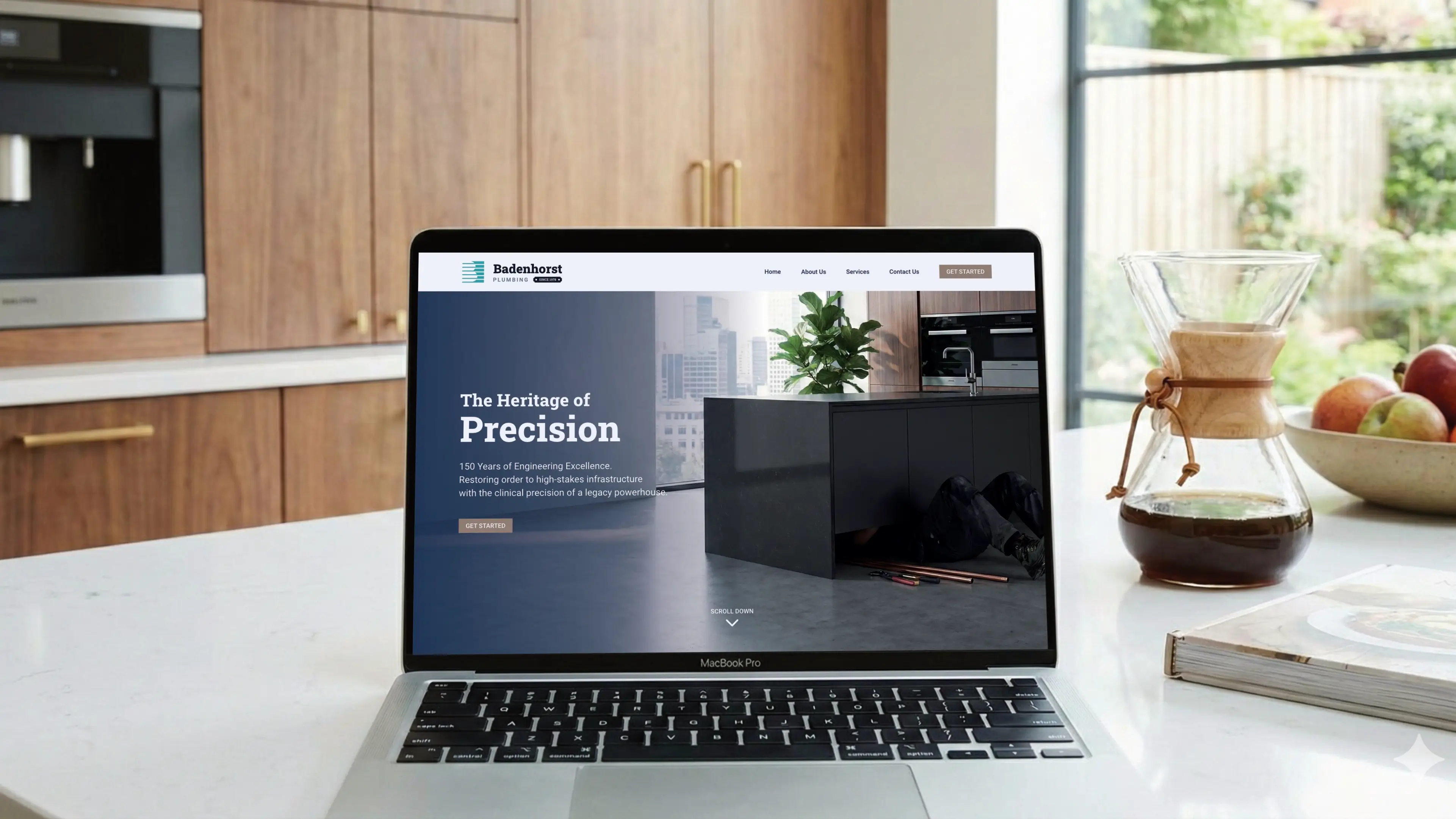
The visual identity must bridge the gap between 1878 heritage and modern minimalism. Non-Negotiable: Integration of "Est. 1878" as social proof of stability. Anti-Cliche: Strict avoidance of industry tropes (wrenches/droplets). The mark must feel like a premium architectural or engineering firm.
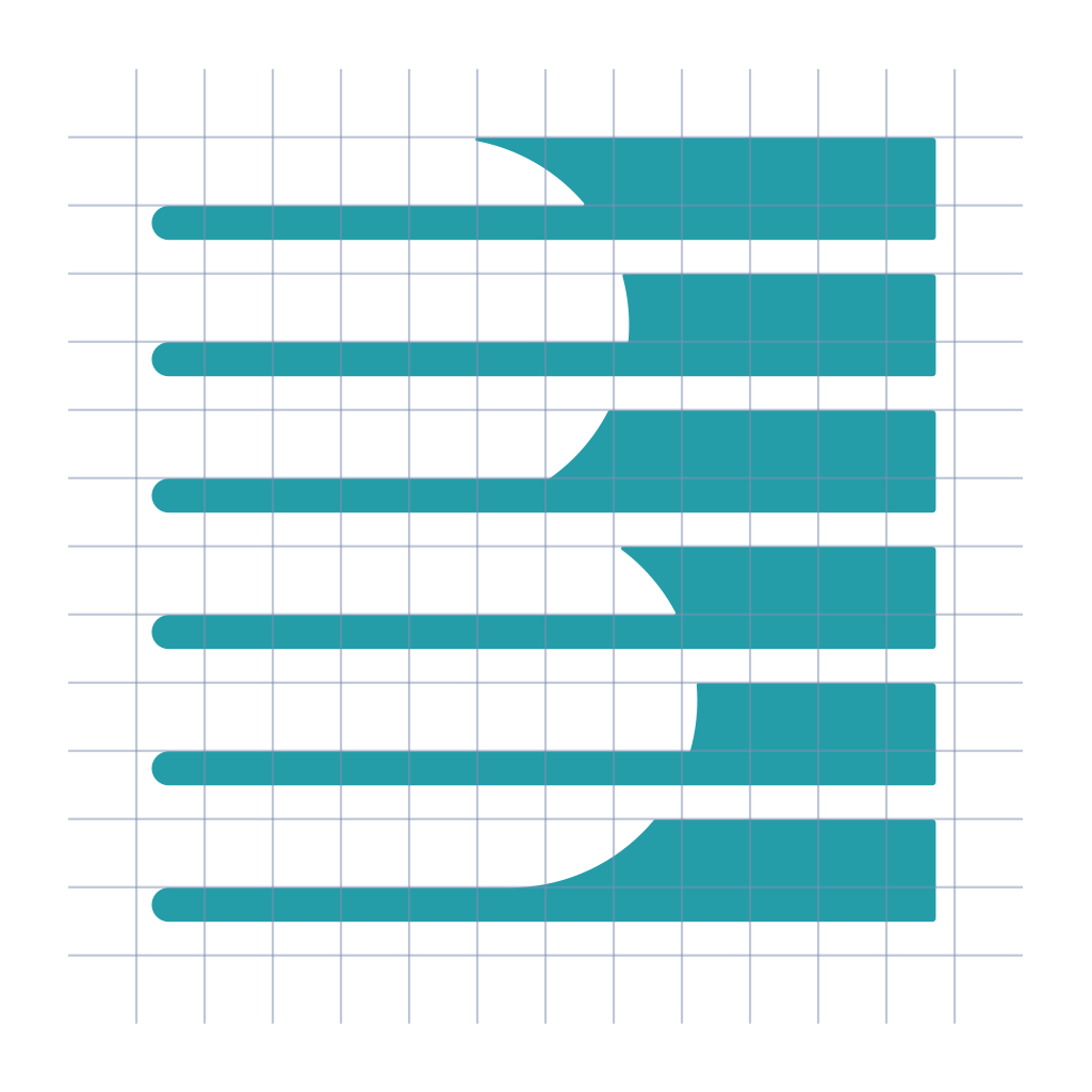
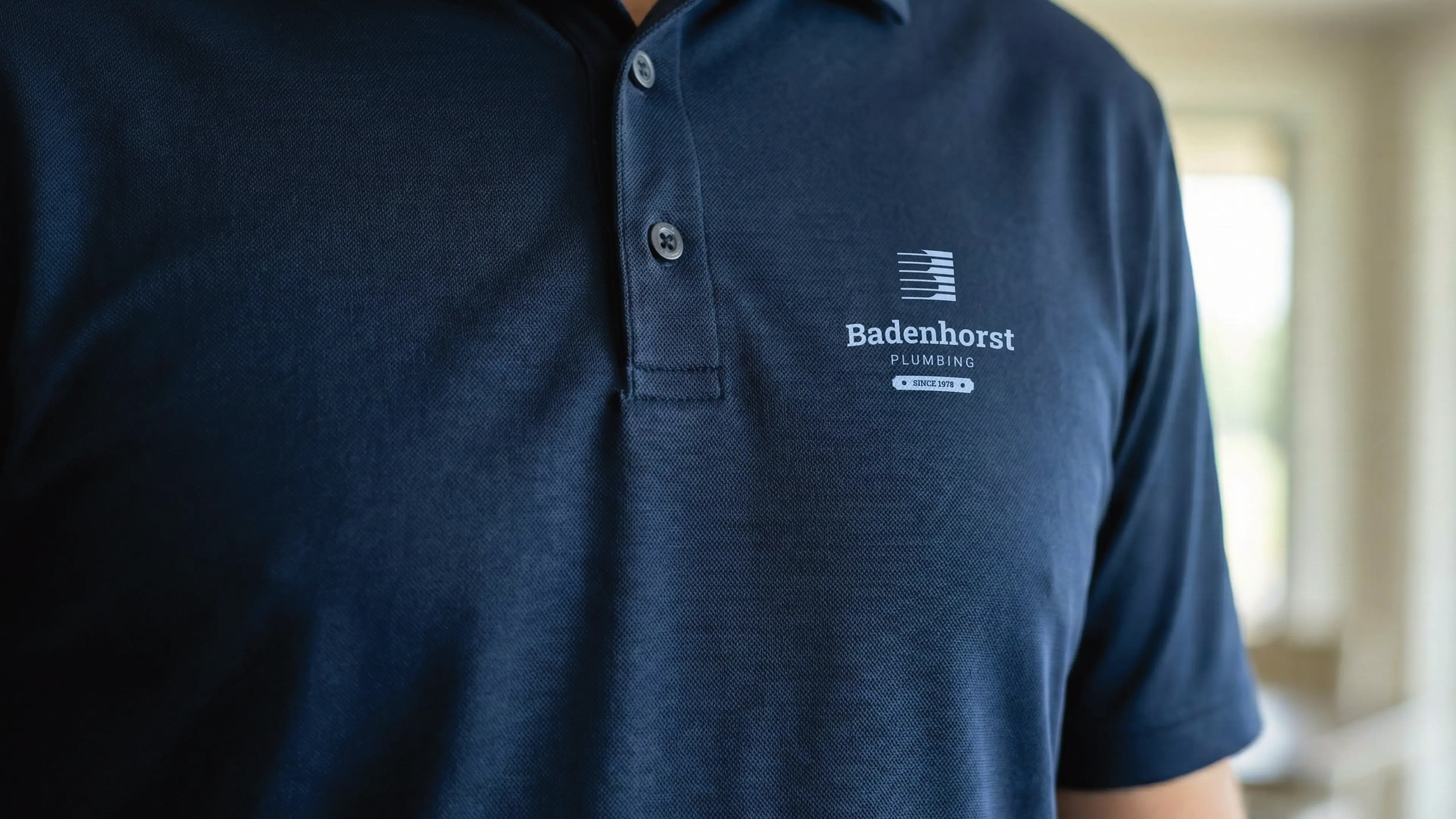
The logo features a capital letter B in the negative space, with a horizontal line over it that blends the letter in with a solid background. The horizontal lines create a sense of calmness and movement, which emphasizes the brand's confidence to provide peace of mind.
The logo functions perfectly well in a vertical or stacked layout. This means that the logo will work well on vertical applications like smartphones, tablets and roll-up banners.
The logo is designed to be functional in a horizontal layout. This allows you to use the logo on horizontal applications like building signage, websites and stationery.
This palette is highly acceptable for the Badenhorst brand as it replaces common plumbing clichés with a sophisticated, architectural aesthetic. The deep navy and slate tones honor the 1878 legacy and 'Sage' archetype, while the muted teal and bronze-tinged tertiary provide a modern, high-end distinction that resonates with property developers and the 9/10 luxury positioning.
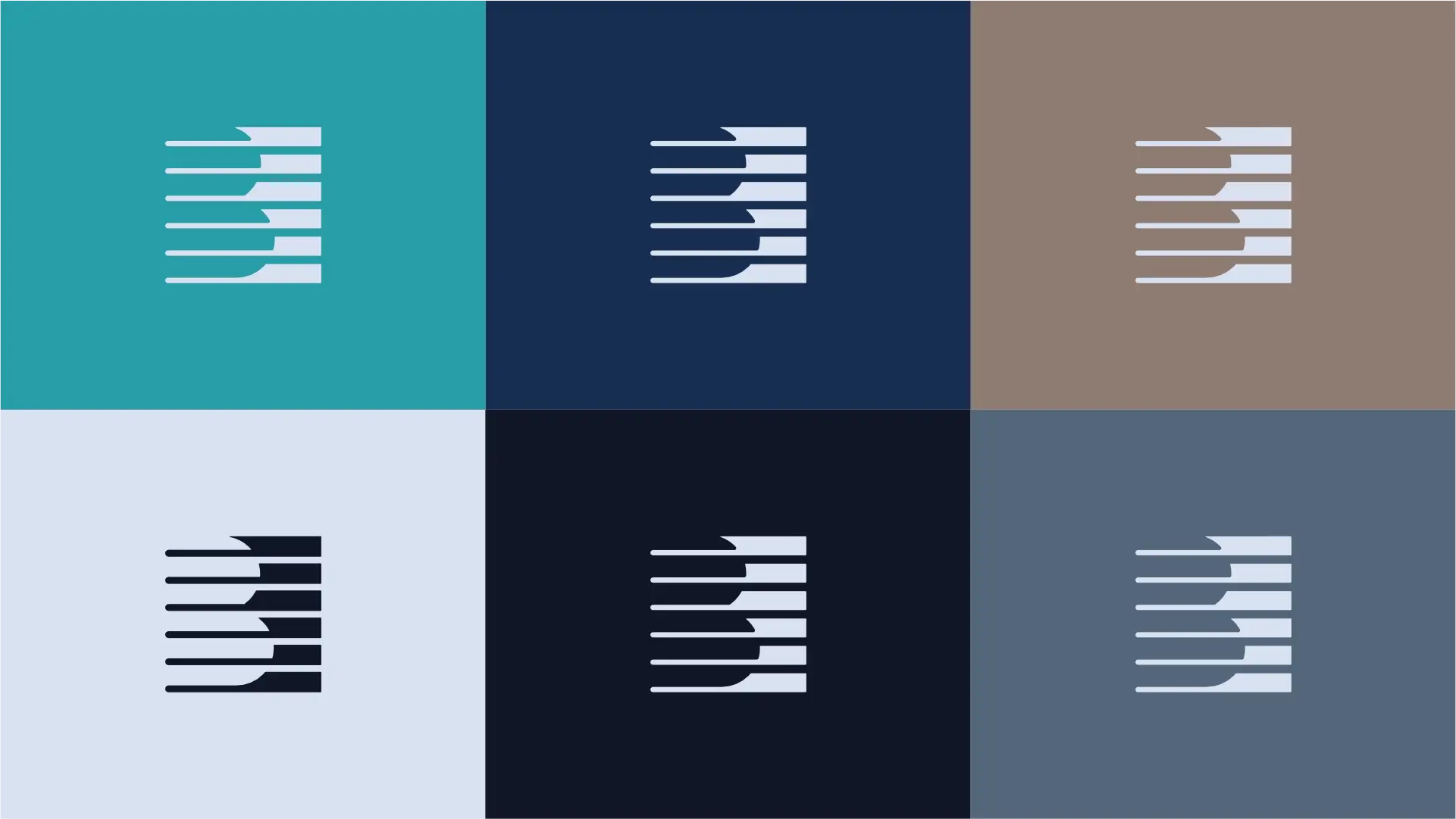
This colour balances the refreshing nature of water with the structural stability of oxidized copper, signaling both technical expertise and a calm, clinical approach to problem-solving.
Evoking the depth of a 150-year legacy, this shade communicates absolute trust, authority, and the disciplined professionalism of the Hero archetype.
This earth-toned neutral suggests raw materials and site logistics, grounding the brand in the tactile reality of high-stakes construction and historical architecture.
This cool, clean light tone represents the 'white-glove' finish and the absolute cleanliness promised in the Badenhorst experience.
A colour of absolute power and precision, it provides the necessary weight to the visual identity, ensuring the brand feels like a dominant industry titan.
This sophisticated grey replaces harsh blacks to maintain a high-end, architectural feel that ensures readability and a sense of calm reliability.
The primary colour version of the logo functions perfectly in a vertical layout, designed for maximum brand impact on light and dark digital surfaces.
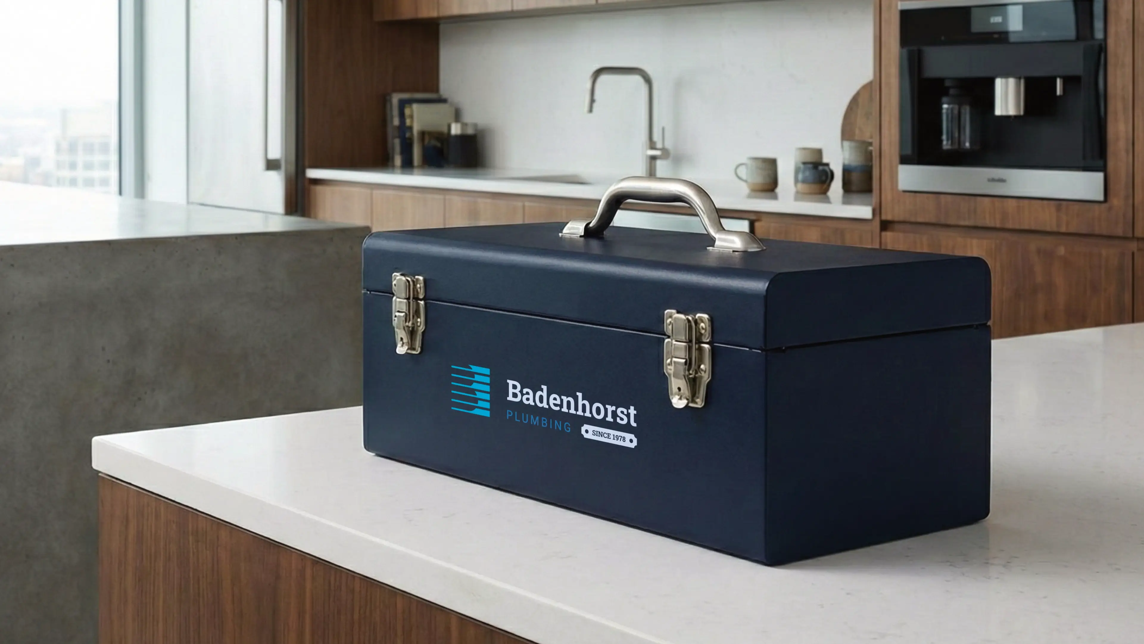
For wider applications like navigation bars, signage, and stationery, the horizontal colour variations ensure the brand remains legible and professional.
The pairing of Roboto Slab Extra Bold and Roboto Regular creates a strategic visual tension between historical authority and modern minimalism. This typographic system reinforces the brand's shift from a traditional contractor to a legacy-driven infrastructure titan, offering a blend of 'Heroic' strength and 'Sage' professionalism.

Robot Slab
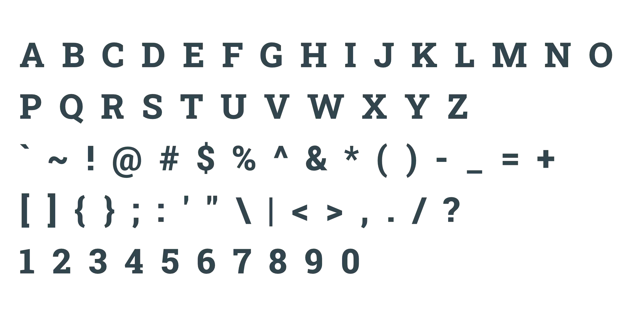
This heavyweight slab serif combines a rigid, geometric structure with a sense of historical permanence that mirrors a 150-year-old engineering foundation. It creates an immediate impression of the Hero archetype, signaling a disciplined, high-stakes authority that refuses to compromise on strength. As a heading typeface, its bold footprint ensures maximum impact on executive stationery while grounding the brand’s premium 9/10 positioning.
Roboto
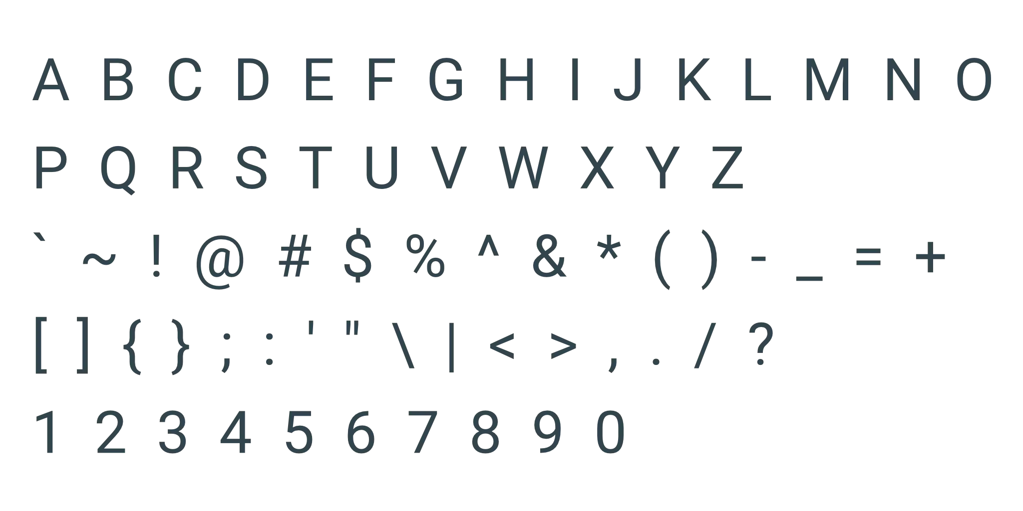
A clean, modern neo-grotesque sans-serif, this typeface provides a sophisticated, 'Sage-like' clarity that balances the intensity of the primary slab. It conveys a professional, approachable ethos that mirrors the brand’s commitment to transparent communication and clinical precision. Its high legibility and balanced proportions make it an effective choice for subheadings and dense paragraphs, ensuring the 'Badenhorst experience' feels organized and high-end.
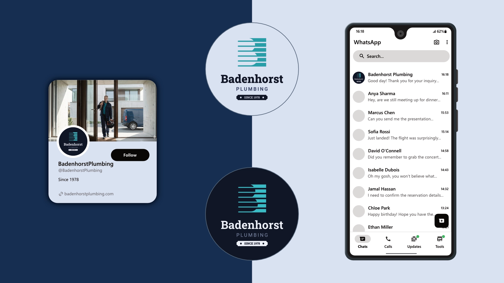
The logo is designed to fit inside a profile image that can typically be uploaded to social media platforms like Facebook, LinkedIn, and Instagram.
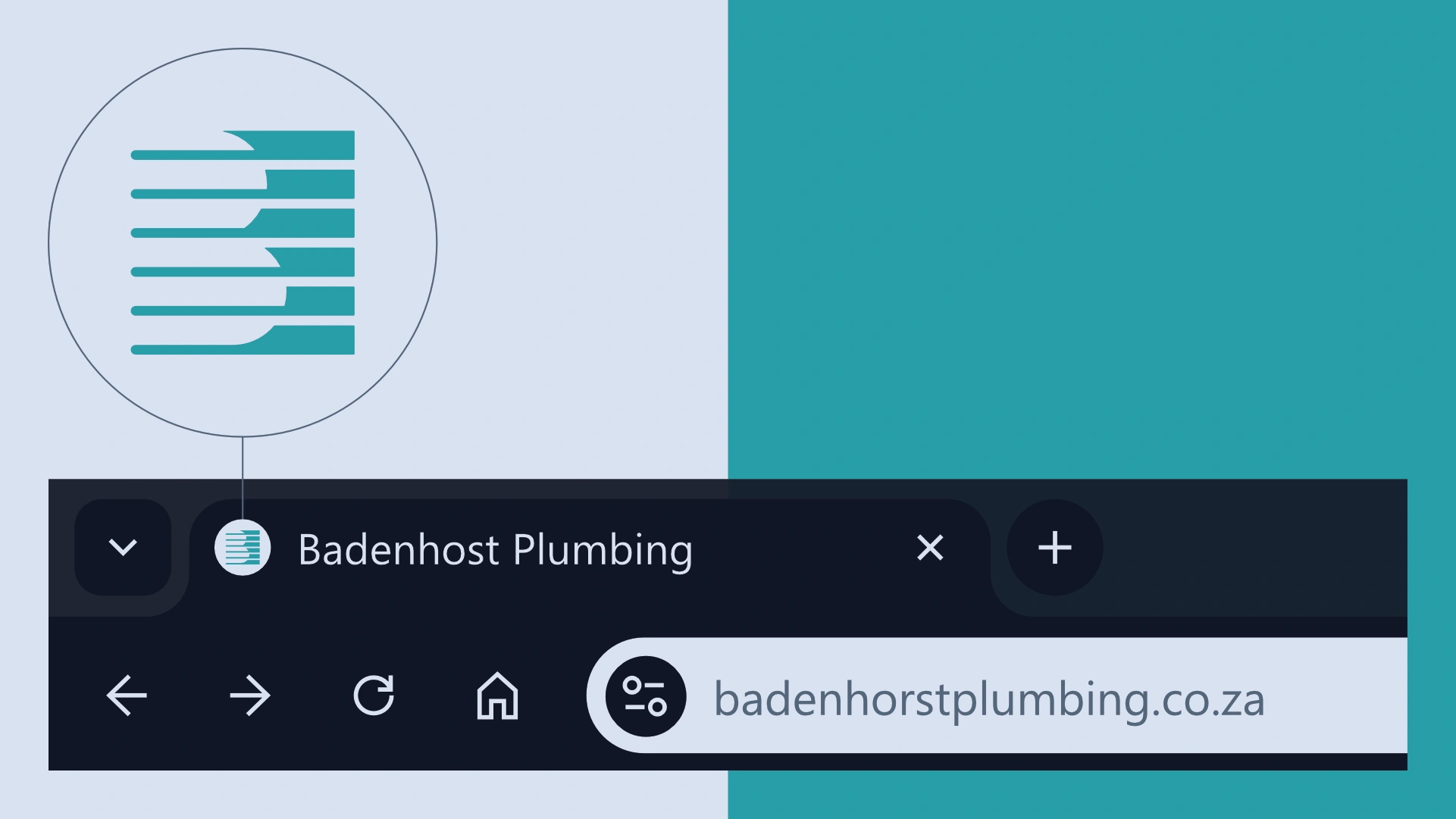
A favicon is a small icon that represents your website in browser tabs, bookmarks, and address bars, ensuring brand recognition at a glance.



Contact us Today To
The best way to get things done is simply to begin. Reach out to us at Fletch in Pretoria, South Africa today.
