
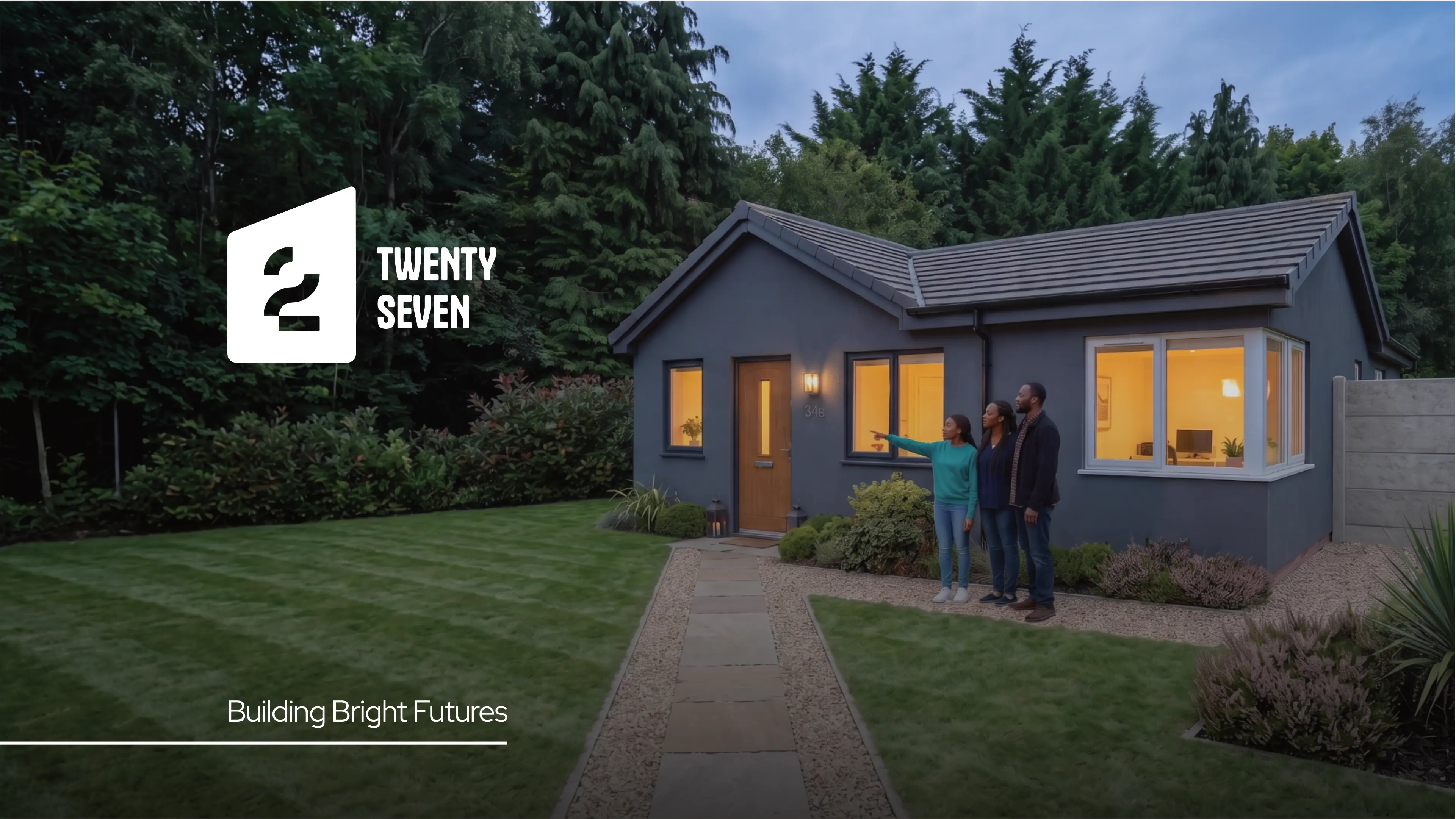
Twenty Seven, a new brand named after the owner's grandfather, was established to provide purpose-built student accommodation, aspiring to be a 'Home away from Home'. Operating in the property development market, Twenty Seven uniquely focuses on township areas to meet high demand for bedding, offering full turnkey solutions. Positioned as a mid-range, somewhat formal brand, it differentiates itself from competitors by its community-focused approach, aiming to develop more properties and expand into rentals in the future.
Their target audience is diverse, encompassing parents, students, and young professionals aged 19-60, seeking safe, comfortable, and reliable accommodation. They also cater to middle to upper-income investors, both male and female, who are interested in socially impactful ventures like reviving township accommodations or diversifying their portfolios. Ultimately, the brand aims for its audience to describe their experience with words like 'Comfort', 'Home', and 'Safe', reflecting a commitment to security and well-being for all.
The requirements for the logo design are to establish a professional, memorable visual identity that builds trust. This logo will be seen widely on branding stationery, social media, websites, apparel, vehicle signage, general signage, and exhibition equipment. Crucially, the design must incorporate Zennith gold and black. While the brand currently lacks a slogan, they are enthusiastically open to creative suggestions that can complement the new logo.


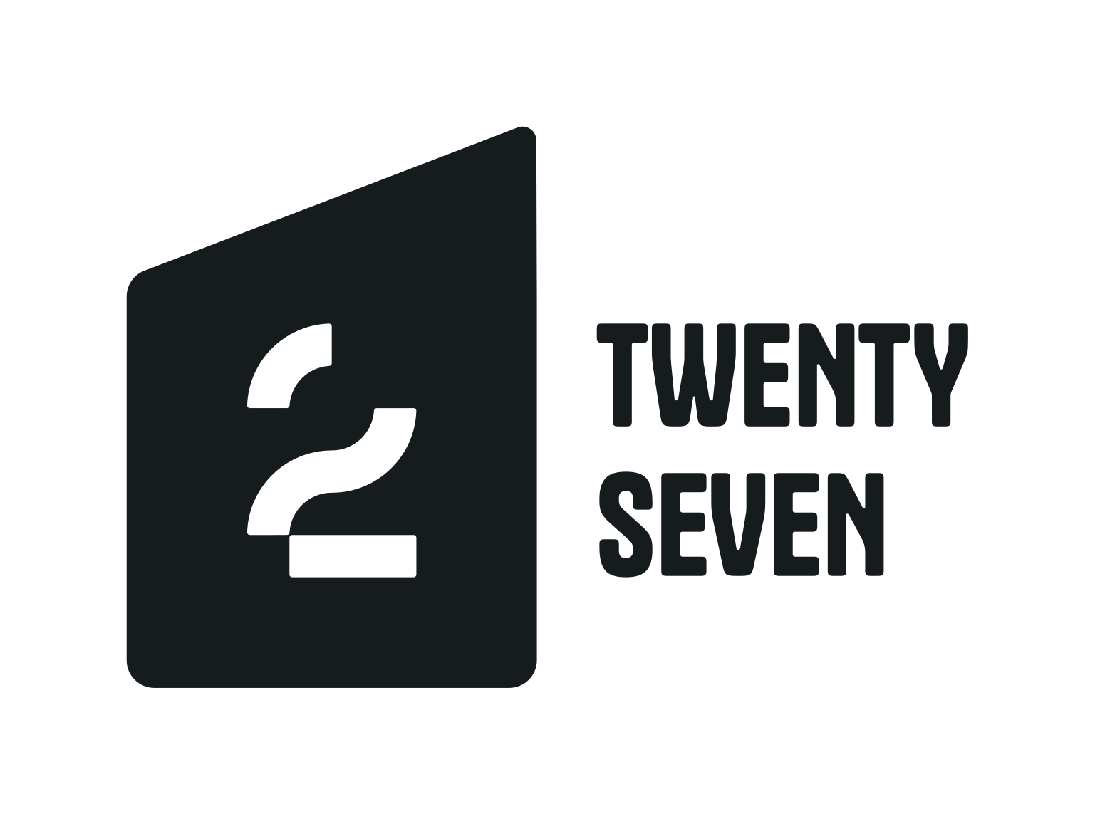
The logo features a shape that is half of a standard house shape. This is a subtle nod to the homes being intended for students and young professionals. Even though the shape is that of half a standard house, it still looks modern. Inside the shape is a number 2 and an upside-down 7 as a play on the number 27. Not so obvious, but one of those designs that once seen can't be unseen.
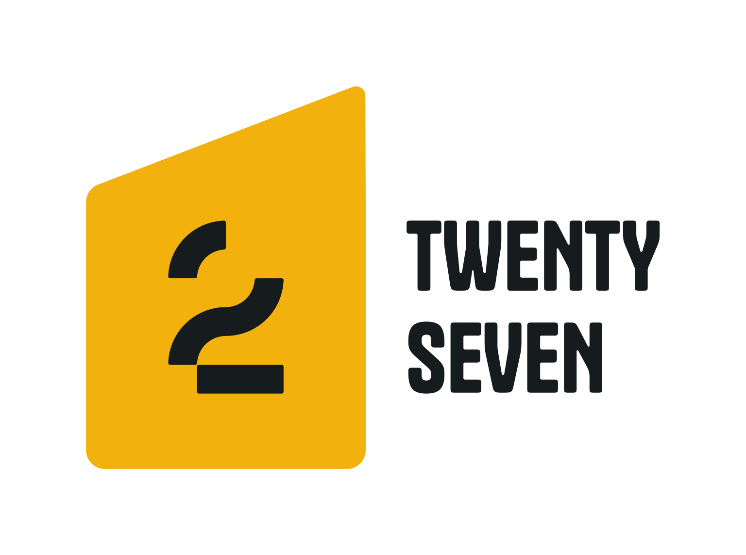
The logo functions perfectly well in a vertical or stacked layout. This means that the logo will work well on vertical applications like smartphones, tablets and roll-up banners.

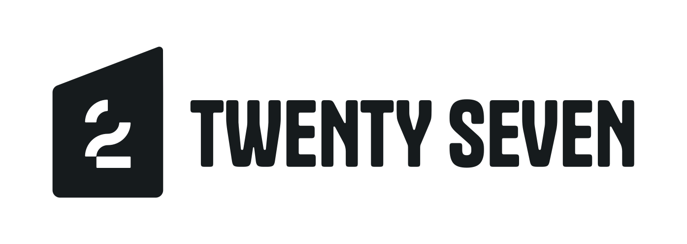
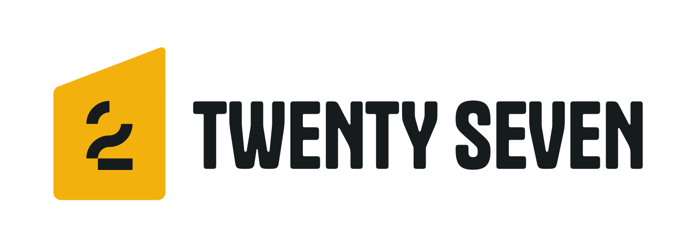
The logo is designed to be functional in a horizontal layout. This allows you to use the logo on horizontal applications like building signage, websites and stationery.

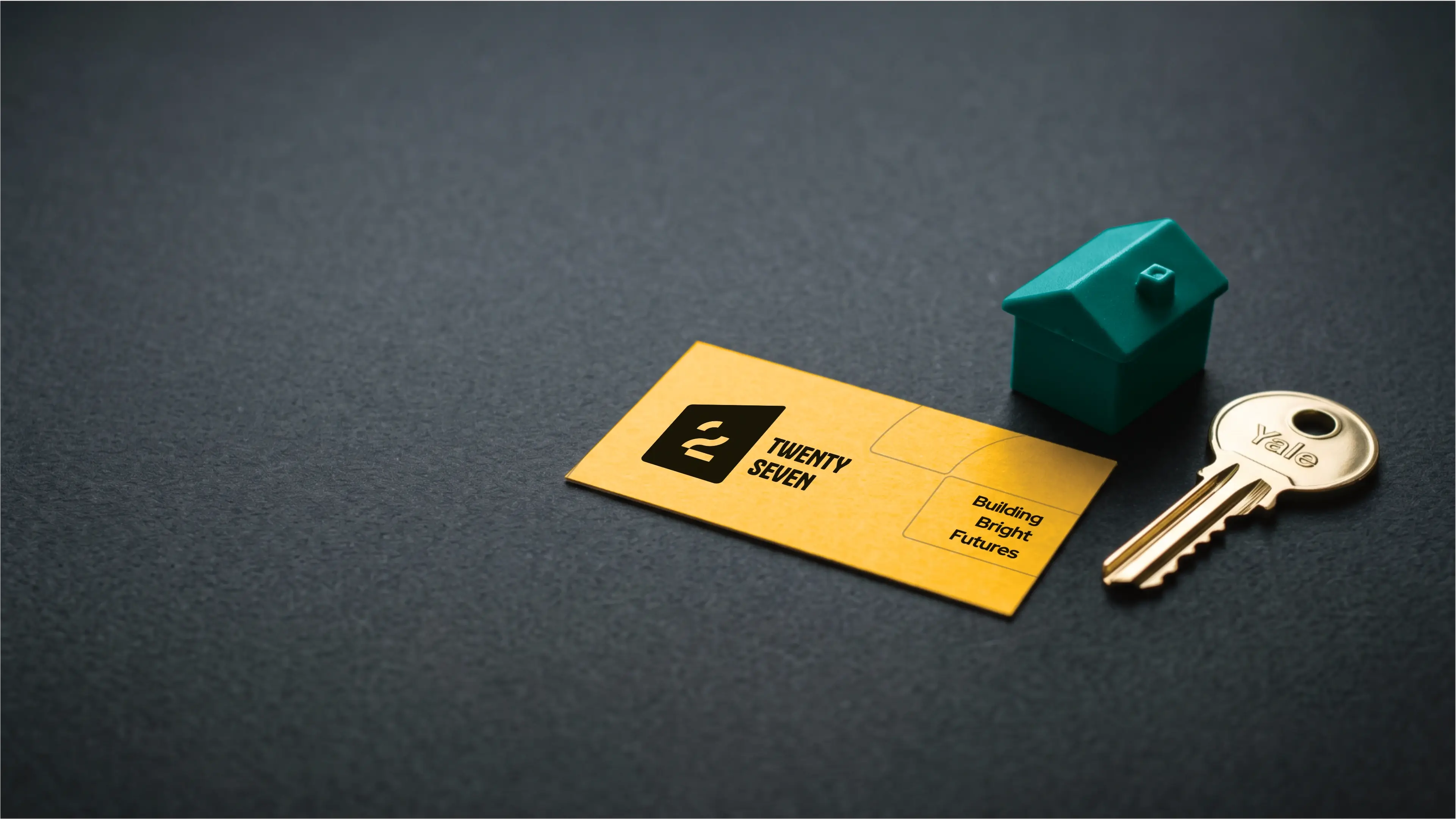
This palette for Twenty Seven blends earthy tones with sophisticated neutrals, reflecting its 'Home away from Home' ethos in township student accommodation. The vibrant primary colour evokes community warmth, while the deep greys and teal signify reliability and growth. This balanced selection supports a mid-range, formal, yet community-focused brand identity, ensuring trust and comfort for students and stakeholders alike.
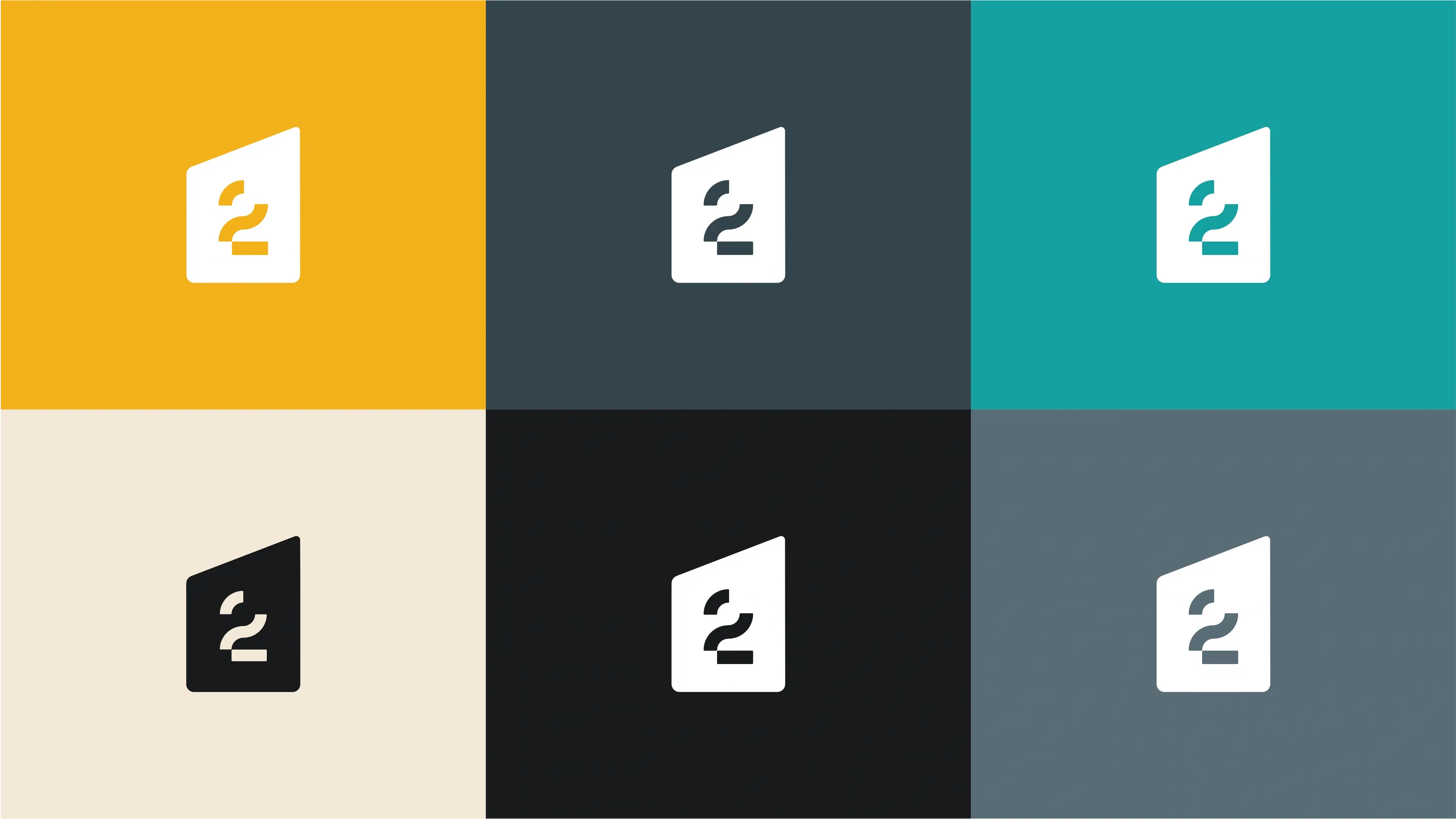
Evokes warmth, optimism, and energy, signifying a welcoming and vibrant community atmosphere essential for a 'Home away from Home'.
Represents stability, sophistication, and reliability, forming a strong and professional foundation for the brand's property development focus.
Conveys serenity, clarity, and innovation, reflecting the brand's aspiration for growth and its fresh approach to student accommodation in townships.
Offers a sense of calm, warmth, and comfort, reinforcing the brand's promise of a cozy and elegant living environment.
Signifies authority, sophistication, and depth, embodying the brand's professionalism and its long-term vision in property development.
Communicates reliability, intelligence, and a calm focus, ensuring clear communication and a sense of trust for students and partners.

The primary colour version of the logo functions perfectly in a vertical layout, designed for maximum brand impact on light and dark digital surfaces.
For wider applications like navigation bars, signage, and stationery, the horizontal colour variations ensure the brand remains legible and professional.

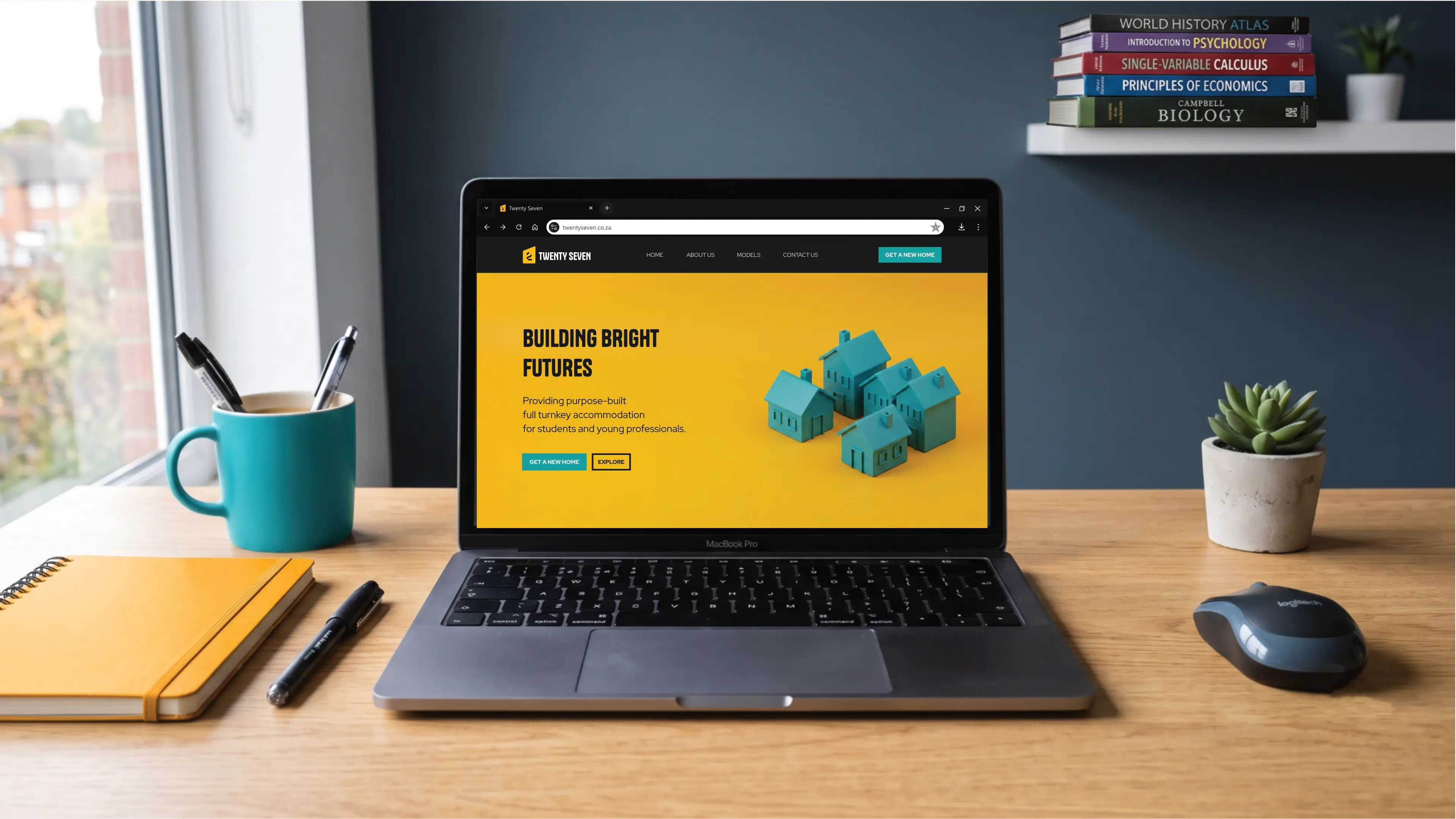
The pairing of Tanker and Red Hat Display creates a balanced and effective typographic system for Twenty Seven. Tanker's strong, modern presence for headings is complemented by Red Hat Display's clear and approachable style for body text. This combination projects a professional yet distinctive brand image, balancing the robustness of property development with the warmth of a "Home away from Home," ensuring both impact and readability for the mid-range, community-focused brand.
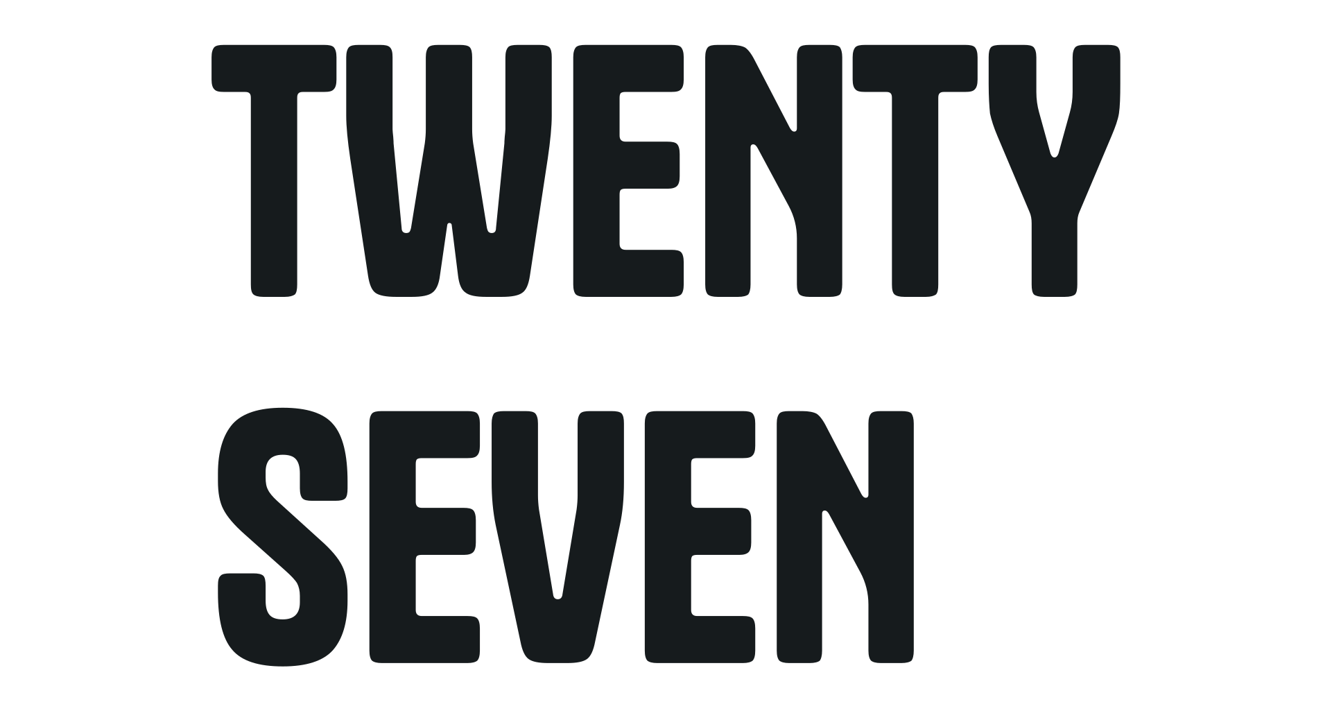
Tanker
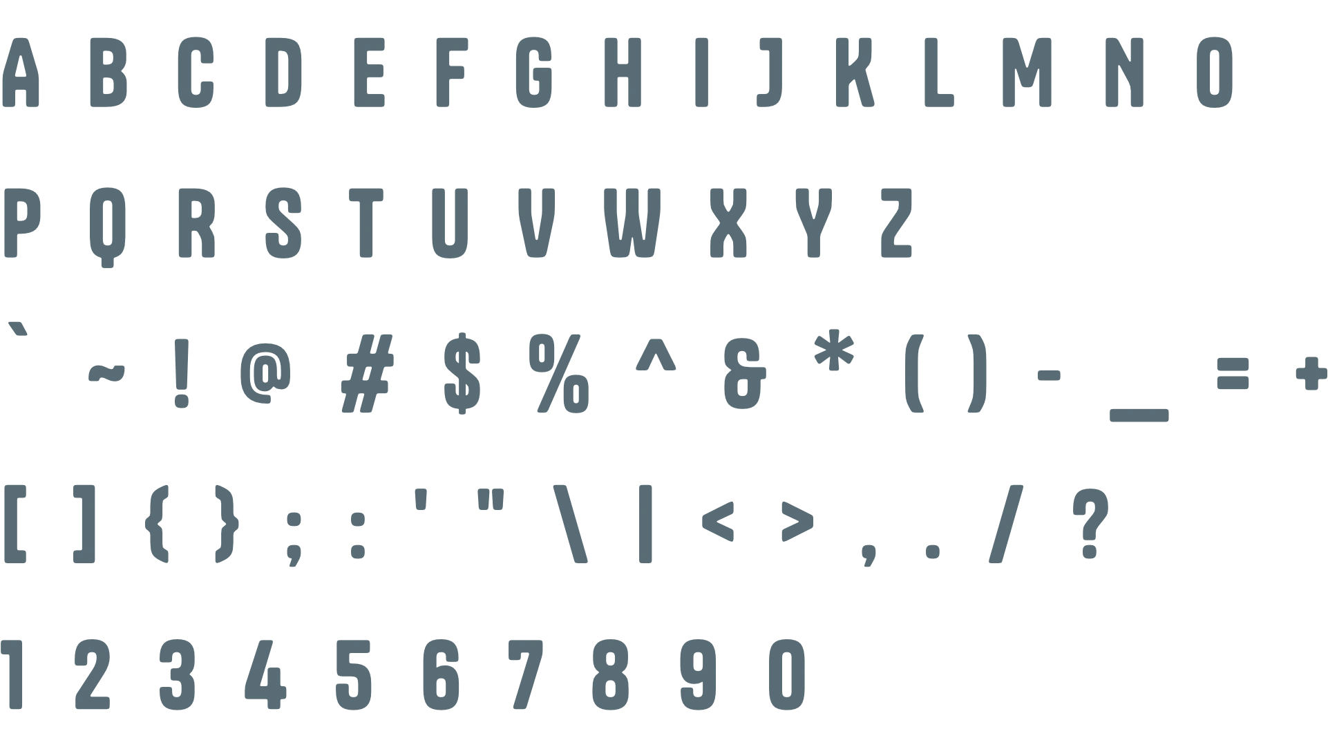
Tanker, with its robust and industrial sans-serif style, projects a strong, modern, and authoritative impression suitable for headings. It effectively communicates the brand's solid foundation in property development and its unique, community-focused approach. Its bold presence ensures key messages stand out, aligning with Twenty Seven's mid-range yet distinctive positioning, creating an impactful visual anchor for the brand's identity.
Red Hat Display
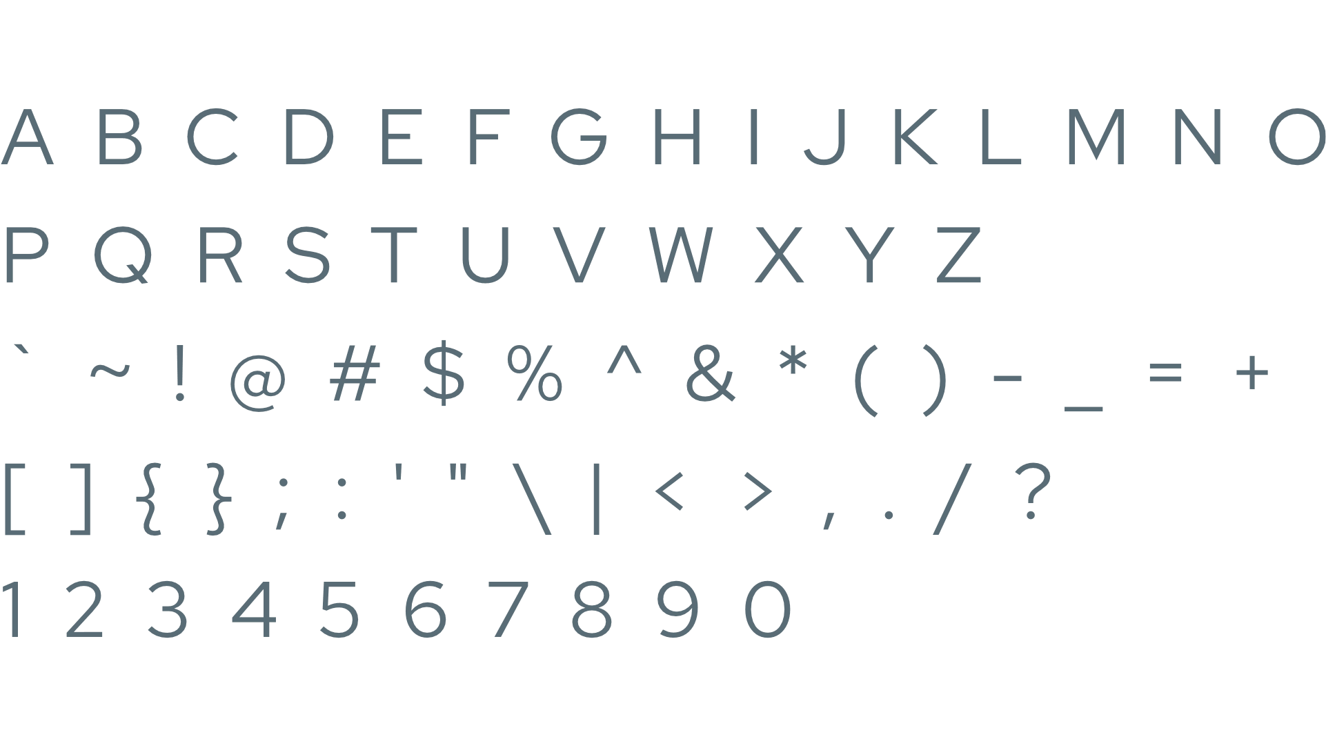
Red Hat Display offers a clean, contemporary sans-serif style that creates an impression of clarity, professionalism, and approachability. It is highly effective for subheadings and paragraph text, ensuring excellent readability for all brand communications. This typeface supports Twenty Seven's "Home away from Home" ethos, providing a reliable and welcoming feel while maintaining the brand's mid-range and somewhat formal positioning through its elegant simplicity.
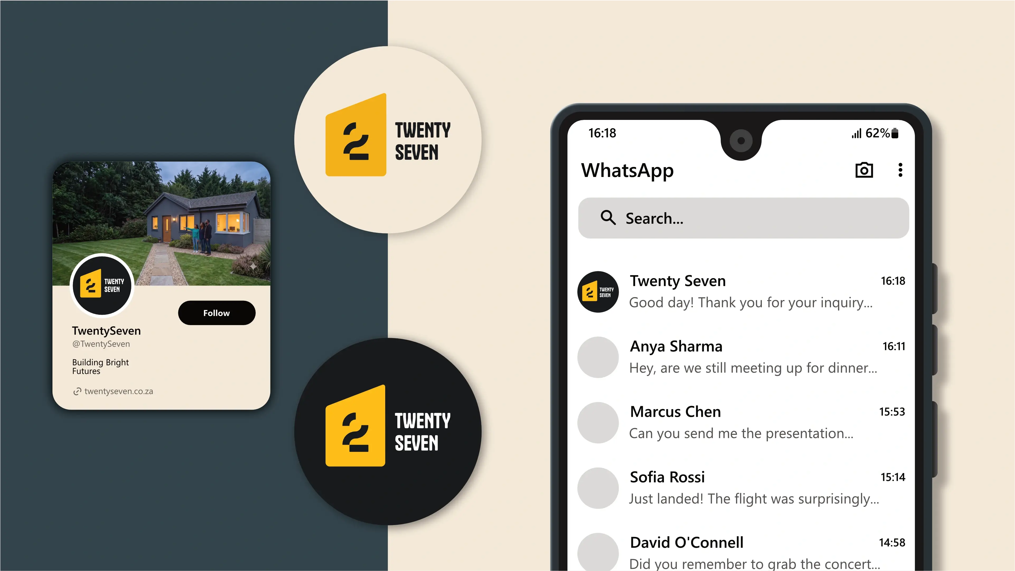
The logo is designed to fit inside a profile image that can typically be uploaded to social media platforms like Facebook, LinkedIn, and Instagram.

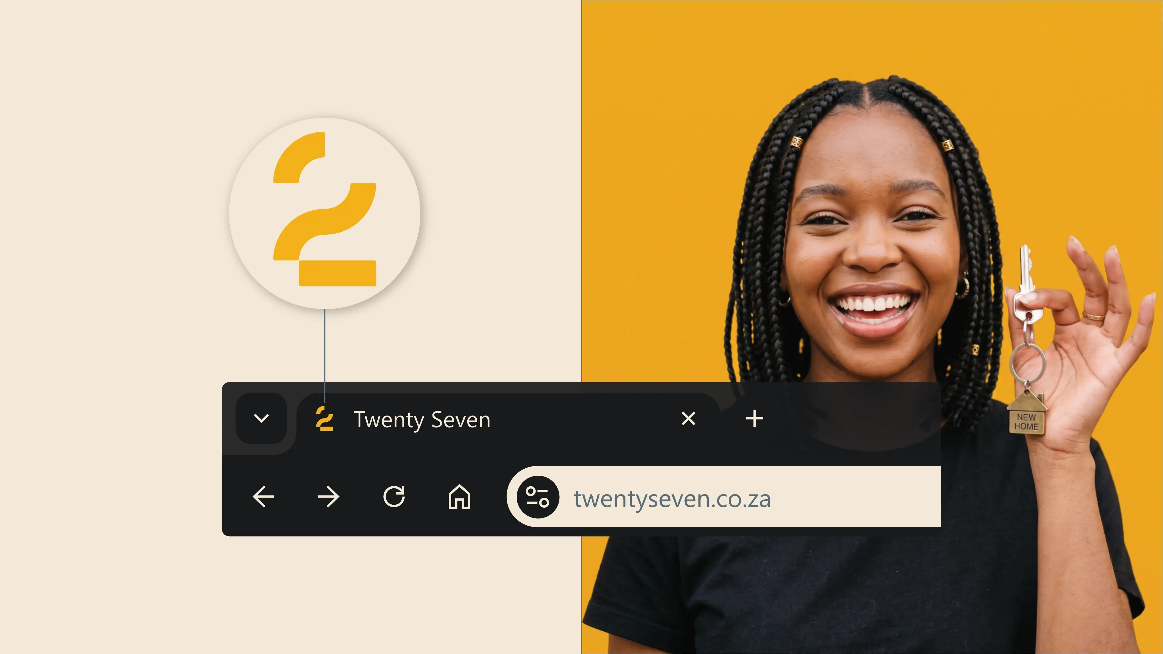
A favicon is a small icon that represents your website in browser tabs, bookmarks, and address bars, ensuring brand recognition at a glance.



Contact us Today To
The best way to get things done is simply to begin. Reach out to us at Fletch in Pretoria, South Africa today.
